
It’s been said that you never get a second chance to make a first impression. For many potential customers, the first impression they get of a brand is from a business card. Whether you’re designing a card for your own business or working on a project for someone else, stay away from these five pitfalls.

1. Poor Paper Quality
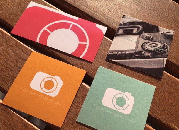
Many designers spend a lot of time trying to find the perfect graphics, tag lines and style for business cards while neglecting an important basic principle. The appearance of the business card isn’t the only thing that’s sending a message. The feel of the card also reflects on the quality of the business.
As a general rule, stick with at least 14-point card stock to avoid a cheap feel. If the card contains photos, glossy card stock is a must. Textured card stock is an excellent choice for clients who desire a premium feel.
2. Choosing RGB Instead of CMYK Setup
Some designers are more familiar with designing in RGB, especially those who are experienced in digital work, but it’s important to choose CMYK setup to get the most accurate color and design results for your business cards. RGB is a good choice for designing websites, but CMYK is superior for business cards since it was created specifically for printed designs.
3. Inconsistent Branding
Business cards do not stand alone to represent the business. Instead, they are used in conjunction with the company’s other branded objects, including their:
- Letterhead
- Brochures
- Website
- Other marketing materials
Inconsistent branding makes a company less memorable in a client’s eyes. It also gives the impression that the company doesn’t know what they are about or what they have to offer. Help the client achieve cohesiveness by making sure that the business card design fits with the rest of their branding strategies. This can be accomplished by using the same logos, fonts and basic color schemes on all marketing pieces.
4. Using a Small Font Size
The standard business card size is 3.5 inches by 2 inches. Some clients try to fill the small space with as much text as possible, resulting in a tiny font size that is difficult to read.
When you’re designing a card, don’t use a font size of less than 7 pt. An estimated 95 percent of the population over age 35 uses reading glasses, and you don’t want someone to have to pull out their glasses just to view the company’s name. The most important information on the card, such as the the person’s name and business name, should be highlighted using a larger font size.
5. Not Understanding the Target Audience
Before you begin the design process, take some time to gain an understanding of the company’s target audience. A card designed to connect with students who are just out of college will look a lot different than a card that’s mainly used to market to senior citizens in a high income bracket. The more you know about the target audience, the better you can tailor the card’s style and theme to attract that specific group.


6. Non-Standard Sizes
This one annoys me because I regularly see it from up-and-coming designers with no real world experience. Business cards have standard sizes (85mm by 55mm in the UK) for a reason!
Cards made of plastic or metal are fine, but if your card is so large I have to cut, fold or rip your business card to fit it in my wallet – you need to rethink its design.
Dominic X. Crewe
Brand Identity Designer
Sugar Cube Productions Ltd
5a. Not understanding one’s business. Too often businesses focus on “features and benefits” as “FEATURES and benefits” instead of “features and BENEFITS.” Customer first.