
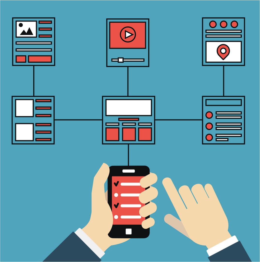
There’s been an interesting shift in website design and online marketing over the last few years. Specifically, website design is moving from content-heavy keyword stuffed sites to visual, simple, user-focused experiences.
Consumers are in the driver’s seat because they have more choices than ever before. They’re visiting sites that are easy to navigate and buying from businesses that give them the kind of user experience they expect and, in some cases, demand.
According to McKinsey Research, 70% of buying experiences are based on how the customer feels they are being treated. If you’re redesigning your website, make sure you’re measuring the user experience by considering user experience goals, elements of the website, and mobile friendliness.

Consider User Experience Goals
What’s the purpose of your website? For many businesses, a website is a platform that legitimizes the business, builds trust and authority. There’s no need to go into great detail about your product or service as long as the visitor understands what you’re selling and how they can connect with you to learn more.
- Actions: Calls to action like subscribe to our newsletter, call us, follow us on social media and schedule an appointment need to be visible on every page of the website.
- Social media: Links to social media should drive to a site that you’re frequently updating with valuable information. Never drive traffic to a social media site that you don’t update. You’ll lose credibility and customers will wonder if you’re still in business.
- Contact: Forget the contact us page. It’s no longer part of the user experience. Consumers want answers immediately. Provide a mechanism for support like a phone number, email address or chat messaging functionality.
Where to Spend Time on Design
All too often we see clients spending too much time and effort on the design of the home page. The reality is that most visitors won’t enter your site through the homepage. It’s likely that your marketing and social media campaigns will lead them to your blog or specific landing pages on your site. Review website analytics to find out how people enter your website and focus on those pages during the website redesign. It is also important to track page Bounce Rate, Avg. Session Duration, and Pages per Session. A good goal is to reduce Bounce Rate, increase Average Sessions Duration and increase Pages per Session.

Importance of Mobile Design
Google recently released the mobile-friendly update. If your site isn’t mobile-friendly, you’ll need to make sure it is after the redesign. Sites that aren’t mobile-friendly appear lower in search engine results compared to their mobile-friendly counterparts.
More importantly, having a mobile-friendly website is important to user experience. At least one-quarter of web searches are performed on mobile devices. This number continues to grow year over year. If your target audience is younger (18-34 years old), they are likely using a mobile device.
User experience is key to convert visitors into customers. As you review your website, make sure you’re considering the user experience in addition to other elements of design. If you are in the market for a website redesign, make sure you hire professionals that understand the effects of user experience on the success of your website. If you need help or guidance, contact the team at Fyresite to find out how you can improve your website UX.


How about some general tips on these. I’ll start with some content tips.
Don’t make pages with 20 folds of content for mobile EVER! Aim for 5 folds on any device.
Include validation and authority via social media, testimonials, blog posts and news as well as community participation. (Islands don’t survive often; work with others).
Please create content that focuses on well-defined intended audiences; and try your best to reduce that number to one. Content loses it’s power if it’s too general-purpose.
Unlike paper, too much additional media on the web, without knowing your user-profile and that includes broadband, is probably a bit sucky, and it’s expensive to produce and deliver.
Mobile friendly is a term not well explained to the small business owner. He looks at Google Mobile Friendly test and thinks that is gold. Although passing this technical test is imperative you must also pass the end user test of usability. Is the nav intuitive for a website user of that industry? Example a Doctor’s website should have “Make an Appointment” on the top of mobile along with the phone number.