
A few weeks ago, I showed you a bunch of super sleek fonts to use in your clean designs, but if you’re looking to establish a classic mood for a design, you may want to choose elegant serif fonts.
This article presents to you 30 of the best free serif fonts around…
Novello

Museo

AlexandriaFLF

Bienetresocial

Kontrapunkt

Serif Beta

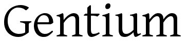
Gentium Basic

Centabel Book

Divona

Andron Freefont LAT

Grandesign Neue Serif

TypoLatinserif-Bold

Bergamo Std

Contra

Sanford

Temporarium

Juvelo

Justus

Day Roman

Bitstream Vera Serif

Dustismo Roman

Portland LDO

Cardiff

Oxford

Queens Park

Athena Unicode

Imperium

RomanSerif

Slab Tall X

Liberation Serif


Great resource, hadn’t seen a couple of these before so thanks for the share 🙂
These are stunning! I personally love serif fonts, as I believe sans serif’s are getting overused and killed. Nice collection! Thank you!
No offense but I wouldn’t call too many of these fonts elegant, while I wouldn’t call Museo a serif font at all. Where are the classics like Baskerville, Caslon, Goudy, Bembo? All truly elegant not to mention Garamond, Jenson and Joanna all well established (Garamond was designed in the 1540s) truly elegant fonts. Do yourselves a favour and take a look at some of the masters of type design.
Thanks for the post, I tend to use Museo quite a bit recently. There is a great showcase of Museo here: http://francescomugnai.com/
From this list Novello and Alexandria are probably the only ones I would use. But you left out on of the most beautiful serif typefaces there is, Archer. Check the link to feast your eyes on true beauty (especially in bold): http://www.typography.com/fonts/font_styles.php?productLineID=100033
@Paul it’s 30 elegant *free* serif fonts, the ones you mention are not free. Do yourself a favor and figure out the purpose of an article before writing something snotty in the comments.
@kyle steed
Thanks for pointing out Archer…shouldn’t have left that one out.
I didn’t see my comment as being ‘snotty’. I understand that the fonts are free, I was simply pointing out that with the constant flood of free fonts on the market we are losing sight of true elegance in type design. Surely real quality is worth paying for?
Paul: When you start out with “No offense…” and follow up with “Do yourselves a favour…”? Yeah, that’s snotty.
And if the list included such well-known stalwarts as Garamond and Caslon the author would no doubt have received equally snotty remarks about stating the obvious.
I love Trajan! Modeleted after Roman carved letters from the first century AD–still popular after 2000 years! 😉
nice fonts! i love Kontrapunkt
thx
bigyaz: Handbags at dawn! Seems Kirsti and Kyle have the right idea. Trajan a classic since the Roman Empire and Hoefler & Frere-Jones one of the world’s premium type foundries.
I’m not totally against free fonts, I’ve used a few myself in the past but if you’re not experienced enough to recognise a well designed font you can very easily fall into a habit of using poor fonts and your work is going to suffer in the long run.
Glad to see some us are still flying the flag for good font design.
Interesting list. To me, it shows the future of “elegant”. Many comments mentioned the heavy classics: Bodoni, Caslon, Bembo — then others mentioned the more contemporary classics like Archer. This list reads to me like the “elegant free fonts” or “elegance on a budget”. Not to take away from the fonts, as I’ve downloaded and used Museo and Kontrapunkt on many occasions, but always with the notion that I was “modernizing” and “removing elegance” by applying those fonts. Thanks for the post.
AMAZING TYPEFACES!
These are some nice substitutes for the regular old fonts I see so much of. Thanks for posting!
Very good collection!
Gonna use 4-5 of these in my future works 🙂
Thanks for the set!
Thanks a lot for sharing this 🙂
Gopal Raju
productivedreams.com
twitter.com/gopalraju
this is the problem with fonts, once you place them side by side all looks the same.
Couldn’t believe you missed the ” TRAJAN PRO “
Imperium seems to have changed since you looked at it
Hey, let’s not let the tone disrupt the message. When I saw “30 Extremely Elegant Serif Fonts,” I was hopeful. I look at this list and agree with Paul. I would call very few of these fonts “extremely elegant,” free or not. All the typefaces that Paul mentioned would rank more elegant to me than most on this list. One could take offense at this comment or use it as a helpful critique. The latter is my intention.
@Paul @likethegoddess Your comments would’ve been helpful if you explained your understanding of “elegant” and precisely why some of your fave fonts should’ve been in place of (or in addition to) these.
Then again, this article could’ve shared more narrative on that, too. Let’s help each other out.
I liked Queens Park when it used to be called Palatino.
good resources.. thanks..
That’s a big ask, Torley. One can only go so far within the confines of blog comments.
I’d say the first change I’d make is to the title, dropping “extremely” and adding “free.”
“Elegant” is such a subjective term. One could write a book on typeface elegance!
To me, an elegant serif face must first be effortlessly readable as a paragraph font and would have an innate beauty of its own. Look at how well each letter relates to the others, how well kerned out of the box, the style expressed in each individual letter.
The serif typefaces that I find most mark elegant, as Paul mentioned and I alluded to, are Garamond, Baskerville, Caslon, Goudy, and Bembo. To those, I could add Bell, Mrs Eaves and Warnock. I’d add Bodini, as SOS Media Web Design mentioned, as a classic modern serif. I’d say the list is missing classic slab serifs like Rockwell and Lubalin Graph.
Compare the fonts I’ve mentioned to those on this list for yourself and see what you think. Remember to check the italic, bold, and italic/bold versions. Some may measure up, some not. It’s up to you.
For those complaining about the authors use of the word “Elegant” perhaps a better term, like “Contemporary?”
To clarify, I was complaining about “extremely” rather than “elegant,” although I like Patricia’s suggestion of “contemporary.”
wow… i hadn’t even heard of most of them. thanks for sharing the list. 😉
Hello,
I would like to point out that
NOVELLO lacks numbers,
ALEXANDRIA is a stolen STYMIE,
BIENETRESOCIAL is a blended GEORGIA and TIMES,
DIVONA is extremely bad drawn (bad curves),
GRANDESIGN is a MYRIAD with serifs added, very amateurish and the special characters are all MYRIAD,
BERGAMO is a stolen BEMBO,
SANFORD is a tweaked AMERICANA,
TEMPORARIUM is a stolen GENTIUM (why would anyone rename a free font?),
JUVELO has no special characters,
JUSTUS is a stolen WALBAUM,
DUSTISMO has broken characters and the bold weight has a corrupt i,
PORTLAND is identical to QUEENS PARK and they are both stolen PALATINOS,
CARDIFF is a stolen TIMES ROMAN,
OXFORD is a stolen PERPETUA,
ATHENA UNICODE is a stolen NEW BASKERVILLE,
SLAB TALL X is a stolen and scaled SERIFA.
Very nice collection of serif fonts. I’ve used a couple of these before. Certainly some new ones that I’m sure I will utilise in the future.
Nice post Henry, look forward to more…
thanks for providing these fonts free. i can’t believe what a bunch of jerks are here bitching about a gift horse. get a life! i’m taking my own advice and am off to continue mine 🙂
Always good articles here! Thanks & keep up the great work!
Great collection! I really love the Museo, and Kontrapunkt typefaces. 😀
slab tall x? are you serious?
Italic Queens Park almost looks like Garamond, nice.
This list is absolutely fantastic!
I really liked most of the fonts on it. 🙂
Thanks for the superb list, some of these serif fonts are gorgeous.
Great selection! I’ve been using serif but only few I have pick, with this list i see there are other more beautiful serif fonts around..
Thanks for this post! I’ve been on this site for just a few minutes and already I have several new sources for free fonts. Good stuff.
i just decided on centabel for a logo. this list helped me feel more confident in my choice, since i’m a beginner. and bonus, david didn’t have anything nasty to say about it. thanks for the list!
Thank you for your selection.
Is just an individual matter of taste.
Nobody can say you on how to choose your shares
I like Centabel and Juvelo.
Great selection of fonts here! Would work really well with an elegant web design. I particularly like ‘Sanford’.
Awesome list of resources! Thank you for sharing.
I would just like to add one more set of typography resources and that is the forum of http://www.pilo.me
It is a private typography forum with an unbelievable amount of free fonts, premium fonts and exclusive typefaces. I think it was voted the best typography forum of 2009. If you are a font lover/addict, check it out. Like I said though, it is either private or invite only. I have never seen a typography site like it with all it has to offer. Anyhow, check it out, pilo.me
Anyhow, great article, I definitely will be referring to these time to time.
How could you leave off Copperplate Gothic Bold? Some of the fonts you’ve picked certainly are pleasing to the eye, but nothing is more pleasing, elegant and sophisticated than Copperplate. You’ve broken our hearts.
Nice post 🙂
btw also nice serif fonts http://www.fonts2u.com/category.html?id=16
Please let me know. Are these all fonts web-safe.
Great List of fonts, Contra looks amazing.
Its nice to see new and really cool fonts. Thanks for sharing really nice and cool ideas here.
What font did you use in the title of this article?
wow this is lame why are people fighting over fonts…. what a shame…..nerds
Half of these fonts are rip offs of genuine, well-crafted fonts, and the other half are just plain ugly.
I agree with the above.
I agree with Helen and Ben.
I agree with Helen, Ben and Vanessa.
I agree with Helen, Ben, Vanessa and Iriko
I don’t agree. Changing small details in a font makes it a new font entirely, so they should be “ripped off” and republished.
I agree with Scott.
Just celebrate that these are free fonts… sheesh
haha..totally agree with melissa
I agree with the other Scott.
But they left out some fancier ones:
Espinosa Nova Regular, Cambridge Serial Regular
What is the name of the font used for the title of this article?
Thanks for these, very helpful for a design project I’m working on
Day Roman, One of my favourite fonts .Thanks for this information