
Apple’s mobile operating system has gained a huge following in just a few short years. Although it can take months of dedicated study to even begin programming iOS apps, there still seems to be a solid market of intelligent developers. In the last year alone we’ve witnessed the iPad2 and iPhone 4S releases which have both appeared stunning.

And along with these advances in technology comes a much larger demand for iOS apps. I’d like to go into a few design trends which have become prevalent in mainstream iOS interfaces. Designers have started following innovative and whimsical methods for constructing beautiful app layouts. And there is a lot to be said of this booming mobile industry!
Offset Center Tab Button
Surprisingly I have run into this feature a lot more in the social network-type applications. The offset tab button is generally placed in the center of a series of tab views in the bottom bar. Foursquare and Instagram are two examples, although there are other designers picking up on the trend.

The benefit of this tactic from a metrics perspective is that you’ll see a lot more active sharing using that center button. With Instagram you tap there to snap a new photo, in Foursquare you are sharing a new check-in. This center tab view should represent the key action(s) you’re hoping to get out of each user.

Another cool example can be found in Tumblr’s iOS app. This mobile port of the social blogosphere is using the offset center tab just a few pixels in height. It seems like a small effect, yet your attention is constantly attracted to the “Post” link.
Popup Modal Views
Modal boxes have been popular in both desktop and browser-based applications. When developing for iOS these modal boxes are perfect for quickly gathering some user information. These systems work best in a true/false or yes/no format so the user isn’t flustered in dealing with a whole new window.

In the example above Tweetbot uses a brilliant modal box design with an outer shadow effect. Another point of notice is how the two buttons have been colored differently – this is to imply that you need to make a choice between the two. In this screen I’m being asked to confirm or deny a spam report(which I politely canceled!).
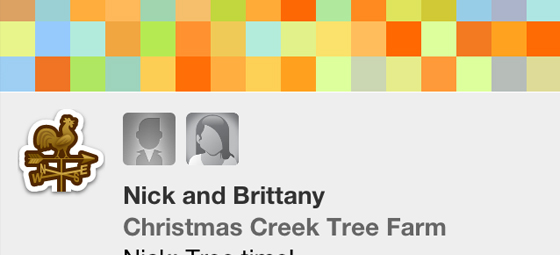
Link Icons
When designing an iOS user interface you want important bits to stand out from the rest. This is worth stressing in preparation so that your layout doesn’t appear bland by design. Things for iPhone uses some really unique icons to label each of their different scheduling areas.

Another one of my favorite examples is Cloudette, an iOS solution for CloudApp. Basically you log in to your account and the home screen displays all your contents in chronological order. The app includes icons next to each file based on the type(URL link, photo, .zip archive).

Even if you aren’t a magnificent designer you should be able to find some awesome freebies throughout the web. Having a few icons sprinkled throughout your menus will help to differentiate the many links listed together. They also add onto the beautiful user experience which you would expect in any mobile app.
User Profile Badges
The most popular example of the social badges group has to be Foursquare. We’ve all caught a glimpse of these badge designs and there are plenty to go around! The site’s founder Dennis Crowley has actually collected over 100 different badges! Talk about some real dedication.

Adding this functionality into your app brings about an entire gaming mechanism. Your members will be constantly working to unlock badges and show off their hip trendy profile. Im Game is another app released in private beta where you check-in to each video game as you play them.

Users who check into specific genres more often can unlock secret badges, along with others means of social gaming. If the badge system doesn’t work in your app I suggest not trying to force it. But collecting user input will keep your member base growing and interested in future products!
Custom Loading Animation
This hasn’t been as popularized as the other trends recently, although there are 2 apps worth noticing. Gowalla’s newest re-design uses a checkered array of moving colors to display when content is being loaded. It’s a really unique animation and certainly along the lines of something I’ve never seen before.
Another great example comes from Kevin Rose’s recent publication of Oink app. The user interface is much smaller this time around, as they focus on a tiny loading bar towards the top of each screen. The animation movement is very fluid and I feel the concept has been implemented brilliantly. Take down a few notes from these guys and see if you can come up with your own unique loader.

Pre-Cropped Images
There is a lot more code required to dynamically pull out images of differing sizes. It takes even more programming to crop and maneuver user uploaded content. As such these trends are still limited to app development teams with enough time and patience to implement them.

Ballin’ is a great example which pulls data out of Dribbble’s network. The shots are updated usually every 24 hours to include both a thumbnail and full-screen view for when the iPhone is in landscape mode. Altogether this technique is more intensive in programming than actual design. Yet it appears very trendy and flashy, and certainly something which I expect to continue in future mobile apps of 2012.
Conclusion
This guide has introduced some of the latest design trends in iPhone/iPad applications. If you’re an aspiring designer I highly recommend skimming through my previous article on iOS user interfaces in Photoshop. There is a lot to study and practice, but the payoff is certainly worth the effort. If you have any questions or comments please share with us in the discussion area below.


It’s good to see apps moving away from the “native” styling of the iPhone and iPad. As seamless as the native UI is there are some really good designers that can make the whole experience a lot nicer.
Some interesting ideas…
amazing ideas you share always and this is also appreciated as helping to get inspirations on app designs.
Thanks for this post. I think we’ll be seeing a lot more “web app trends,” like we do for “web design trends.”