
Everyone wants a site that will make visitors stick around and maybe come back for more. You actually want them to come even when they are not ready to purchase anything, because if they have fun, learn something new, or if they get to participate in something, they’ll come to know you.
You’ll have that coveted relationship that everyone one. And when they’re ready to purchase your products or services you’ll get the business. The other reason to have a really engaging website is that you want your current customers to not shop around; you want them to be repeat customers.
So let’s have a look at some things you can do to make your site memorable.
1. Your Visitors Should Have Some Fun
Standard navigation menus are pretty boring. It’s much more fun for a visitor to see a theme-based menu that relates to your niche.
Have a look at the landing page of Small Stone, a site that sells music and videos. They have their menu set up like a sound board with each dial a navigation button – very unique and impressive!

Another example of entertaining and navigation menu design is a British company Custom Tshirts. Here the buttons on the T-shirt are menu links, and swiping the mouse over each one of the smaller t-shirts will enlarge them and take a visitor to details and options:

Other ways for visitors to have fun or become engaged are to:
- Anthropologies is a company that sells clothing. On its site it has a page with DIY drink recipes. These change often and relate to the seasons of the year. Visitor and customers alike visit the site often to get the latest recipe.
- Have a contest on you site. Starbucks recently held a “White Cup Contest” inviting followers to decorate a white cup, take a screen shot or picture and submit it. “Winners” were posted on the site and it was highly advertised on its Facebook page.

2. Engage in Storytelling
Customer relationships are built over time and telling stories is a great way to enhance those bonds.
Every site should have an “About Us” page that tells the story of the company and appeals to visitor emotions. Somewhere on the site should be a place to share customer stories.
Sites that feature their customers on a regular basis, using their products perhaps, will engender strong loyalty and lots of shares by those customers to their friends and family.
Jack Daniels does a great job of storytelling. It requests crazy bar stories from its followers. These are then produced through media and featured on the site. Followers keep coming back for the bar stories and Jack Daniels keeps its brand front and center.
3. Stylish Animation
It is so easy to create animation these days. Several new tools pretty much walk you through the process as you design and your own – pick themes of characters, props, etc., and most of the new software is “drag and drop.”
Sites that use animation in very controlled ways and that change out that animation often (think themes with the same characters, etc.) will have visitors coming back to see your latest creation. Keeping animation in compliance with the “environment” of a website means that it will take many forms, not just cartoon characters.
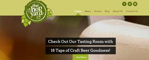
Here is a great animation example for The Hop Yard, a company that both grows hops and brews beer. It’s simple, sleek, and sports excellent animation in just the right amount.

4. Use Color
Dependent upon you product or service, you will want to have a color scheme that “fits” your company. The website of a mortuary, for example, should use more muted tones.
A site selling beachwear might choose a far different palette. The ability to use color to enhance a web environment as well as the improved technology in getting clear, crisp colors of any palette, allow sites that are truly visually appealing.

5. Experiment Navigation and Menus
Traditional navigation menus are kind of boring, and more recently site designers are experimenting with different methods of presenting navigation.
One method is to hide the menu completely so that it does not detract from the composition of the home page, such as the following:

Here the menu is hidden in the upper left corner. Other designers are experimenting with making the menu the entire home page, with background images that create a stunning effect:

6. Dynamic Infographics
The brain processes visuals better than words, so when you have important content you want a visitor to remember put it in an infographic. These used to be really difficult to create but now there are tools that make the process fast and easy.
A really great infographic tool is KISSmetrics and here is an example of an infographic created using it:

7. Make Forms Pleasing & Fun
Most forms are formatted plainly and often too small. Be certain that your form fields are large and that your “submit” buttons are large.
More importantly you’ll want to have a “theme” as background for your form. You can get really inexpensive form themes at JotForm.com.
Some designers experiment with placing the form right on the home page of a site, the idea being that if one wants a visitor to provide his/her information then it’s best to ask for it up front. This design is actually quite nice and would not seem to irritate a visitor at all:

8. Background Patterns that Fit Your Climate
Every site has an environment or a climate – it depends upon the product or service.
The “climate” of a banking and investment site will be far more subdued that that of a site selling concert tickets or promoting bands. You need backgrounds and icons that match your climate, and you can find them and insert them easily with any number of pattern tools.
One app that has perhaps the largest selection of backgrounds and icons is Samurai Shizoo. The entire site is in German but you really won’t notice that much. You can still easily select the patterns you want.

The ethereal background “fits” with the saying on the page.
Many designers are now embedding looping video as a background, and the effects can be quite dramatic. But if you have critical information on a page, the video can be a huge distraction!
9. Add New Stuff To Your Site Often
Visitors like to see variety, without changing the basic navigational methods decide to change out your pictures, your background, etc. for a fresh look. One of the best tools for this is IM Creator.
It was originally created for individuals to create sites for friends and family but it has grown far more sophisticated. Here is an example of a site you can create with this app:

This home décor website can offer a picture of the day or week and keep visitors coming back to see what has been added.
10. Give Away Free Stuff
Nothing keeps someone coming back more than the opportunity to “cash in” on coupons or free stuff.
Whether you offer a coupon for 20% their next purchase or a free e-book with informative and educational content, people need to have a reason to visit you. And if you are going to have a sale and offer, certainly publish it all over social media. But make them come to your site to retrieve the coupon.
New design tricks are being developed every year, and the great thing about the web is that those new ideas spread quickly. If you keep your ear to the ground you will learn these new tricks in a pragmatic manner. You don’t have to be the innovator; you just have to be the one who picks up good ideas when you see them!


Leave a Reply