
While sifting through websites of popular companies I happened upon Pepsi. Their layout is somewhat strange and initially caught my eye in an uncanny manner.
Most large corporate websites offer a direct connection to recent news, corporate info, products, marketing tools, or similar features.
But the Pepsi Co homepage feels shuffled up and almost chaotic. It’s a rather daring approach from such a large soft drink vendor and I’d like to explore their website to see if it can match up with such a big name corporation.
Block-Level Grid Layout
The first thing you’ll notice is that the layout breaks down into a square grid. This behaves almost like a Masonry grid featuring squares & rectangles of varying widths connected together in a seamless pattern.
At first glance the design looks cacophonous. Lots of varying colors, shapes, and font sizes lead the eye all over the place. But when you actually focus on individual items you’ll find product advertisements, tweets, and photos shared on social media.
It seems Pepsi’s homepage is meant to be a connecting driver between consumers and the corporation itself. I’m not saying this is a good or bad thing – but it certainly deviates from the norm of large corporations.

When hovering over different areas you’ll spot tiny animation effects. These almost feel out-of-place but they match with the layout’s sense of discord.
I have to say that my immediate reaction is to leave the site. Pepsi does not make a good first impression with such a chaotic design style.
But if you stick around and try interacting with the content you may find yourself lost in the wall of Pepsi media & branding.
Fixed Side Navigation
Another thing that makes this layout unique is the aligned sidebar navigation. There are only a handful of links that each lead to larger flyout menus.

Everything is animated which in my opinion is a tad annoying. The animations are smooth and look great, but feel somewhat unnecessary. The site is already rather hectic and the delayed animations only draw out more discontent.
The strange thing is that all nav links seem to run with dynamically-generated text; that is to say all text seems graphical rather than textual. The navigation doesn’t follow many traditional rules for for web performance & semantics.
Also the real corporate links are only crammed into the bottom of the page. Not exactly the worst place, but still a rather confusing location if you’re digging for important corporate info like careers or contact details.

While Pepsi’s layout is unique and certainly eye-catching it does not deliver the most exhilarating experience. I’ve gotta give points for diversity – but on the topic of interface design, usability trumps diversity every time.
Fractured Content
It seems that most pages in the site break off and fracture from the home layout. The Pepsi Shop is found on its own domain, jobs/careers have their own page, and the Pepsi products just link out to Facebook.
The content structure feels fragmented with so many paths diverging from the original layout.
Delineation is a crucial part of good website navigation. If visitors don’t know how to delineate their actions, then they really don’t know how to do anything.
When people visit Pepsi’s website what are they trying to do? And does this layout actually help them get any of that done?
From my brief experience I’d have to say no, or at least not easily.
The odd design and customized navigation stands out on aesthetic principle but at the expense of clean, stable usability.
Risky or Rewarding Design?
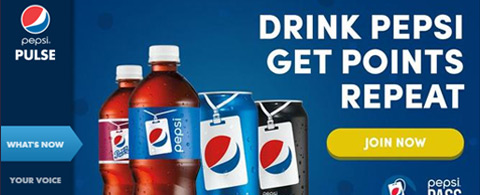
One thing Pepsi does right is the branding. Colors, imagery, and typography seem to match up in a way that clearly demonstrate it’s Pepsi’s website.
The problem is that almost everything else drives a sense of confusion whereby visitors are desperate to find some equanimity. This is never a good thing in any website design.
Interfaces should be immediately obvious – you look at them and just instinctively know what to do. Branding and colorful design aesthetics can only go so far. I’m not sure this design actually harms Pepsi’s image, but I can’t say it helps a lot either.
All-in-all I give credit to Pepsi for daring to style their layout in such a bold way. However from a practical standpoint it’s really not the best option and certainly doesn’t lead me to investigate the site any further than a morsel of the second.
If there’s anything to learn from Pepsi’s website it’s that user experience should always come first.


This brand never disappoints. The actual customer engagement you’d know, if you look at such sites. The simple navigation bar can make a huge difference. I think this is the great learning for others who are struggling with customer engagement and CRO.
Onestop Realestate, voted India’s Best Real Estate Portal, offers innovative and user friendly property advertising services This offers people looking to buy or rent a property an unmatched perspective of the desired property
Simple and great design from a brand like Pepsi. Solid navigation and color combination.