
Whether you’re a curious new designer or an experienced professional the subject of vertical navigation is an exquisite talking point. It seems like the very idea of vertical page elements would break a cardinal rule in the field of web design. Yet searching through Google I often find plenty of clean, usable layouts that incorporate vertical menus. Lengthy navigation doesn’t work on every website but when it does work, it can be a blessing in disguise.
I’ve put together a slew of tips and example websites featuring upright vertical navigation menus. Each one should prove to be an inspiration for anyone who’s hoping to design their own vertical menu. This is certainly a difficult task and similar to the design process itself, one mistake can screw up the whole layout. Take these suggestions with a grain of salt and look beyond the examples to see how you can apply vertical website navigation menus into your own web projects.
Single-Page Layouts
Each website project should be created with a navigation catering to the content. Single page layouts are often the most flexible because they don’t always require a laundry list of links. Content sections may be linked from the navigation but the site won’t require large dropdown menus or sliding link panels.

The portfolio site of Jorge Rigabert is an excellent example. The site is split into colorful sections which incorporate different pieces of information. While scrolling down the page a left-hand navigation column scrolls along with you.
Sadly I’m unable to read Spanish, but the link text itself stands out as bold and colorful. The hover & selected link effects are also striking as you maneuver throughout the page. Vertical navigation doesn’t always need to be flashy – but it certainly doesn’t hurt to incorporate a little excitement into your design.

Silly Poems is another great example which uses a more creative design style. Both the vertical navigation and parallax background elements scroll along with the viewer. I also particularly enjoy the many graphics scattered throughout the page. Although it’s a great design, I will admit the navigation menu isn’t really needed on larger browsers since the site itself is so compact.
Single Column Menus
Not every website can work as a single-page layout. Thankfully there are lots of alternative ways to structure a vertical navigation. Sometimes a designer will still choose to fix the menu to scroll alongside the user. It’s a popular choice and you’ll find this effect used just as frequently with horizontal navigation, too.
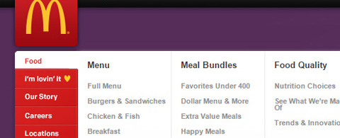
But in many cases the vertical nav is simply placed at the top of the page and blends into the header. Take for example the McDonald’s homepage which uses a red vertical navigation matching the company logo.
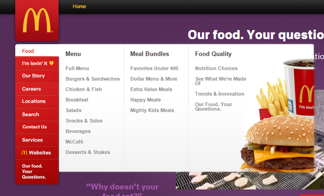
When hovering over each menu link a flyout bubble appears off to the side. This isn’t something you’ll find in every vertical navigation because there’s usually more than enough room for links. But the flyout menu is still just as valuable as any horizontal dropdown menu and behaves in the same fashion.

You’ll find another great example on Power to the Poster which is a poster retail website. This layout is centered in the browser window and has a much more condensed page header. All of the menu links seem to blend right into the background and work nicely alongside the logo design.
Both McDonald’s and Power to the Poster utilize contrast for navigation link hover effects. Text is easy readable and stands out among the assortment of similar links. Keep this in mind while designing your own vertical navigation style. Although you can perfectly nail the positioning and composition, a small update in the color scheme can dramatically affect the entire layout.
Small & Simple
With vertical navigation you really need to condense information into a smaller section of the page. This often ties into resizing fonts and potentially removing certain elements from the page. Remember to keep it all simple and easily identifiable – turn this into your vertical design mantra.
Personally I enjoy the navigation style of Web Designer Wall. The site uses very small icons accompanied by flamboyant text links which stand out on a beige-pink webpage. On larger screens the “blog” link actually has a flyout menu which displays the most popular categories and tags. This effect works beautifully on a vertical menu because of its size and relative position to the content.

If you’re going this route then be sure to keep everything as simple and refined as possible. Small basic links perform a lot better than lengthy, descriptive text. Give visitors enough information to draw a conclusion on each page link – but don’t stuff them full of extra gobbledygook.

The homepage for Parachute Clothing uses a similar vertical navigation with icons and pithy link descriptions. The menu itself only uses about 4-5 links and each one includes a small icon beside the text. I feel it not only helps me recognize the navigation, but it helps to break up the page by adding space into the composition.
Sliding Drawer Navigation
The buzzword “responsive” has become just as pervasive as “synergy” and “thinking outside the box”. But unlike those last two examples, responsive design is actually still quite fresh. People are getting more comfortable browsing on mobile devices and this leads to a world of compact tiny screens rendering expandable HTML/CSS websites.
To go along with vertical menu styles I want to point out the value of sliding drawer navigation. Many people loathe this interface style as a bad choice for user experience. Granted this all comes down to opinion but I think sliding menus come in handy when used scarcely and appropriately.

Kick Point is a digital marketing agency which uses the three-bar hamburger sliding drawer menu on their website. This sliding nav is actually visible at all resolutions so it’s not just reserved for smartphone browsers. When opening the menu it stays fixed and scrolls with the user much like other examples in this post.
But it does work a little differently in that each link loads onto its own page. So even websites that use a lot of page content would still run perfectly fine on the sliding drawer navigation scheme. The sliding menu always opens at the same width & height so it’s easily accessible regardless of screen size.

Another very similar example can be found on Bad Assembly. What’s most interesting about this layout is how it incorporates both vertical and horizontal motion. Users with a mouse or touchscreen can swipe between content like any typical parallax website. And the content animates a sliding motion which takes up the entirety of the screen.
For a website like this it makes sense to utilize the hidden sliding drawer effect. Everything on the page loads quickly and feels snappy regardless of Internet browser or device.
Plus the contrast between links and page text is phenomenal – easy to see even on a dimly-lit screen. If you’re attempting to build a vertical sliding navigation I think Bad Assembly is an excellent site to check out. Even if you don’t want to build the same parallax animated functionality, the design itself is wondrous and behaves much like any typical user would expect.
Each of these examples should prove that vertical navigation can work great when designed properly. Not every website can benefit from such a vertically-dominant layout. However I’ve found plenty of vertical designs that truly capture my attention and bring me further into the content. Dare yourself to apply some of these techniques in future projects and don’t be afraid to play around with vertical navigation in your own design work.


This is an awesome share, Vertical menu’s are really trending now especially with the audience I work with. Thanks for the share!