
Almost all mobile app developers have a website that describes what their app can do. Some of these websites are beautiful and unique. While some websites use photography as a background, others use typography, color gradients or even video backgrounds to leave their visitors speechless.
Do you need some inspiration for your landing pages? I’ve collected 19 of the best-designed app landing pages that keep readers craving more.
01. Saurochat

Saurochat kept their design simple yet complex through their color-changing gradient and the rounded shape of the overlay. We also like the font that they chose and the word placement.
02. Primer

Primer not only surprised us with their color-changing gradient, but also with their inter-changing objects in the background. We also think that the shadow positioned behind the phone mock-up was very well placed and quite genius, giving it that 3D look.
03. Square

Square‘s page has clearly organized headlines, which kind of read as answers to frequently asked questions. There is plenty of white space (giving it a clean, simple, and modern appeal), succinct text, and matching, relevant images.
04. Coin

Coin displays its product’s positioning and differentiation through a visual journey of the Coin card. Just check out that fun animation — what a great way to represent how a product works.
05. Moovrs
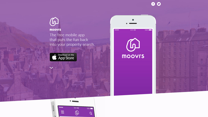
Moovrs show us their predominant color through the wallpaper color overlay and in the background of the phone mock-up. We also like that the image is a cut-off rectangle because that gives it it’s unique style.
06. Facebook Messenger

Messenger includes a laptop view of the app in the background, making it clear that Messenger is a cross-platform app that can be used anywhere.
07. Vee for Video

Vee for Video shows off with their beautiful and colorful geometric background. They have rounded icons and some color overlay photos, but for the most part, they kept the geometric aspect.
08.Seattle Cider

Seattle Cider has a really cool, interactive display that tells the story of how cider is made from start to finish, while users scroll down. It’s a surprising and delightful user experience that goes above and beyond the typical product page. It doesn’t just display the products, it shows where they came from, and how.
09.NeuBible

NeuBible has all of their bases covered: a striking hero shot, clear messaging, and a prominent download button. Combined with a gorgeously designed app, these three features may help NeuBible convert the masses.
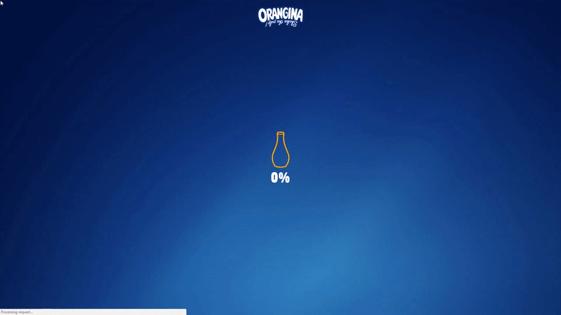
10.Orangina

Orangina has animated images and bold colors that fit in perfectly with Orangina‘s bold, fun personality.
11.Qapital

Qapital is notable in the fact that it takes a visual approach to a market that is usually appealed by practical messaging and conservative imagery. Large images dominate the splash page to reflect the app’s interface. Qapital does an excellent job of making finance feel exciting: a very tall task.
12.Mango

Mango’s website exudes friendly, approachable, and helpful brand personality. The video couldn’t be more delightful. I mean, a guitar-playing mango in a top hat? Yes, please.
13.Rizon

Rizon displays a clean design and clear messaging. In a nice touch, Rizon’s logo mirrors the app’s main screen, which lets the user know what hour the best photos are taken (“The Golden Hour”). Visitors are prompted to sign up through a centrally located button and a straightforward preview of the application.
14.FiftyThree

FiftyThree surprises us with their simplistic design. It is so smooth and easy to understand just exactly what they do. We also like the clear fonts that were used.
15.Bellroy
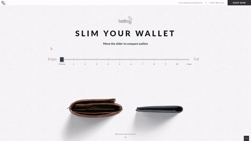
Bellroy presents an interactive section that shows how the skinny wallet will fill up in comparison to a different wallet. As users move a slider back and forth along a line, both of the wallets fill up with cards and cash, visually displaying the very problem Bellroy’s skinny wallet solves.
16.Mylo

Mylo has done the best job this year, implementing an auto-play feature along with a narrator (defaulted to mute), which clearly details the app’s value.
17.TriplAgent

TriplAgent comes with a color gradient background. We like the design of the city guides. They are simple, striaght and to the point, and with a clean font, we give a thumbs up to them.
18.Oreo
Oreo also took a unique design to this page. Even though the cookies themselves are monochrome, the page is wonderfully colorful. From the videos, to the backgrounds, and to the graphics, we love all of their color choices.
19.Panik

Panik staggers us with a dark background and an iPhone that displays how their app works. They also put their included features. The logo looks pretty nice with a on button instead of just the letter I.
And that concludes our 19 favorite app landing pages. Did we miss something? Leave us a comment with your favorite landing pages below.


A lot of these aren’t apps… What the heck..?
a lot of these a simplistic and not that ground breaking nor interesting