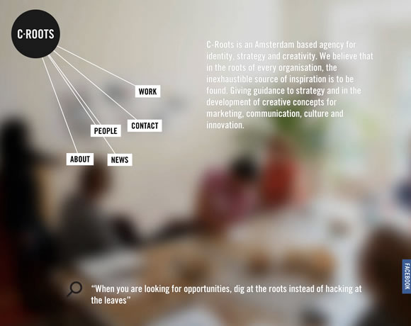
White is certainly an elegant color, and when properly used in web design, it can deliver really beautiful results, as the ones we will see here today. Using the right amount of white in a website creates a clean and elegant design, and it makes things easy and pleasant on our eyes, helping the viewer like what they see. From white space to white type against dark backgrounds, images and several other “white uses”, we’ve gathered here some inspiring examples of how to incorporate white in your designs for an elegant result.
Inspiration  Gisele MullerMay 13, 201310 Comments03.9k
21 Beautiful Examples of Using White in Web Design
Share
Gisele Muller
Gisele Muller loves communication, technology, web, design, movies, gastronomy and creativity. Web writer, portuguese/english translator and co founder of @refilmagem & @mentaway Twitter: @gismullr


Great examples, thanks.
White can be very a difficult to colour to use: get it right, and it’s wonderfully clean, bright and minimalist. Get it wrong, and the whole website looks cheap and amateurish.
You have some really fantastic examples here.
Lss is definitely more!
Hi Gisele. Fantastic gallery of websites you’ve just showcased. I do like how they incorporated the colour white to create a stunning design. For me, white, black and grey always stand out. But clever use of pastel colours where appropriate is equally stunning.
This is a nice list. I like KOA Water. Thanks Gisele. 🙂
This is an great example of using white space on a billboard design. The Louis C.K. HBO special is the ONLY ad I actually remember from walking around Times Square last month! http://wp.me/P39oPN-xk
Nice collection, hard to use white sometime, without making it feel empty !
We also design logo and website at http://les-internets.fr !
Feel free to have a look 🙂
Excellent post and very nice collection of web design in white. Thanks for sharing
Thanks for the examples! White is a very versatile color because it looks clean, professional, and natural depending on how you implement it. It’s really just up to the creativity of the web designers.
Nice…great post!
ada blackjack shop looks good! thanks!