
A couple of weeks ago I wrote an article about 9 graphic design trend designers need to be aware of and it was very successful. People and designers for that matter, like to stay abreast with the latest news and trends from the graphic design world. This is why I decided to take a look back at the trends that were popular in 2016 or before and are still really popular this year.
As we also mentioned in the previous post, some of the trends are just for print design, some are just for web design, and some are applicable to both areas. Some of them are new; others you’ve already seen gaining or becoming popular in the previous years. And for sure, their popularity will increase this year.
1.Hand drawn graphics and icons
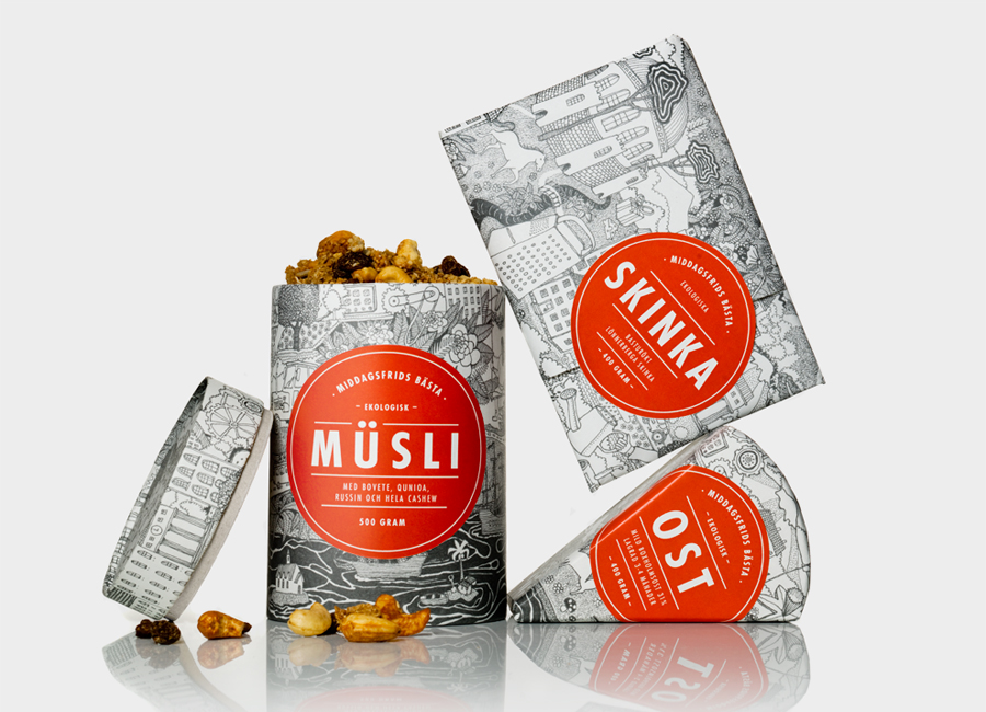
As we also said, 2016 is the year in which we are witnessing a growing desire for authenticity and simplicity. This need and desire for more authentic imagery also influence graphics and icons. Illustrated (or hand-drawing) images are great for adding a personal or fun element into the graphic design or content work. We have seen brands embracing this trend heartily, as they look to differentiate from the competition. Maybe for many, this trend seems simple or unprofessional, but it tends to evoke a kind of childish and nostalgic feeling, helping the brands to stand out.
Like many of the trends in 2016, this is a push back on the clean and almost clinical nature of design in recent years. For example, Dropbox has adopted the use of hand-drawn illustrations in everything they do. It has become part of their brand now and is easily recognizable.

Plus, by adopting hand-drawing designs for their visual designs, they appeal to the child in all of us, and makes the product seem more accessible. This is especially helpful if you are a large tech company like Dropbox.
Illustrated images can be used in a huge range of situations, but are becoming increasingly popular as a way of explaining and illustrating more complex problems or instructions. 2016 will likely find itself littered with these types of design as their ‘sketching’, ‘independent’ quality becomes more and more popular amongst consumers.
Another great example of hand-drawn icon comes f rom Casper, a mattress company. They use illustrations on almost all of their landing pages.
MailChimp also got into the spirit and used hand-drawn illustrations in their 2016 annual report!

Their examples were also followed by other companies, which have adopted hand-drawn illustration into their visual design.
2. Use of negative space
Negative space is, quite simply, the space that surrounds an object in an image. Just as important as that object itself, negative space helps to define the boundaries of positive space and brings balance to a visual design.
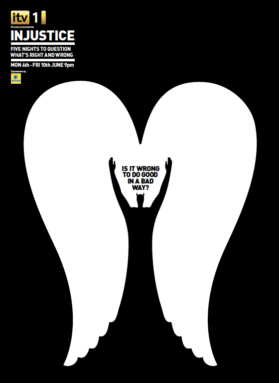
Used strategically, negative space can be a clever way to add deeper or double meaning to your designs, particularly for logo and branding projects. Or it can simply help give your composition a more minimal look. This is an older trend, but in the past few years we have seen it come up again. More and more these days, we are seeing an emergence of artists creating positive spaces and shapes that, in turn, cleverly carve out shapes in negative space intentionally. And the results can be stunning.
 And of course, there is the famous spartan golf club logo.
![]()
3. Creative use of neutral space and grid
In previous years, graphic design had been adapted to organized columns and grids, but in 2016 we saw a considerable shift towards irregular layers and ultra-modern design. This trend influences especially the web design, but we will see it also in print design.


4. Custom graphics and illustrations
Even if using stock photos is still pretty popular, the usage of the custom imagery and illustrations is the new trend we have seen growing significantly in the last years because it brings more personality than traditional photography.

This is one of the best ways for adding a visual appeal to any design and for creating unique visuals for any brand. Custom graphics and illustrations create a visual language that really captures the tone of voice and personality of a brand or product. Visual language also clarifies messaging by boiling down concepts into easily understood visuals.

As brands continue to embrace design thinking and other design-centric approaches, this tactic of making imagery more personalized and relatable should continue to rise.
5. Semi-flat design
After Windows launched its Metro style, the flat design has inundated the design world, mainly because of its evolution from a minimalist style that suits the new developing technologies. But now, because of the Google’s Material Design, it becomes more dimensional. Google Material Design takes all the things we’ve loved about flat design and adds to it light and shadow effects, giving us a slightly more realistic and dynamic feel.

In this way, by integrating depth and dimension through the usage of subtle shadows, cards, and well-thought out transitions, semi-flat design has become a much better design alternative due to its ease of usability. Furthermore, semi-flat makes people embrace that “less is more”, is less heavy and makes pages load much faster.
It appears to alleviate all of the problems caused by flat design and we expect to see much more of it in 2017.

6. Asymmetry
A super hot trend in graphic and even web design is creating asymmetric layouts. While striving to create original designs nowadays, designers have been breaking the rules of symmetry more often than ever and the results are fascinating. In this kind of compositions, if you draw an invisible line in the middle, dividing the composition into two even parts, you’ll see the graphic design elements are not exactly balanced on both sides of the design.
Breaking the rules of symmetry certainly sounds exciting and cutting edge. Here are a few examples that illustrate this trend:


7. Visual Storytelling
Storytelling is not a new concept. We have been surrounded by stories for our entire life. They help us making sense of the world around us. And the business storytelling in not an innovative concept either. In a way, the advertisers had been using it for decades to present products and services, brands or companies. But in the last years, we have started to see this concept also in graphic design. Designers are giving users rich, unique experiences through the use of visual storytelling because visual content always works better than a simple piece of text – it makes your story more attractive and alive.
We absolutely love Peugeot’s Hybrid Graphic novel. The site does a beautiful job of entertaining users with a scrollable interactive graphic novel while also allowing them to learn about Peugeot’s HYbrid4 technology. We highly recommend you to visit this site if you haven’t already. It’s a blast to scroll through and it serves as great inspiration for interactive web storytelling that makes learning fun.

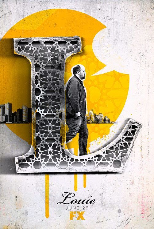
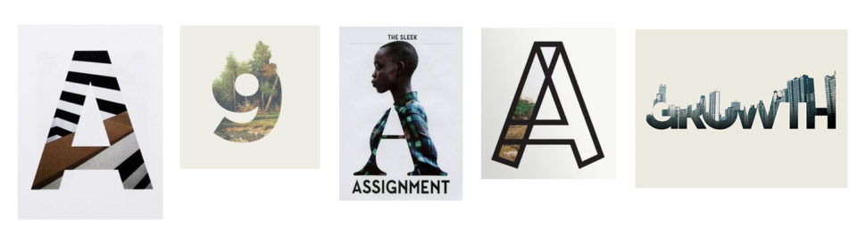
8. Typography and Font Combos
Combining not only fonts of different families, but also fonts with images in quite creative manners, typography is a trend that has firmly taken its place in top design trends for 2016.
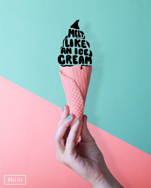
From designs whose, most prominent element is a letter to designs which depict images wrapped in texts and vice versa, this tendency of playing with texts is not fading away. On the contrary, it will gain even more popularity since it gives designers the opportunity to unleash their imagination to the highest extent.


We can see this trend also for logo design. The mix of images with typography work really well together and it creates a contrast between them.
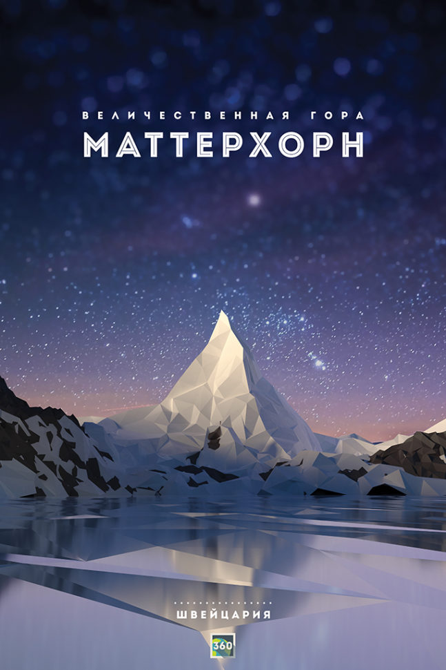
9. Low-Poly Designs
This trend inspired by game graphic designs has been making waves in vector illustration for quite a while, but we’ve seen a breackthrough in 2016 when more and more designers and game deveopers started adopting this style.. Complete layouts, such as posters, flyers and stationery design will bring together beautifully detailed low-poly illustrations with logos and typography influenced by the game-inspired trend.

The trend alone certainly looks cutting edge since it comes in geometric shapes and color game which gives the feeling of a 3D composition. To take it to the next level, designers have been combining it with other graphic design trends such as bright colors and asymmetry, which makes it even more alluring.

Have we missed something? Let us know in the comments bellow and we’ll write about it.


I’m impressed and inspired by the tips you’ve given. I’m going to start working on my website right now! Lol 🙂
Inspiring makes a lot of sense, and very practical.