
The seemingly endless amount of navigation styles can be overwhelming. Some websites only require 3-6 links and have much more flexibility than sites with 30+ links. How do you plan large detailed navigation menus without losing your hair?
Mega navigation menus are the typical solution to high-capacity link websites. These come in all shapes & sizes for varying projects from international corporations to online magazines.
Each of the following patterns have been hand-picked to match up with live examples online. If you’re designing a mega nav dropdown then you have to check out this article. I’ll cover tips regarding how to design a successful menu that’s both functional and stylish. By the end of this post your head will be jam packed with new ideas and healthy in-tact hair follicles.
Matching Styles & Animations
CSS3 animation has been a game changer for web designers. Everything from simple page elements to SVGs can be animated on command.
Typical dropdown menus have relied on JavaScript for years. CSS3 is one of the newer methods that has also been applied to mega dropdown menus. The pattern you’re looking for is consistency with animation and design style.

Take Mashable which is one of the largest social media magazines online. When first hovering onto one of the links a brief delay passes before a dropdown flows on-screen. As you transition between different links you’ll find that new content populates the same box.
Mashable’s layout is completely responsive so the menu is built to take up 100% of the screen. It may not be the classiest example but consistency supersedes fanciness in the realm of UI design.
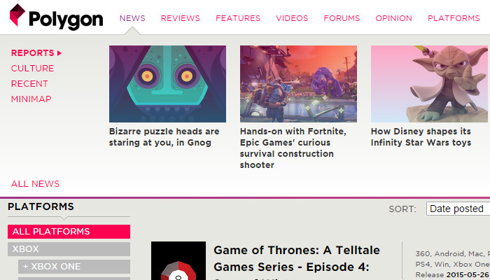
Another great online magazine is Polygon which features very similar animations. Their navigation also takes up 100% of the screen while switching between different content styles.
Visitors expect some consistency with colors, spacing, and typography. It’s a good idea to maintain this consistency with your animations, too.
Multi-Level Flyouts
Really large dropdown menus need to include tiered navigation. This occurs when you have links that include sub-links and need to reserve enough space in the menu to show them when appropriate.
One of the simplest examples can be found on TutsPlus when you hover the “Free Tutorials” link. Each tutorial category includes many sub-categories that fly out depending which link is active.

Background colors also match and feel rather apropos in this layout. Simplicity really does work to your advantage when used correctly.
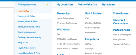
A much more detailed example is the Walmart dropdown navigation. The company offers so many products that each department needs to include a flyout menu. This menu in turn contains a few sub-categories with sample products.

The design itself is fantastic and works in unison with Walmart’s branding. Links are small but not too small, hover effects fit into the menu, and everything just looks like it’s in the right place.
When designing a multi-level nav your concern is always going to be screen space. You never know the end user’s exact resolution and it takes work to design menus that run at all sizes. But take these examples as guides that simplicity can go a long way.
Dropdown Icons
Visual cues are a huge aspect of user experience design. Certain glyphs and symbols are instantly recognizable and imply a specific action.
For example, almost everyone recognizes a printer icon and tacitly understands how it works. The same can be said for dropdown menu icons that represent hidden flyout menus.

Take a look at the demo for NanoMag on ThemeForest. It uses a horizontal navigation with downward-pointing arrows after each link. These arrows imply that something will happen underneath the link – and sure enough, when you hover a menu pops out.
You should also notice that a few links do not have arrows. When you hover these links they behave just like regular links without a meganav menu. Dropdown icons visually define which links are meant to behave differently than others.
Click-to-Show Toggles
Some developers prefer to change up their interface design with more forced interaction. Microsoft’s homepage uses dropdown mega nav menus for their top navigation bar.
But to access the secondary links you have to actually click on the primary link. Useful feature or annoying misstep?

I personally don’t like this design because it feels like a prank. The main links should go to individual pages, but they only show secondary menus. To get to a page you need to click twice.
Playing devil’s advocate the links do have icons explaining that they’re meant for dropdowns. I just would’ve expected a cleaner experience from Microsoft’s corporate website.
If you like the click-to-show feature it’s certainly a viable option for mega nav design. But it seems to work a lot better on mobile screens where there’s no such thing as “hovering” a link.
Varied Dropdown Menus Layout
Dynamic navigation menus can include lots of different media like thumbnails, grids, and block-level link lists. These varied displays look great but may not be appropriate for all styles of content.
A useful trick is to vary your mega navigation menus based on content. So one menu could include thumbnail photos with links to articles, and another menu includes nothing but text links. This is mostly useful on a website that has large volumes of content marketed for different purposes.

The Food Network website has a beautiful mega menu tied onto each primary link in the navigation. But each dropdown menu is slightly different with a unique structure of links, thumbnails, and list styles.
Food Network is a large brand so it’s understandable to see this technique on their website. It’s a great example to demonstrate how content can be organized in a way to capitalize on clicks(for example hover the “videos” link).

A simpler example can be found on Best Infographics which uses a mixed bag of design patterns. Some dropdown menus are just regular dropdowns – no mega navigation, just simple text. But other dropdowns are fullsize horizontal mega menus with thumbnails and everything.
This is a great design pattern for websites that have varying styles of content. It’s easy to implement but requires a lot of grunt work in CSS. If you have the patience to try this design style you may be surprised how well it works on larger websites.
Wrap-Up
In truth there isn’t a lot to master regarding mega navigation design. These trends mostly fall into basic UX components wrapped up in pretty interfaces with a red bow. If you understand user experience and study from these examples then you can build top notch meganav dropdowns with ease.

conclusion is good thanx “In truth there isn’t a lot to master regarding mega navigation design. These trends mostly fall into basic UX components wrapped up in pretty interfaces with a red bow. If you understand user experience and study from these examples then you can build top notch meganav dropdowns with ease.”
The first and foremost issue with mega-navigation is “mega”.
Thinking for web designing is very hard for any person. When i see this post i have new and better idea’s for Menu creation. In Dropdown Menu, Toggles are mostly use for mega navigation design. Thanks for help and share this post.