Minimalism is the design concept where you build interfaces using only the most important elements. These websites often come out looking very clean and intuitive for users. The style has been adopted in many different fashions and today influences much of the modern web.
I want to share a few design tips towards building minimalist user interfaces. A cluttered web design harbors resentment in the eyes of many visitors. Too much information overload and you’ll send people running away! But with just the right balance you can put together exceptional user interfaces which are easy to build and even easier to use.
Plan for Necessity
When designing a mockup for a web layout be sure to plan each element in advance. Make sure your website is utilizing each bit of space with important details. A clean interface will happily leave extra open white space if this is beneficial to the overall experience.
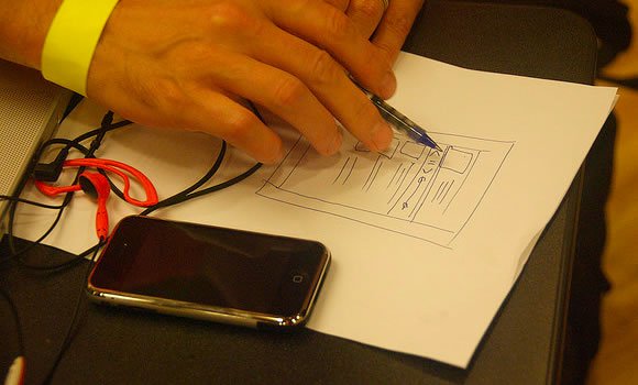
I suggest making a sketch first of all the components your website should contain. Ask yourself if each area is really vital to the overall design. Do you need a sidebar section on the homepage? Does this contain important links every visitor will need to access? There is no right or wrong answer as it varies between project.
But you should have a keen internal sense of what feels right and what feels wrong. When you can understand which page elements are necessary then it makes your job a whole lot easier. Each small page section should fit into the bigger picture like a puzzle piece.
Paint with Basic Colors
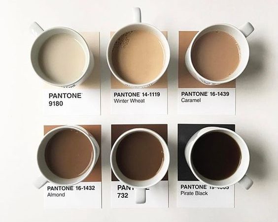
This isn’t a hard and fast rule to follow but it does help during the initial design phases. When you look over other similar clean web layouts you’ll notice many of them cater to a specific color scheme. Black, white, and grey are very commonly held together with 1 or 2 other primary colors.
When you can start designing or even wireframing on a simple color scheme it leaves more room to focus on content. There is always a chance later to change colors and append new styles. But focusing primarily on the clean interface will always bring out your most talented work.
Make Navigation Simple
Simplicity is another word I like to associate with clean design. Users on your website should feel like it has been baby-proofed for non-techies. All page text should be fairly large and easy to read from a great distance.
Even your navigation links should be very straightforward and easy to pick up just skimming the page. I lean towards using extra styles such as tabs, toolbars, dropdowns, and other fancy design methods. This can become one focal point on your page and it works brilliantly paired with a navigation scheme.
But alternatively you could employ minimalist ideas into website navigation. Links formed towards the top or bottom of the page naturally draw attention from wandering eyes. People are conditioned to expect a top and/or bottom navigation. Putting on any additional colors or textures is really just to please user aesthetics.
Clear Out Redundant Areas
You may find yourself looking over a design to pinpoint a few areas of duplicate content. In some situations like a sidebar or footer block this redundant setup is helpful. Users don’t always want to scroll towards the top just to access specific links.
But your page space is likely small and there isn’t room for so much content. Almost everything you are displaying should be unique, and oftentimes links to other web pages(blog posts, press releases, videos…). Filter out the redundant ideas and replace them with newer more useful ones. Your visitors will get much more out of the experience.
Match your Page Elements
Using the new CSS3 properties it’s so easy to create many of the difficult effects we all love. Box shadows and rounded corners are two of my favorites – but there are so many others to list. When you are styling default HTML elements like forms and buttons you should pay attention to consistency.
I like cleaner interfaces which keep the default styles in-tact. This isn’t to say I don’t enjoy a customized layout. However I find that between Windows/OSX/Linux there are many differences in browsers and rendering engines. Unless you can test your site everywhere the majority of your audience will appreciate a linear experience.
Plenty of options are available for web developers looking to customize these elements. Form input fields are a great example because it’s difficult getting a consistent design between text inputs, dropdowns, sliders, radio boxes, and textareas. Check out our article on streamlined CSS properties and how you can incorporate these into your design.
Conclusion
Hopefully these tips can get you thinking with a minimalists mindset. Designing a clean user interface is actually a lot more work than it appears to be. You have to put yourself in the user’s shoes and see your website from their eyes. It can take months of practice but the artistic direction is phenomenal. If you have similar ideas for designing clean minimalist websites let us know your thoughts in the post discussion area below.


A good post…Good words! Thanks for sharing!I agree all the points. The good way for create an excellent work!
Thanks. The colour scheme is very important- nothing screams “amateurish” than too many colours.
Another excellent post Jake. Thanks once again!
Colors are indeed very important in user interface. Colllor.com is a good example and a good tool to find them.
Yup fantastic thanks for sharing the link. I’ve always used Adobe Kuler but I bookmark these color resources to try out during later projects.
Jake! I always visit your because I know you have a great skills in web designing and now I found a new tips from you again.. Thank you Jake!
Yes thank you very much! I love writing for WDL because of the freedom in topic and discussion. And I love to educate and help out designers all around the world, so these compliments do mean a lot. cheers!
Jake,
I love your ideas. Every web designer should start with paper work.
You can change your ideas, mindset, voice of info and design any time.
Also possible to create a lot of version to check which one are clean,
perfect for your business.
Thanks for your great job!
Great article.
I really wish there was an easy option to print articles from webdesignledger.com.
Thanks for the post. Your tips were spot on and I will use your tips when deigning my next website.
Good points, and I agree about the white space. I feel like learning the essentials of interaction design is an important part of designing left out of most (young) designer’s education. Defining user goals and problems through context scenarios and personas avoid the cluttering that happens when you add unnecessary elements that very few users would need. Thus, leaving a minimalist design on a site that’s easy to use.
Cheers. (I can’t believe I just used the word “thus”).
Very helpful tips, thank you Jake!
I’m also a fan of minimalism primarily because it is very easy on the eyes. I also think that it affects better navigation, paving a way for convenience to visitors and readers.
A nice one Jake! User Interface should be smooth enough to impress a visitor. For those who are confused with the color theme of their website I would suggest to go for a simplistic color theme to reflect the professional attitude 🙂
Thanks for the info, it is a nice post. I think color combination, font, images are the main factors which make your website good or bad.