

In most cases, when we are creating a web design, we are moving towards a black and white trend. It seems that it is the simplest, most elegant, and the best way to give readability on the web. However, it’s not always like that. We must take into account, based on the general function of the web, each section and determine whether the introduction of backgrounds gives an original point to the project or not.
With a black/white design, it is very easy to introduce a color that is the one that accompanies the project and gives it a note of contrast. But, if we talk about a background, we have to take different factors into account so that they fit the project and become a point in favor for it. Mainly, we have to think about how the background will transition from one page to another.
It doesn’t matter what sort of website you’re designing, if you follow these few rules, you’re backgrounds will fit in just fine:
1. Define the importance of the font
Less is more!
If you are clear about the message, why use more than we need? The font has to help us to strengthen it, but never take away from it. The font has to compliment the message in a way that perfectly describes those thoughts that are dancing around in your head, but not so much that the users notice the font more than the message.
In fact, it should almost go unnoticed by users. It should be so perfectly thought out, that the users are receiving the your message, even if you aren’t telling it to them directly.

Maybe this is easier said than done, but the font should be heavily considered when talking about backgrounds and textures.
Make it big!
The font doesn’t necessarily have to go completely unnoticed with all of your projects. Some projects require a font that is noted and that makes sense of all the content. If this is your case, make it big, do not stay half-hearted. Make a statement if you have to.
2. Incorporate a trend
If you’re looking for the perfect background or texture, you might be looking for a while. The easiest way to make sure your textures and backgrounds respond well with the users is to incorporate a trend, especially if you’re in a pinch for time. Here are a few of the big trends of 2018 and 2019:
Gradients

This year we already knew that gradients would be fashionable, so it would be a good idea to use them. Also, since, large fonts are a trend, it can be a good option to incorporate them in the header on the background, for example.
Union of colors
If you think that the gradient is too much for you, you can also play with the combination of two colors. You can further this idea by using texts with different colors. As long as the colors don’t clash, you might have a great contrast on your hands.
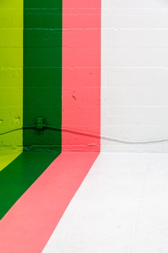
If we take different shades of the same color, we can create depth and visual interest. Use complementary colors to create contrast… As you can see, this idea is as big as the colors in the chromatic circle.
Hand drawn images
We’ll get more into using images in a second, but for now, just know that hand drawn art works well with many brands. Typically speaking, users see hand drawn or custom artwork on websites as a personal touch.
Combine these pieces of art with a nice contrasting background, and you might just be able to call yourself a trendsetter.
3. Use an image
The use of an image as a desktop background won’t go out of style anytime soon. You can use images in many different ways, covering the whole space, cutting out an object or person that you want to highlight, or with the introduction of gradients or elements of color.
It’s pretty clear that images help us tell our stories. After all, how boring is a page with no images? But, using the right image can mean the difference between a simple story that will be forgotten and a message being delivered.
Using abstract shapes and simple imagery can also help you a good bit. This sort of practice has sort of gone in and out of style over the past few years, but it’s always a good option for filling space.
The conclusion
Backgrounds and textures provide great insight into web design. Not only do these things take an otherwise bland space and transform it into a unique domain, they help us convey our messages.
With all that said, next time you want to change a background, or add a new one to a newly built website, give it a little extra thought. In the online space, anything that can help you stand out will help, and if that particular thing can help you grow and share your story, even better.


Leave a Reply