
The performance of your website is very important; a fast website have readers which sticks around, online seller which sells more and it’s a major criterion in SEO ranking. The website speed enhancement is not about a button to press and voila! It’s a bit more complex but main speed monitoring tools like Dareboost or GTMetrix agreed on the fact that the heavy resource to load are usually images.
Here’s a shortlist that you should keep in mind about image optimization when you’re building a website.
To begin with images
Adapt the image size to fit your content
Display image at its natural size, do not use HTML resize. A scaled image is an image that has been scaled to match its displayed size. It happens usually when you’re using handles to resize an image in a WYSIWYG editor.
Seems basic but it can generate a lot of impact regarding loading time. Experienced webdesigner knows this fact, but nothing could be less certain in the case of final clients that update content every day.

Image size and screen resolution
“Pixel dimensions measure the total number of pixels along an image’s width and height. Resolution is the fineness of detail in a bitmap image and is measured in pixels per inch (ppi). The more pixels per inch, the greater the resolution. Generally, an image with a higher resolution produces a better printed image quality.” Reference: https://helpx.adobe.com/photoshop/using/image-size-resolution.html
On a web display environment, the resolution has no effect on the image visual quality but it has on image weight. If you load two images, same size, let’s say 250px x 250px on a webpage @72dpi and @300dpi, the final screen display will be visually similar but not the weight. Higher resolution will be interesting only for the print or if you resize the image. For example, to print it on an A4 paper support.
Avoid loading massive image amount on the same page
Regarding image gallery or blog views, there’s also something you can do. Don’t load thousands of images on the same page, even little thumbnails. Consider using a progressive loading script, Facebook, Flickr and all social media are using it. A web page witch uses those scripts will defer the media loading until you scroll down and call the display of those media.

Image specifications and screen
Raster and vector images
A raster image is made of pixels; a vector image is made of basic geometric shapes.
Commons usage of vector images on the web is for:
– Logo design
– Icons
So a raster image will be dependent on resolution, if you to enlarge or reduce a raster image, you’ll shrink pixels. Vector images do retain appearance regardless of size.
Types of compression algorithms: lossy and lossless
This is also something you can find in the recommendation of Google and in speed testing tools. There’s several scripts to do image compression on the web. We can distinguish:
- Lossy compression
- Lossless compression
Lossless and Lossy image compression terms determine, in a file compression, if all original data can be recovered when the file is uncompressed. With lossless compression, all of the information can be completely restored after uncompressing. With a Lossy compression some data can be lost because, for example, on a .png image, quantization of color reduces the color number.
OK, but why would I take the risk to make Lossy compression, even if I can save a lot of loading time?

Lossy and lossless choice
The point is that the image Lossy compression is far effective than the Lossless one, especially for a web usage. Check the landscape images bellow before and after a Lossy compression. Quality is similar and images weight goes from 254KB to 39KB. At the opposite, a Lossless compression goes from 254KB to 180KB. For a final usage of an image, Lossy compression seems really better.


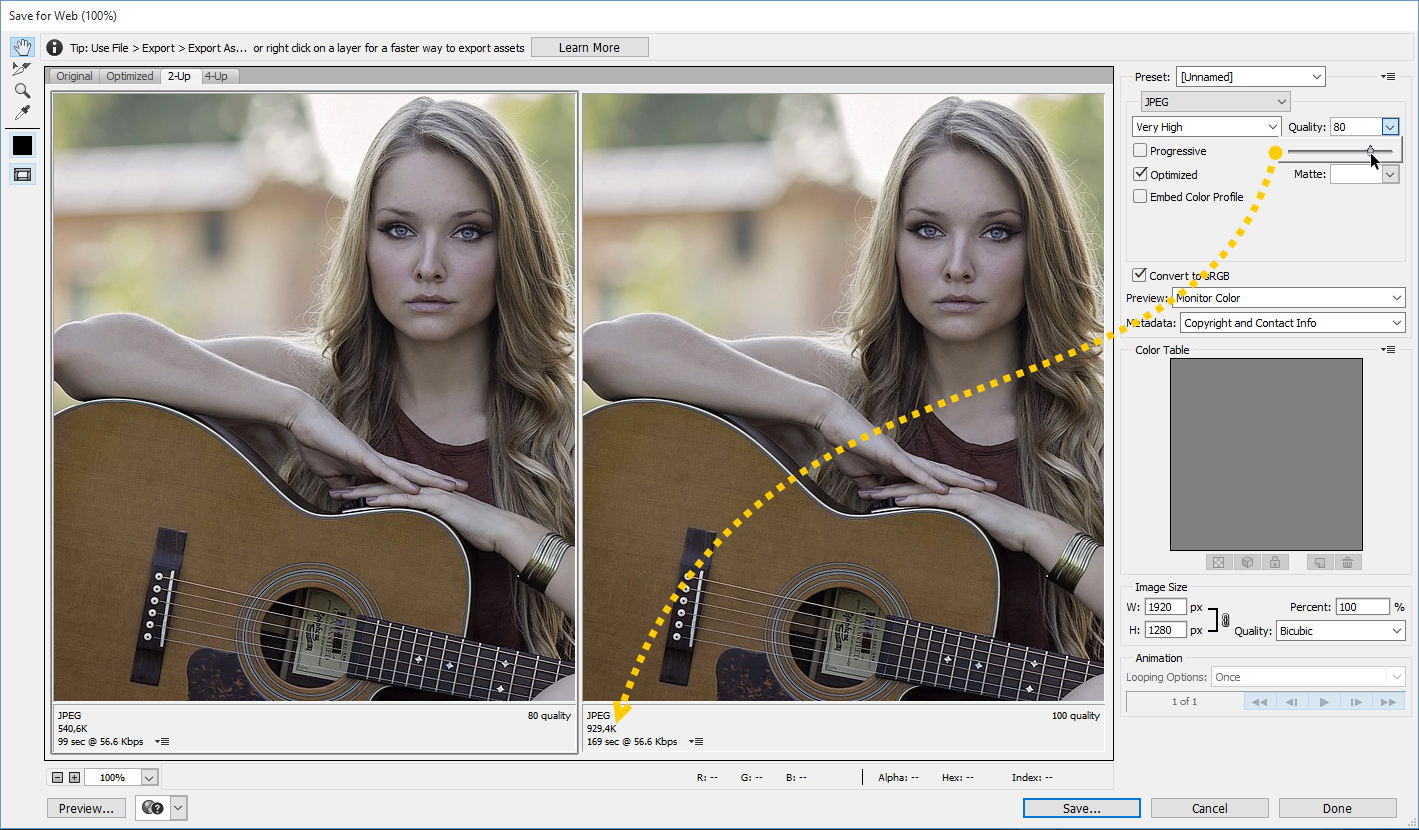
Cropping and resizing images in Photoshop
When you’re building a website from a Photoshop design, one big part of your job is to find the best format and compression to apply on images. Finding the best export ratio between weight and quality is the key. As Photoshop is applying a global compression on all the image area, it’s quite complex to have both light and high quality images.

Considering 30 images per page creation that includes the content and theme design images, how much time do you spend on image export? The process is quite long and include several tries at compression levels.
Considering that, you can use a tool to compress final image during the creation process or let a CMS extension doing the job automatically.
Image compression tools
There’s some image compression services on the market.
– ImageRecycle is offering the largest range of CMS integrations (WordPress, Joomla, Shopify, Magento) and both Lossy and Lossless image compression + resizing. The compression tool can also be used on a custom project using an API. ImageRecycle got unique features comparing to competitors like PDF compression, website audit report, 1-month image backup/restore: https://www.imagerecycle.com
A free trial of 100MB of content optimization is available, then prices start from $7 for 1GB of content with unlimited and free sub accounts.
– Kraken provides a WordPress plugin and an API to compresses images + make resizing. A free trial of 50MB of content optimization is available.
– TinyPNG: provides an API plus a WordPress and Magento plugin.
ImageRecycle online optimizer preview
To compress you images/PDF you can drag’n drop content in the uploader or use the URL of the page and get a zip file of all the images.

PDF report
Paste your website URL, get a PDF report in your mailbox with the detail of the images that can be compressed, pretty useful for clients.

In conclusion
Images usually represent 50-70% of your website content, then the first time a page is loaded is mainly determined by the image weight. This is even more important on mobile because connection is usually slower.
Keep a nice looking and fast website, optimize images!


Two 250px by 250px images will have the same weight no matter the DPI setting. Two 2 inch by 2 inch images will indeed have different weights.
Unfortunately, none of this matters because things are in reverse as far as images go. We should be saving images smaller for mobile devices than for desktop devices. However, that is not the case. Images for mobile devices need to be made larger because of the higher resolution screens, thus negating any benefits of compressing or optimizing them.
I recommend ImageOptim for Mac
JpegMini is the best program I have found for optimizing Jpeg images. It’s free up to 20 images per day and $20 for unlimited license… Totally worth it!
Interesting post. Images on a website are a necessity however over utilization will impact website performance in a long way. Foremost task is to identify amount of necessary images, try to avoid using them at every place. Next is to ensure that images are responsive so they can fit any given size of screen. Compress and crop the image considering the real essence of Image is not lost. If your website is developed using any of the enterprise web content management services like WordPress, Drupal or Sitefinity CMS, there will be number of tools available to handle the requirements. Considering example of WordPress as being the most popular, the latest version automatically converts every onsite image to responsive image, whereas WP Smush can be a good tool to compress those images. For websites with lots of images, use CDN for optimal results.