
If content is king, then design is the castle. Good web design for businesses not only has the content to peak audience interest for whatever product or service you’re selling, but also has an intuitive UI to encourage sales. Lots of designers think they have brilliant ideas for designing UI, but without real world user experience telling you what your audience needs, how can you know if your design is the best?
Below are a few questions you should be asking yourself as you design websites for businesses. All examples were analyzed with Ptengine using their Heatmap feature—a feature that makes it very easy for designers to understand how users are interpreting your site.
1. Is a huge banner really an effective way to sell a product?
Once you have a huge banner on your page—this means the part of the page that’s above the fold will already be mostly filled—you must have a really good design in order to have your audience click through below the fold. Here are Heatmap screenshots of one of the biggest sports shoe vendor’s product page. We instantly see that there are very few clicks on the banner. If we go deeper by using the Page Analysis, we notice on the first fold only 10% of the clicks are actually on the banner. It is obvious the purpose of the banner design was to promote the featured shoes to the audiences, but instead the audience chose to click through to the main navigation to browse through the shoes they liked.


2. What contents should you put into the most prominent space?
Many designers are instructed in what content should be placed where on the site; however, you need to find out whether or not the placement will work for your audience. Here are two live cases showing some good content with bad placement.
Several appealing dessert recipes are located at almost the bottom of this homepage, where only 37% of visitors view. Looking at the click heatmap, we can see where a ton of users have clicked on these recipes, but not all visitors will even see this option. Designers should feature killer content in more prominent spaces, shouldn’t they?


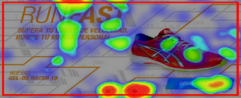
The same thing also happens on the shoe vendor site. With so many types of shoes listed on one long page, you need to figure out to what shoes your visitors are most drawn. Only 20% of the site visitors came that far down the page, but the click through rate is so high that the shoes must seem very attractive to them.


3. Should you always link images?
On websites, images will always perform better than text, but your design shouldn’t be a failure in directing the audience to the right place if links are not added to a meaningful image.
Here’s the first example of a landing page. Looking at the click heatmap analysis, we see some clicks were on the images. We understand the audience wants to take a closer look at what the website is offering. Users are expecting the image to be clickable and to direct them to more information.

The second case here is a help center page for cellphone devices. Notice in the phone number area where there were some clicks, but it was just plain text. Users were expecting to be able to click this number and make a call. Don’t want to lose direct engagement with your target customers? You’d better improve the design.

4. Is my button design good enough to be clicked on?
Look at the example below. Notice in the female section, the designer used the word HOT to attract potential female click throughs, and even though it was designed with a pink color, it did not perform well. It is even more obvious in the male section where all buttons designed in light blue have very few clicks too. We can understand what the designer was going for, but according to users, it is ineffective.

Great designers not only bring experience and good ideas for building a perfect website, but they also know how to adjust their design for more conversions and better engagement according to user experience. Ptengine is a great tool to help them analyze the effectiveness of their design by the solid evidence provided by data generated from visitors. If you want to be a great designer as well, try out a fantastic heatmap and analytics tools like Ptengine.
This post is sponsored via Syndicate Ads.


Wow, this is great. I am wondering if this is too harsh to share with some of my clients but this is so true in my point of view. I think simplicity is best. I also agree with the banner/slideshow. Is it really helping? If not, shorten it so clients can see below the fold.
Great share!