

Cards. You may be unfamiliar with the term, but you’re no doubt familiar with the concept. Cards are ubiquitous in web design these days, and the trend seems to be catching on. In fact, the revered web trinity of Google, Twitter, and Facebook are all doing it, so it must be worth at least a cursory look. But, because we don’t like to do shallow here, let’s dive straight in.
What are Cards?
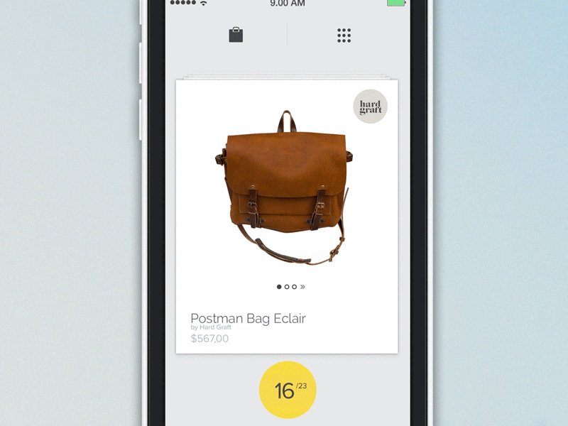
Simply answered, cards are packages of interactive information, usually presented in the shape of a rectangle. Just like credit cards or baseball cards, web cards provide quick and related information in a condensed format.
The hallmark of all cards is interactivity. Not only do they provide information, but they politely demand engagement. Cards commonly include like buttons or ways to post to social media.
What Cards Are Not
Because card based design is in its infancy, there’s a lot of haze and confusion about what is and isn’t a card. Adding to the trail of uncertainty is the fact that not everyone calls it a card. A card is also known as a tile, a module, or a portrait, just to name a few.
Sometimes, it’s easier to define something but ruling out what it is not. A card isn’t strictly a design. You can’t simply have a page, draw boxes on it, and call each box a card. Well, you could, but it wouldn’t fit the definition posited in this article. Instead, a card must have functionality, be self-contained, and possibly flippable.
Now’s an appropriate time to bring Dr. Phil into this. He famously said that no matter how flat you make a pancake, it still has two sides. That’s the way to view cards– they should have two sides. It may not be that the cards have an animated flip, but rather each card presents an overview of information and gives you the option for further involvement. A card is not just one piece of information, always embedded is the invitation to do more.
Following this definition, a card can’t just be pretty; it must be useful.
Why Should You Use Cards?
Cards can be used in a variety of ways to satisfy specific functions. Here are the main reasons to introduce cards into your design:
Cards grab attention. They’re an exciting alternative to overly gratuitous text.
Cards are responsive. Designing for mobile browsers is a necessity, and cards are great for responsive design.
Cards are digestible. Because of their limited space, cards can’t really say much. But that’s a good thing! Readers who want more can click to get it.
Cards are shareable. Cards enable users to quickly and easily share bursts of content across social, mobile, and email platforms.
How Should You Use Cards?
The main point of cards is to interact with the user and prompt that user to action.
The type of action will vary, depending on the relationship you’d like to foster with your site visitors. To answer this question for your own site, put on your UI/UX hat, and think of how you’d like to interact with your visitors and how they’d like to interact with you.
Let’s take a look at 4 major players who use cards. There’s some powerful takeaways from each.

The feed on Facebook is card-based. Each card features content, a way to like, share, and add comments. It also adds in social proof. You can see how many others liked, shared, or commented, which may influence your engagement. Quietly tucked out of the way is a drop menu that gives you the options to hide, unfollow, and report spam.
The Takeaway: Clearly, Facebook is prompting users to positively engage and to stay connected. They don’t want you to think about unfollowing or hiding certain cards from your feed.
You can use cards in much the same way–set cards up to encourage positive interaction.
Google Now

We already know that Google is a champion of card-based design. Many apps in its infrastructure already feature cards, such as Gmail Promotions and Google Glass. Google Now takes it one step further by being completely card-based. This offering is a virtual personal assistant who reminds you of friends’ birthdays, checks local traffic and weather, tells you what to watch on tv.
The Takeaway: Most cards require action, such as snooze, view email, wish happy birthday. Implementing a call-to-action at the bottom of your card can improve visitor engagement because you’re guiding them down a path of action.

You knew it was coming! Pinterest features one of the most popular card-based designs ever. It’s spurred quite a few imitators. Pinterest is a visual pinboard that allows users to pin, or add, images onto virtual boards. Hovering over a card gives users the option to pin it, send it, like it, or edit it (if it’s already saved to your pin board). Clicking the pin gives you more options, including the ability to visit the website of the image.
The Takeaway: Hover options are great way to solicit action without obscuring the card’s image.

Twitter cards are tweets with rich media attached to them. The media could be a photo, a collection of four photos, a video, or an audio, just to name a few. These visual cards attract attention in an endless sea of texts and #hashtags.
The Takeaway: Front and center, Twitter encourages replies, retweets, and favoriting but, similar to Facebook, it obscures the negative actions, such as mute and block. Similarly, in your card design, focus primarily on what you’d like people to do most.
6 Great Examples of Card-Based Design
Now that you’ve seen how titans of industry use cards in their designs, it’s time to look at how everyday designers like me and you incorporate cards into their work.

Roman Shkolny’s imagined mail client interface uses cards to visually catalog emails. In this example, emails can be stacked into conversations. Hovers allow color tagging, reply, forward, delete, and more options.
Move Product by Barthelemy Chalvet features highly animated cards that can be selected, deleted, or saved for later viewing. Pop-up cards provide further prompts for the user.

Coke’s Ahh.com campaign features a bevy of card, some rectangular, but most square, some animated but most stationary. As you click each card, it flips over to provide two calls-to-action: add to playlist or play this now.

Popular designer hangout, Dribble, features a card-based design. The cards provide insight on how many viewers clicked a card, how many liked it, and how many comments are listed. When users hover over the card, a brief summary of the image is shows, as well as the upload date.

Silktricky is one of my favorite card-based designs because it’s just plain fun. Interacting with the cards and watching them respond to your selections makes the whole design feel intuitive.

Vox gets into the card game with a what they refer to as card stacks. Akin to slide-shows, card stacks provide a comprehensive amount of information about a particular subject. Each individual card is dedicated to answer one particular aspect of the subject. Cards are shareable and, because of their truncated size, are also easily consumable.
Conclusion
Cards are the perfect way to make your design glanceable, user-friendly, and responsive. They definitely deserve your consideration.
Now that you’ve been acquainted with card-based design, will you be implementing it into your design?


What about my facebook Seo example’s
http://www.cfconsultancy.nl/facebook-test/
Um, please keep in mind that some card layouts (Google Now, Pinterest, dribble, etc) make content inaccessible to some people. I don’t know how common it is, but processing content that is not clearly ordered is extremely hard for me and at best it gives me a headache (at worst I literally cannot access the content of the cards).
Great post. Very Informative. Thanks for sharing.
At first I thought I had no idea what a card site was, but now that I have seen some of your examples, I realize that I have seen these be really useful on other peoples sites. Are these suppose to be any better for SEO?
will have to have a second look at this as I said no to a card based design and now I’m reconsidering my decision.