
12. Constellation 7

OK, I think this is one of the ugliest websites I have ever seen. I’m not kidding. They use a blend of conspicuously bright colors throughout the entire site, bold and colorful typography, and some animations that are making you run as far as you can. Fortunately, they don’t have any music.
13. Mojo Yogurt
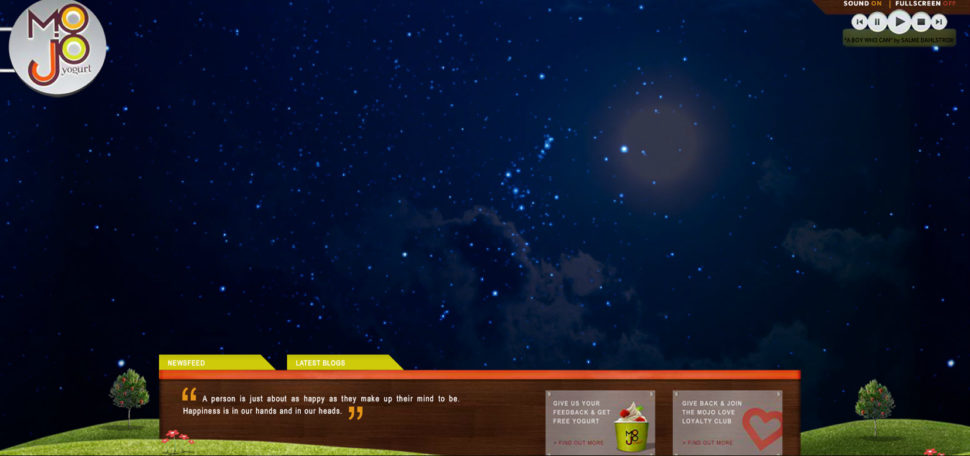
Again, this is a website built using Flash. The whole design wouldn’t be that terrible, had it not been for that horrible, annoying background music, and sound effect that you can’t pause. Just to let you know, dearest Mojo Yogurt, people who visit your website are trying to look for your product, not listen to that awful music.

This company has chosen to have irritating music in the background with no option for you to turn it off. Along with Flash-based, horrible design and low-quality images you get the idea of a terrible-terrible site. I really don’t know how they plan on attracting customers with such a website.1

This is the company’s website that built Industrial painter. Taking into consideration that it’s a web design company, I can say it’s even worse than Industrial Painter. That’s mainly because you expect a web design company to know about the latest trends and design. Instead, we find annoying music, along with a non-responsive, flash based, and horrible homepage design. I cannot overstate how horrific this website looks.


So… you need to link your titles to the websites.
That’s pretty funny. If you’re going to write up a page criticising other websites, maybe best to make sure that page has functioning, and correct, links.
The attitude behind this article is why designers frequently clash with business folk. What you think is a fail by your design standards most times generate quite a lot of traffic and income.
One example is the Lings automobiles site. He found a way to differentiate himself from the crowd and get people talking. For a business website, the only two metrics that matter is how much sales is generated and how much trust is built. Aesthetic beauty is not a requirement for either of those, although it can help.
The only thing people are talking about is how or his website is. I’m not sure it will generate much in the way of sales.
But you may have a point. My Father spent his life working in advertising and h with regards to TV Adverts he always said the only ads that are remembered are the really good ones and the really bad ones. And it’s always easier to make a really bad one!
And someone at Web Design ledger needs to learn how to actually spell the word ‘Failures’!
Brutalism is a growing (but very misunderstood) trend in web design. Most, if not all, of these could be considered brutalist.
There might be some negativity about this, but I think there are some useful takeaways. If an element adds to the user experience then great. But if it doesn’t add to the experience, it usually detracts.
As designers that work for businesses we need to meld our own design ideals with the business goals. That means creating a user experience that is positive and generates income, whether that means incorporating more than we would like into a page or chiselling some away to reveal a product that gives the best of both worlds. 🙂
People always share the most beautiful and well organized website. But in this article it was really different idea. Sharing the worst websites ever. Are they really worst?/?
Great feature!! you need to link of this page to the websites.
TRY ‘The Daily Dot’
This is the first time I’ve heard of Ling’s Cars. IMO I think the gaudy design is intentional and awesome.
I believe is succeeds in executing what it is attempting to achieve.