Site icon Web Design Ledger

20 Vintage Packaging Designs You Would Love to See

Just fifty years ago competition on the market was not so high as it is today. Manufacturers were trying to put more attention to their products and branding. Of course, their possibilities to make the design stand out were not so good as they are now, however, retro fonts and pin-up pictures looked lovely.

Retro designs inspired us to combine this fantastic collection of vintage packaging examples you need to see. These packs are encouraged by 60s, no matter they were created in last few years. These packages look old thanks to retro fonts, pin-up images, and washed out colors.
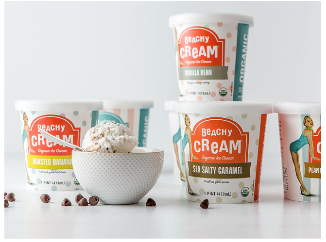
1. Beachy Cream Ice Cream Pint Packaging

2. Mike-Sells Package Redesign

3. A KISS FOR PASTA

4. Ale-8-One Core Packaging

5. La Glace Ice Cream Vessel

6. Vintage Seltzer Water Rebranding

7. Package Design (Coffee Break)

8. Back Yard Honey

9. The Great British Butcher

10. Oil Can

11. Granville Island Pet Treatery Packaging Design

12. Three Sisters

13. Fossil Watch Tins

14. Fresh Toothpaste

15. Rivercity Beverage Boys

16. Blondy

17. Yugoslav film archive – package design

18. Identity for the coffee shop Coffee Station

19. Freskinho Cake

20. Miss Molly’s Honey Visual Identity & Packaging Design

Exit mobile version