
In a competitive market, there are many ways to make your brand stand out. You could go for a unique catchphrase, a state-of-the-art product, or maybe just better prices. All of those ideas are great ideas, but sometimes a little design ingenuity is the best tactic, and what better way to be unique than having a custom logo font.
Typography is a detail that a lot of people notice. It has to be legible and friendly, yet fit your brand perfectly without losing its meaning. Coming up with handwritten logo fonts can be quite difficult, but thankfully you have the internet to inspire you.
With no further ado, let’s look at 10 of the most famous handwritten logo fonts to inspire your next project.
Ford
![]()

Henry Ford was an incredibly smart man. Not only did he perfect the commercial production line for vehicles, he was also quite the salesman.
The inspiration for the Ford logo is simple: it’s Henry’s handwriting. Well, actually, it was his chief engineer’s handwriting, but it’s designed after Henry’s.
This logo font has stood the test of time, as it was designed all the way back in 1909, and it’s still used as Ford’s main logo to this day. The font, in combination with the colors, feels inviting and very recognizable. Here’s to 100+ more years, Ford.
Disney
![]()

Since we’re talking about brands that have built their reputation on family names, it would be silly not to mention Disney.
Walt Disney is famous for his ambition and drive. His name is the very foundation that provides the framework for some of the biggest grossing movies of all time. This isn’t even mentioning their multiple theme parks around the world, private cruise lines and numerous television stations.
At the heart of all of this success is Walt Disney’s name, handwritten by him, as the logo and face of the company. Every single character in his name is easily recognized as being apart of the logo, and even separated from the rest, it can probably be pointed out.
Disney’s handwritten logo font is the perfect example of what a handwritten font should accomplish, and it serves as the perfect inspiration.
Ray Ban
![]()

Ray Ban has made their name in the fashion world. For years now, they have reigned supreme in the industry, with few competitors.
It was Ray Ban that came up with the first ever aviator sunglasses design. Even if you’ve never owned a pair, you most certainly know what Ray Bans are, and the luxury that the name represents.
One thing that may not be so clear, however, is where the name and the logo font came from. Let’s start with the name. The name is fairly simple. Back when they designed the aviators, they had one thing in mind: to block out all of the sun’s “rays” so that people could wear them comfortably. Can you see where this is going? Ray Bans got their name from banning the rays of the sun from entering our eyes.
As for the typography that Ray Ban chose to represent them, it’s a handwritten-style cursive that is incredibly unique. Much like the previous 2 examples, they wanted to pick a font that would stand the test of time. I’d say they did a pretty good job.
Kellogg’s
![]()

Kellogg’s boasts one of those logos that has a lot of meaning behind it. The story goes that back in the day, William Kellogg would hand sign each and every one of his boxes of cornflakes for quality check reasons. It wasn’t until the 1910’s and 1920’s that the logo really began to take off, however.
Over the years, Kellogg’s has made very slight changes to the logo itself. The core typography has remained the same. Without a doubt, Kellogg’s is one of the most recognizable logo fonts in the world.
Wendy’s
![]()
The famous American fast food joint, Wendy’s, just recently made the swap over to a handwritten font. Before, they were using a bold typeface that really didn’t compliment the restaurant as well as the new cursive font does.
On a small side note, the typography is paired with another custom aspect of the food chain: the image. The image is a portrait of the original founder’s daughter, Wendy. Overall, the new font is a way better fit for the brand, as the image and the font gives it a more personal touch.
Le Tour de France
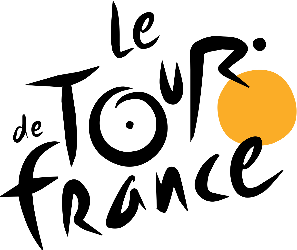

Le Tour de France is a world famous bike race that takes place in none other than France itself. The logo that they chose to represent them is quite iconic as well.
Recently, the logo was updated with a smoother edge, in addition to a few other small changes. Still, though, you can see that this font looks very handwritten. Overall, the font hasn’t changed much since the new update, and it still looks great.
There is also a hidden image built within the typography in the logo. Can you spot it? Here’s a hint: it’s a bike race.
Virgin
![]()
Over the years, Virgin has made quite a name for themselves. From their mobile phone services, to their trains and media outlets, they’re more popular now than ever.
If you take a look at their logo, it looks exactly as if someone with great handwriting decided to write the famous name in ink on a piece of paper. It’s a simple logo, but it’s kind of allowed to be with an incredible logo font like that.
All the inspiration you’ll ever need
If you’re looking for a nice handwritten logo font, there are plenty out there for you to download. What makes a logo truly unique, however, is the inability to be copied. Using custom typography usually isn’t cheap, but it is certainly worth it.
Using a truly handwritten font basically ensures that your logo (or whatever else you decide to use the handwritten font for) will be relevant for years to come. Take a look at any one of these examples of custom typography, and draw your inspiration. In 100 year’s time, you might still be using the same logo like Ford. Or, you might have a mega successful restaurant chain that is truly unique like Wendy’s. You really never know.
All-in-all, a custom, handwritten logo font is a great way to go, but it’s not for every brand. You really have to make sure that it fits the brand completely. After all, corporate bank doesn’t really scream “friendly.” The real lesson here is to make absolutely sure you pick the right font, and the success will follow.