


Today Apple.com received a big overhaul. At first glance you may think the layout looks exactly the same – and mostly you’d be right. But the flow of user experience for purchasing stuff has been completely revamped.
This new design is really meant to reduce confusion.
The old design had 2 designated areas of the site: products & store. Naturally this seems contradictory & odd, but it was thought that Apple’s site served more as marketing than an e-commerce platform. Over time e-commerce has grown but Apple never bothered to make the switch.
Thankfully Cupertino designers have taken the sensible approach to finally combine it all together.


All product pages generally look the same with lots of photos and feature details. The classic Apple navbar is also fixed at the top as you’d expect, but without the inessential “store” link.

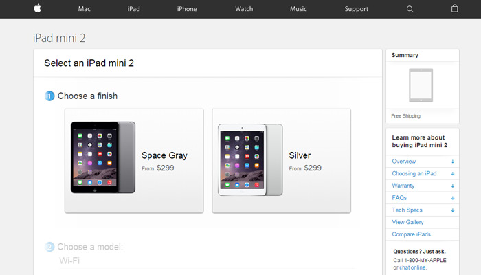
Now product pages lead right into the store so purchasing is all done from the apple.com domain as opposed to store.apple.com. The latter now redirects back to the homepage so everything fits together nicely.
This means your shopping cart can also be managed from any page on the site. There’s no longer a divide between browsing or shopping on Apple.
The checkout pages match the same design as before, so very little UI work has been done. There are minor aesthetic tweaks but overall the redesign is more of a user experience upgrade.

If you’re curious to take a peek head over to apple.com and check it out.
The iPhone page is particularly tantalizing.