
The trend of using minimalist designs has been with us for a while now. It seems like every day major design blogs publish a new gallery of great designs. But do minimalist designs actually mean anything to a designer? Can you become a better web designer by going the minimalist way or is it just a fad?
Actually, I do believe that it is a fad. But at the same time I also believe that you can learn a lot from it and use it to improve your skills significantly.
First of all, minimalist designs are here not without a reason. After the dark age of the ’90s (the dark age of web design, that is) came the year 2000 along with many Flash animations, fancy Photoshop graphics, and all kinds of other clutter. So finally after 20 years of noise a time of calm has come, bringing us this whole minimalism. People simply had enough off all the sites that were impossible to grasp and extremely user-unfriendly.
Minimalist designs change all that and provide a new, friendly environment. There’s nothing else on minimalist websites except for the things that absolutely need to be there. There’s no clutter and no confusion. And the sites are easy to grasp within the first 2 seconds of looking at them.
That is, of course, when done right.
So how can web designers use the trend of minimalism to improve their skills, and how to actually design a minimalist site properly?
Focus attention on the main element


Minimalist designs have very little elements incorporated into them. There’s simply no place for clutter or anything that is not essential to the site’s goal.
This forces designers to choose just one main element that will be the focal point of the whole site.
What can be such an element? It all depends on the site’s goals, but just to give you an example, let’s say that you’re designing a site for a new online service of some kind.
In such a case the main element would probably be the signup form. Consisting of a button, some screenshots, and short copy. You know that you can’t include too many things because the design is meant to be minimalist, so you only have place for the essentials. This will force you to think twice on what is really important for the site and what can be omitted.
Good designers are not the ones who can fill a whole site with stuff, but those who know how to select only the few important elements and forget about the rest.
Get those few elements right
Obviously, minimalist designs incorporate only a handful of elements to convey their message and convince visitors to take action (whatever action it might be).
This forces web designers to get those few elements just right. When working on a minimalist design you can devote more attention to each individual element. You also know that these elements need to be the best they possibly can. Because if they’re not then they’re going to stand out (in a bad way), as there will be nothing to cover them up.
Minimalist design is not about creating a site with just a few elements for the sake of it, but about using the smallest number of elements possible to reach a certain goal. Every element has its purpose in a minimalist design.
You know that you’re doing a good job if there are no more element you can remove without affecting the site’s ability to reach its goals.
Getting everything pixel perfect
This is a strictly graphics-related thing. Minimalist designs have to look exceptionally good. And in order to achieve this you have to make all elements pixel perfect (or at least try to).
Remember, there’s nothing to cover up this one elements that’s not so good looking. Everything needs to be nice or else your main element won’t be the one that’s the most visible … the ugly duckling will.
Crafting minimalist designs teaches you how to be pixel perfect. In fact, there’s no other way of creating a great minimalist design than by doing just that (whatever it might mean to you – there’s no one definition of “pixel perfection”).
Working on your typography
Typography is yet another element of minimalist designs, and probably one of the most important ones.
Since there’s not much to show on a minimalist website the text becomes an element on its own. That’s why choosing the right font, size and decoration is so crucial.
This is an area often neglected by many web designers. In some cases, Arial seems to be perfect for everything, but for minimalist designs it rarely is. Choosing the right font takes time and teaches you the basic rules of typography.
Every minimalist website needs to make a striking impression in terms of typography. If you just choose some random fonts the design won’t make much sense and the visitors will see this. Well, they probably won’t be able to name it, but they will notice.
Learning to use whitespace

Whitespace is one of those things that only the more experienced designers are not afraid to use. Many beginners feel that every piece of HTML real estate needs to be occupied by something, while it’s not the case at all.
When you’re creating a more complex design you get tempted to use every possible piece of space and fill it with that one more element. While it might work in some cases, it surely won’t work for minimalist designs.
Whitespace is yet another crucial element for minimalist designs. The sole fact that a minimalist design uses only a handful of elements forces us to space them out evenly on the site. They can’t just simply be placed all in one place.
The skill of using whitespace is somewhat volatile for web designers. Creating minimalist designs makes you simply better at using it, and this comes handy in every possible piece of design work imaginable.
Standing behind your opinion
In other words, believing that the work you’ve done is the absolute best you could do.
Here’s what I mean. If you’re a freelancer you might be reluctant about delivering a simple design. You might feel that your client won’t be so eager to pay if there are only a handful of elements on the website, and if the form is rather simplistic.
By sticking to minimalism you’re making your skin thick, and you’re learning how to stand behind your designs and be able to explain what their values are.
This is not a strictly design-centered skill, but it’s surely helpful in your freelance career.
Besides, once you learn how to explain the value of minimalist designs to your clients you’ll end up understanding them more yourself. So it’s a win-win scenario.
10 Minimalist examples
What follows is a set of 10 really nice minimalist designs for inspiration.
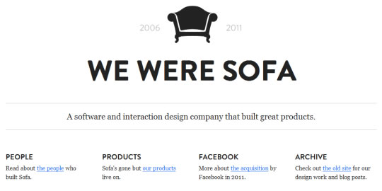
madebysofa.com

cargocollective.com/christopherose

fellswoop.com

madewithlove.be

thepokerclock.com

eutelnet.biz

soulwire.co.uk/hello

rodrigogalindez.com

theconsult.com

epidemialab.it

What do you think about the whole minimalist design fad? Do you think it’ll stick for more than a couple of years? What will follow?