

The increasing popularity of wearable technology like the Apple Watch, and activity trackers, think Fitbit and UP by Jawbone, has us thinking about design in a whole different way. These devices all make data readily available to wearers of the technology and with that comes a whole new opportunity for designing data.
This goes beyond numbers and charts. Designing data and dashboards, for mobile apps and desktops, requires a unique creative approach and visual discipline. The solution lies between representing the data in a way it can be best visualized and understood by the user, but also user-friendly, appealing and even interactive. A great execution of data visualization allows users to focus on a specific measure of data or the overall big picture.
Below are some examples of some beautifully represented data dashboards and UI Design.
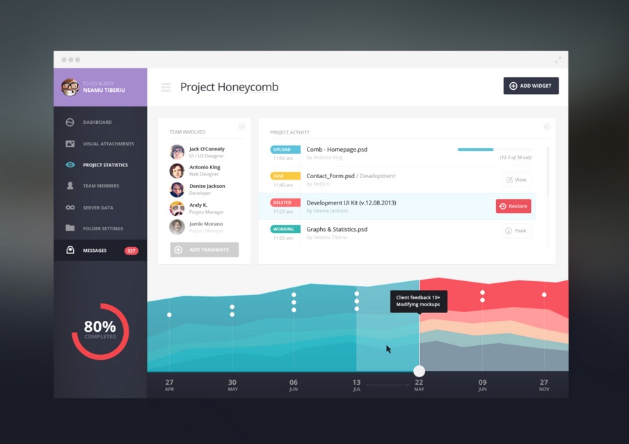
To-Do Dashboard
by Tiberiu Neamu
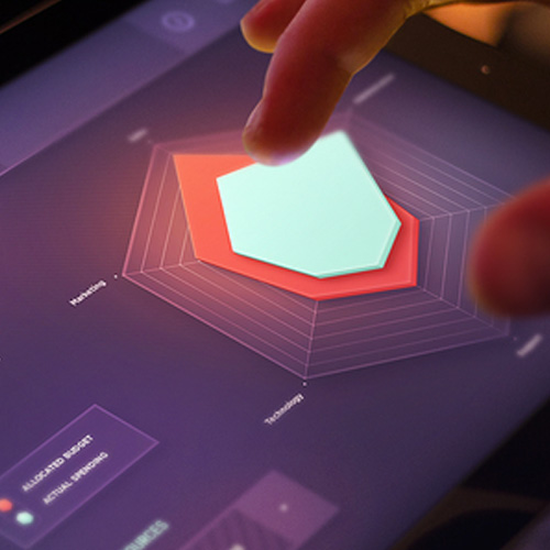
Statistics (radar chart)
by Mike | Creative Mints


Xonom
by Cosmin Capitanu


Infographic Agro Chart Illustration (data visualization)
by Anton Egorov


Training Application Marketing Site
by Sam Thibault for Handsome


Medical App Design
by Ramotion


Nest Control Concept
by ⋈ Sam Thibault ⋈
for Handsome

