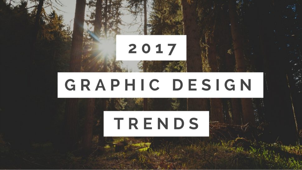
Graphic design trends are typically a mixture of classic favorites and fashion inspired choices, along with a reflection of societal values and concerns. 2017 is definitely poised to continue this trend, and there are some interesting variations between industries and target markets. Overall, though, you can expect the general theme and tone of 2017 to include and embrace even more minimalism and incorporating an organic, eco-friendly look and feel.
Soothing Design Elements
2016 was a tumultuous year, regardless of what side of the social or political fence you fall on. This is expected to influence graphic design in a very noticeable way as we attempt to push forward by looking far back into the past. In a nutshell, this means that simplicity and soothing elements are likely to be the king of graphic design in 2017.
Many studies have determined that spending time in nature is one of the most soothing and relaxing things a person can do, so it’s not surprising that green is going to be one of this year’s biggest colors. Green is known to be quiet and restful, which are qualities that most people are looking for right now. In fact, the spa industry has been using green as one of its primary graphic design colors for many years, and it’s also a very popular choice for healthcare sites. Bringing this color to other industries makes perfect sense right now.
As an added bonus, green ties into another societal element that will have a big influence this year: the environment. When you put all of this together, green seems like the natural choice for color of the year. Other colors that will be popular in 2017 include charcoal gray, brick red, olive green, maroon brown and khaki.
Environmental Influences
Recycling, upcycling and other similar concepts have become extremely popular. Additionally, becoming more self-reliant through gardening and homesteading is something that is no longer done merely by hobbyists and survivalists. Instead, people throughout the U.S. and other nations are fighting for their right to convert their yards into a garden, and community gardening has also become extremely popular. All of this shows an interest in not only conservation but also returning to a simpler, less stressful time.
Graphic designers will be tasked with bringing these societal trends into their websites, logos, packaging and much more. Again, green fits the bill quite nicely, and you can expect to see lots of handwritten fonts and hand drawn imagery. Retro fonts will also continue to be popular, and minimalism that uses green and white will be appealing to many consumers.
Truth on Display Branding
Another aspect of simplicity and minimalism that is expected to grow in popularity this year is the idea of truth on display branding. This means that see-through packaging with minimal wording will continue to attract attention.
Consumers also want to have a better understanding of the ethical and environmental impact of their purchases, so expect to see a big push toward highlighting positive features of products and companies.
Simple yet Bold
Of course, not all companies are going to switch to a soft, green look, nor should they. But the retro feel is being utilized by long-standing companies such as Kodak. There will also be plenty of other examples of bold colors and simple lines, especially in logos. This is going to be most prevalent among tech companies and businesses that are primarily targeting a younger demographic. Although these looks will still be simple, the boldness of their color palette will stand out in a year filled with green and other earth hues.
Hands on Women and the ‘90s Continue
Photographic choices have a huge impact on consumer opinions, and 2017 isn’t going to shy away from trying to evoke a specific emotion. This is going to be the year of tough, modern women, which means ads and website imagery will lean more toward beautiful women getting stuff done as opposed to just looking beautiful. Photos will also continue to have a candid feel, along with referencing the ‘90s. Perfect studio shots will be exchanged for realistic, spontaneous and filter free images of life.
The Impact of the Health and Wellness Movement
So far, 2017’s graphic design trends will result in realistic photos, lots of green, simple lines, minimalist packaging and putting the truth on display. All of these concepts speak to those who are interested in the environment and simple living, but they will also attract members of the health and wellness movement. In 2016, gym memberships, meditation and Yoga classes experienced a huge upswing in popularity. 2017 will continue on this path, and Tai Chi, spas and massage therapists are likely to benefit.
This matters to graphic designers because of the psychological benefits and ramifications of such a popular trend. For example, consumers who are drawn into the health and wellness movement are going to be less interested in snack food unless the design and other advertising elements highlight the positive aspects of these options. The huge increase in gluten-free marketing is part of this, and now that sugar is being blamed for weight gain, expect to see food with a low amount of sugar touting this in all of their design choices.
Ultimately, graphic designers will need to speak to the environmental and wellness concerns of most consumers in order to capture their attention in 2017. Those who make the conscious decision to buck this trend will do so at their own peril unless they’re only targeting young consumers or some other very specific demographic. Therefore, get used to the color green because it’s going to be everywhere this year.
