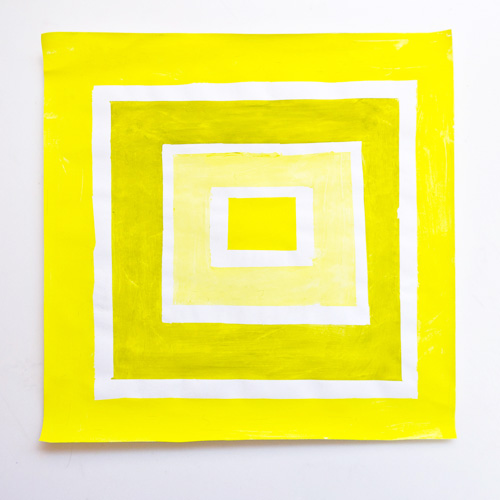
The colors you choose in your designs can really help guide a user through a site or application. The human eye is generally designed to perceive brighter colors to appear closer and, therefore, seems more accessible. A darker color tends to fall into the foreground and appear subdued.
Foreground (Brighter)
Background (Darker)
You can apply the same reaction to color in a scenery image to your UX or Web design palette. Color can be used to create an effective focus point directing attention to the part of your design you want the user to focus on. A variation of different tints and shades can also guide a user throughout a website, allowing them to click according to what you, as the designer, dictates as the next step.
Once you have decided what you want your user to focus on when navigating your site, give the element a vivid color. For action buttons, a bright signature color is recommended. For forms fields, a white or light fill within the field on a darker background is recommended. This makes it easier for your user to quickly identify the what fields they need to fill out with information, in order to move on to the next step. You can add color to the rest of the site, however, mind the brightness. You do not want the color to compete for attention and confuse the user. Stick to a subdued tone of color to allow for the best distinction of elements for your user’s eye.
Trainline does an excellent job at executing different depth of color perception in both their website and mobile app design. Have you seen any other sites or apps apply this simple but effective technique to their design? Please share in the comments below.
