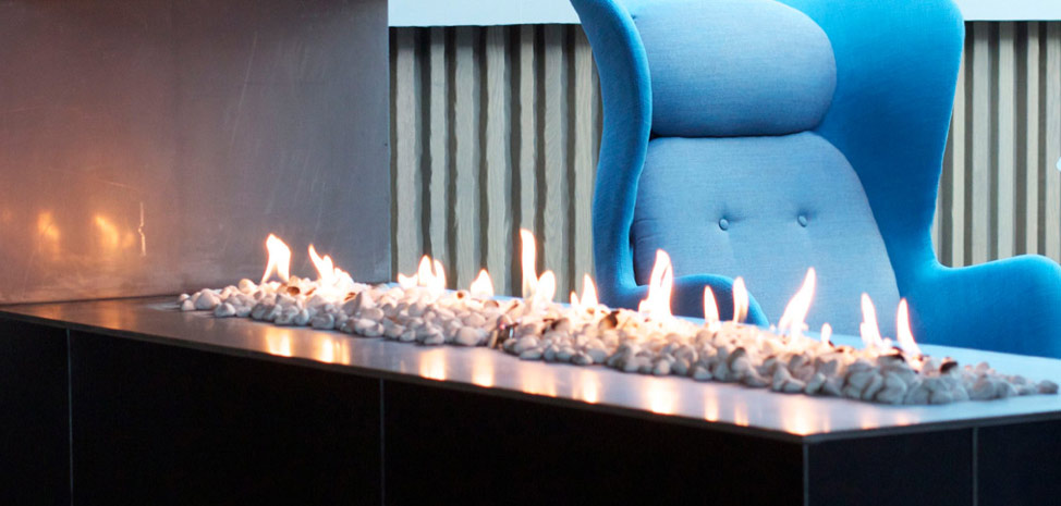
Minimalism is a design style that emphasizes simplicity and the removal of surplus elements in a design, stripping it down to its basic elements, colors, shapes and textures. This style was overlooked in the early dot com days of the internet, but it has now become very popular in website design. The fundamentals of minimal website design in my opinion are balance, alignment and plenty of negative space. Here is my pick of websites from a range of genres that adopt this approach very well.
Teehan Lax – Design Agency
Stripping a design agency down to its bare fundamentals is no easy task! Most design studios over-design the homepage when all that is really required is a strap-line clearly explaining what the company does and maybe some rich imagery to tease the user. The Teehan Lax homepage delivers. Even the menu has been reduced to the now acceptable 3 bars motif and those buttons with just an outline stroke are subtle but effective calls to action. If you skip to the blog page, this has been stripped back to well-formatted text with hints of contrasting colour to highlight links. Combining different-sized fonts is a great way to add visual interest without clutter.
Lacoste – Sports Commerce
Generally Ecommerce sites are guilty of overpowering the homepage with products, offers and deals. Lacoste is different. Anybody familiar with the brand will know that Lacoste is all about lots of white, together with clean and simple contrasting colours. Lacoste carry these values over to the UK website. Lots of white space teamed with paired back navigation make for a serene online experience. The products frame the site using a clever grid system refining the alignment of everything. The product images are bold enough to add visual impact without adding clutter.
Squarespace – Large Commercial
I think Squarespace deserves a mention here, if not for its commercial website then for the array of minimal templates that it offers for sale. Each template is individually crafted, usually filling the screen and giving the reader a breath of fresh air in comparison to other fussy design templates. Squarespace sites tend to balance large striking imagery with well-formatted type, keeping everything visually pleasing, organized and readable. Squarespace is becoming very popular with creative people, proving that minimal templates have mass-market appeal.
Mellbye – Architects
If there’s one discipline that really understands minimalism, it’s architecture. Long before websites, architects were bringing pared-back structure to our cities. Mellbye is a provider of architectural services based in Oslo. Some might argue the Mellbye website looks unfinished with no coherent border/frame/footer in place. In truth the website makes great use of the white space; without it, you’d end up with some other style that’s not truly minimalist. The history page is a perfect of example of not aligning every element but still managing to retain a solid page structure. This style may look simple, but is not easy to design. What you leave out of a design is just as important as what you put in.
Layervault – UK Startup
Being a startup and channeling a minimal theme is brave. It has to work for Layervault because the whole ethos of the company is ‘Simple version control for designers.’ A busy design would conflict with what is essentially a simple product. The homepage is very stark, opting for lots of white space and subtle animations. The animations are simple and clear, involving moving lines with primary colours to add a touch of interest. The design is also very narrow (580px) so when viewed on a large monitor can appear very contained. I think this adds to the overall feel. Grey dividing lines are used as borders between sections and the white space between columns are spaced evenly to create a sense of calm.
