

CSS frameworks have gone responsive, squeezing content into a spectrum of desktop and mobile browsers with varying degrees of success. There’s already a ton of these things floating around.
Today we are taking a look at responsive CSS Frameworks and Grids that we feel are worth your consideration.
Base

Base is super simple responsive framework built to work on mobile devices, tablets, netbooks and desktop computers

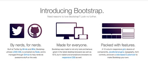
Twitter Bootstrap

Sleek, intuitive, and powerful front-end framework for faster and easier web development.
Kube

Minimal and enough. Adaptive and responsive. Revolution grid and beautiful typography. No imposed styles and freedom.
Foundation 3

The most advanced responsive front-end framework in the world, built with Sass, a powerful CSS preprocessor.
Skeleton

Skeleton is a small collection of CSS files that can help you rapidly develop sites that look beautiful at any size, be it a 17″ laptop screen or an iPhone.
Gumby

Gumby Framework was built to be the most maleable grid framework you’ve ever used while still maintaining the familiarity and ease-of-use of the grid you’ve always used.
IVORY

IVORY is a simple, flexible and fully responsive grid based framework. It takes you all the way from 1200px down to 320px.
Proportional Grids
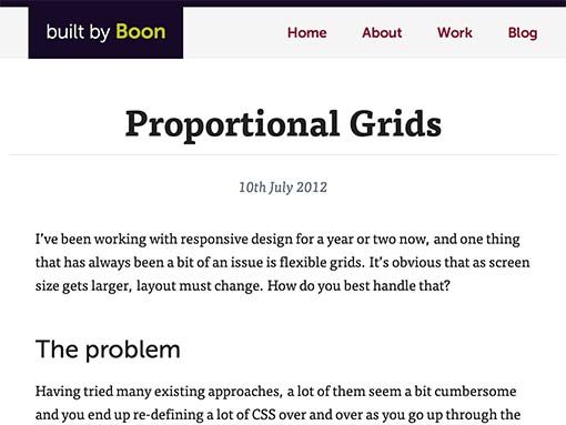
Proportional Grids uses CSS box-sizing to create a solution that allows for fixed gutters (ems/rems) mixed with fluid columns.

StackLayout

A flexible width, component based CSS layout system.
Susy

Responsive grids for Compass.
Responsive Grid System by Graham Miller

The Responsive Grid System isn’t a framework. It’s not a boilerplate either. It’s a quick, easy & flexible way to create a responsive web site.
Titan

With Titan Framework you can create responsive layouts that adjust to any screen resolution at maximum width.
Responsive Grid System by Denis LeBlanc

Simple CSS framework for fast, intuitive development of responsive websites, built using the ‘Mobile First’ approach.
Toast

Toast is a CSS framework as simple as it can be, but no simpler. A twelve column responsive grid makes layouts a breeze, and with box-sizing you can add padding and borders to the grid, without breaking a single thing.
Gridiculous

Gridiculous is a 12-column, up-to-960-pixel-wide framework that allows nested columns. Unlike other nesting frameworks, inner columns have their own 960-pixel break point.
Responsive Aeon 2.0

New version from HTML5 NewAeon Framework, now with a responsive grid all based in percentage with mediaqueries, html5 starting point and javascript.
Inuit.css

It is a Sass based, Object Oriented framework that is full of objects and abstractions. inuit.css provides little-to-no design which means no undoing things, no deleting CSS and no adhering to other peoples’ design decisions.
320 and Up
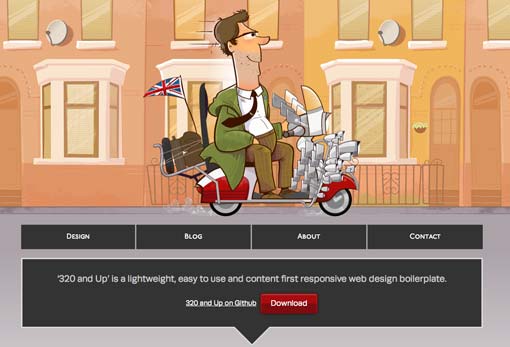
‘320 and Up’ is a lightweight, easy to use and content first responsive web design boilerplate.

The Semantic Grid System

The Semantic Grid System leverages the power of CSS preprocessors (LESS, Sass and Stylus) to create customizable variables for things like gutter and column width.
Columnal

The Columnal CSS grid system is a “remix” of a couple others with some custom code thrown in. The elastic grid system is borrowed from cssgrid.net, while some code inspiration (and the idea for subcolumns) are taken from 960.gs.
Your Turn to Talk
Choosing a CSS framework is not an easy decision. There may not be one right answer for everyone, there are few wrong answers for everyone.
If you are into grid systems, I’d love to hear your feedback about the frameworks above. Which ones have you tried and what did you think of them? Which is your favorite?