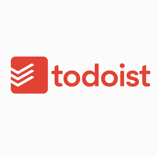
One of the largest and most prominent task management apps Todoist just released an update to their branding. This includes a new look for the company’s typography along with a sleek new icon design.
In a brand new blog post the Todoist team shares their latest feat with the public release of their 2015 branding redesign. It features a red square logo with portions of flowing check marks aligned side-by-side. It’s certainly more recognizeable and probably comes across as the best rebranding the company has seen ever since its creation in 2007.
In the post they write about why they followed this particular creative direction:
People may think that a checkmark is mundane, but we see it as a symbol of the hard work that bridges our goals, dreams, and ambitions to reality. The three checkmarks in the logo represent the plan, the action, and the result. From the start, Todoist has been a community of people who make things happen. We’re proud to reflect that in our new identity.
To maintain a connection with our brand’s 8-year history, we decided to keep the traditional Todoist red. We brightened up the previous hue to make the logo sharp and fresh on-screen.
Along with an aesthetic redesign Todoist has also released updates to native apps for Gmail, OS X, Windows, and more. This rebranding is both visual and functional which can be seen by all Todoist users.
If you want to learn more definitely check out the official blog post or you can watch a quick 1-minute video put out by the Todoist team.
