

The Challenge
Hiring web designers can be difficult. There are many disciplines under the common term ‘designer,’ and experts in one field may be novices in another, while others are a “Jack of all trades, master of none.” To make things worse, people commonly relate “design” with subjective decisions, personal preference and individual style.
All that makes the search for a great web designer seem like a daunting task. It doesn’t have to be like that; the goal of this guide is to help you find the perfect match for your team or project. This can be achieved by better understanding the different roles a web designer fills, and by having a good idea of the sort of strategic questions you can ask during the hiring process.
Web design disciplines and roles
The “web design” profession encompasses many skills, and sometimes, separate professions. A Web Designer nowadays has to wear many hats and may have varying levels of proficiency and experience in different fields.


It’s important for you to know some of the broader terms so you can better understand what kind of design professional is best suited for the role you are trying to fill. This will also help you clarify your project description and weed out some candidates before you proceed to the actual interview stage.
- Visual Design – Skills used during the final stages of design, the visual design phase. Generally found in designers with a more artistic profile, not necessarily well versed in the technical side of web design (although many are). These, however, are nice additional skills you can look for in a web designer on top of their technical skills. Deliverables: visual design, mood boards, Illustrations, banners, photo manipulation and compositions
- Branding and logo design – A profession on its own, branding and logo design are also skills that many web designers have at a rudimentary level. These are nice to have as extras, if that’s part of the project requirement or the job description of the open position you have. Deliverables: Style guides, brand books, color schemes
- User-Experience Design (UX) – Going hand in hand with IA and IxD, UX is the broad discipline of ensuring digital products work, based upon users’ expectations, providing the fastest, most painless workflow, while achieving the goals of the product. Deliverables: User personas, workflow charts, low fidelity sketches, accessibility analysis, usability tests, wireframes
- User-Interface Design (UI) – This is the practice of creating individual control elements and design of broader systems and visual language that makes the usage of a website or application nice and easy. If you are designing applications (mobile, web or otherwise), you will need someone with good UI skills in your team. Deliverables: High fidelity sketches, working prototypes, pattern libraries, UI kits
- Information Architecture (IA) – The art and science of defining the optimal content structure and the clearest navigation methods. For larger websites and applications with a lot of content and different content types, or complex content structure, it’s important to have someone with experience in IA on the team. Deliverables: site maps, navigation lists, taxonomies, content audit, user journeys
- Interaction Design (IxD) – Everything that deals with the interaction between human and machine generally falls into web design. With websites more and more having app-like diverse functionality, and with the myriad of interactive elements users have become used to, it’s nice to work with a web designer who is well versed in good and bad practices of IxD, who understands the well established conventions and knows when to break the rules to achieve a specific goal. Deliverables: interaction and functionality libraries, interactive prototypes, workflow charts, state maps
- Front-End Development – This is the part of development that involves code employed to render the user-facing side of a website or application, and to handle interactions between user and machine on a technical level. The most technical of the design-related disciplines, and often considered a profession on its own, front-end development mainly involves good skills in HTML, CSS, and JavaScript. Good front-end developers also utilise various assistive tools such as CSS preprocessors (LESS and SASS), task runners (Gulp or Grunt), and others like npm, Bower, or Yeoman. Deliverables: Production level HTML, CSS and JavaScript code, tools for handling design changes and sometimes environment migration
Note that this distinction is sometimes artificial, and although there are highly specialised experts who excel at just one of these disciplines, it’s very important for them to have a good understanding of at least a few of the others. So, even if a designer’s only job is to provide the best possible wireframes for a website, s/he must also understand how that wireframes will be turned into a working, responsive set of HTML and CSS files, and how much JS will be needed to implement the intended interactions.
Many of the best freelance web designers have solid experience in a majority of design disciplines. They are used to being a one-person show (or rather, a one-person army), handling web design projects from the initial specification talks to the final production code and everything in between. Web professionals of this profile are great for small-sized and even some medium-sized projects with limited budget and tight deadlines. They are efficient and know how to achieve 80 percent of the results with 20 percent of the effort.
Larger projects benefit more from an in-depth look at each component of the design, and require a design team comprised of highly specialised experts in their own fields. Depending on the specifics and the complexity of the project, multiple roles could be filled by a single professional or by separate specialised teams for IA, IxD, visual design, and so on.
Web Design Workflow
Web design as a profession has evolved a lot over the last 10 years. Effective workflows and practices have emerged and have proved to be the de-facto industry standard. However, there are still certain practices, remnants of the early years of the web design, which should be avoided.
One such ineffective and outdated practice is the “three mockups” approach. In the past, companies that have needed web design services have asked designers to provide three (usually) Photoshop mockups (or other forms of high-fidelity comps) to choose from. These are usually based on a set of initial brief requirements or a couple of talks with the client. The final product of this approach is design-based on personal preferences and subjective choices. Chasing user needs and achieving business goals this way is like shooting in the dark. Working this way (and requesting it from a web designer) should be avoided.
A much better approach to web design is the iterative process introduced by Jesse James Garrett in The Elements of User Design. It involves five stages, each based on decisions made, and work done, in the previous step.

Included here we have a very condensed version of the work involved in each stage:
- Strategy – Defining the key business goals of the product and balancing them with the user needs of the target audience (based on market research, focus groups, user personas, and the like). Deliverables: High level brief, design team requirements, project objectives
- Scope – Documenting the required functionality and the needed content. Also involves deciding what is to be built, and what isn’t, as part of the current project. Deliverables: Detailed project specification
- Structure – Information architecture and interaction design. At this stage, the structure of the website, and its pages, is decided via card-sorting and user-journey maps. For applications, workflow charts and state maps are created. Deliverables: site map, low fidelity prototypes or wireframes
- Skeleton – UI design, information design and navigation. With the structure in place, objective decisions can be made about laying out content, what UI elements to use and how they would work. All navigation elements should be implemented at this point and content added to its proper places. Deliverables: fully functional prototype of the website or application
- Style – Applying the visual treatment and the brand’s style guide to the working product. With a completely functional and properly laid out website, it’s much easier to apply corporate or product branding and make objective choices about its visual treatment.
This is an iterative process and each step can go through several cycles until it’s approved. During each step, it’s also possible to find flaws, or ways to improve the previous, and change the previous set of deliverables to reflect that. The main advantage of the ability to run usability tests at each step is avoiding large commitments of time and budget on ideas which later would prove to be fundamentally wrong or suboptimal.
Web designers well versed in modern practices and workflows should be acquainted with good tools for prototyping and wireframing such as UXpin, Balsamiq or Axure. While some may prefer creating the wireframes in Photoshop, Fireworks or InDesign, others implement them straight into popular CSS frameworks like Bootstrap or Foundation. The advantage of the latter is that these early prototypes later evolve into actual production templates. This eliminates dead-end deliverables and reduces production time.
Finally, the approach described here, as well as similar methodologies, lead to much better informed, researched and data-driven choices and use fewer subjective decisions throughout the whole design process. As such, you can easily identify designers who practice this by asking them about the reasoning behind different elements’ layout, position and style of a project they worked on. They should be able to give you swift and concise answers backup up by facts or research results.
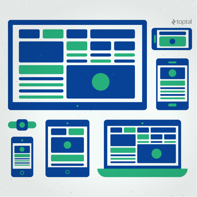
Responsive Web Design Process
These days, with a large percentage of internet traffic coming from mobile devices of different capabilities, it’s crucial that any new website be usable on as many devices as possible. The process of designing and developing websites suited for myriad screens and devices is commonly referred to as “Responsive Web Design” or sometimes as “Adaptive Design” (which is also used to refer to a specific methodology in responsive design).
Today the question whether to have a responsive website is no longer relevant; the answer is a clear “Yes!” and even Google is placing websites not suited for mobile devices behind those that are. The real question is how to execute a successful and effective multi-device strategy without going over budget or missing the point of mobile user experience.
Any experienced web designer should be well versed in the techniques that make a website responsive. To help you find the best matches for your project, we have prepared a few questions and guidelines. There are some important considerations that must be addressed when designing and developing a responsive website.
Content Strategy Across Devices
Responsive design is not just about fitting all your content into any screen size; the designer has to take into consideration the context in which each device would be used along with its capabilities.

Sometimes, it’s better to skip certain pieces of copy on a mobile device, use alternative copy or different image assets because the navigation of a website needs to change between different screens. Other times, specific pieces of content or functionality should be enabled only on mobile devices, such as a “click to call us” button, offer interactions based on a user’s location or show an “app download” button for the specific devices being used.
Q: Do we have to prepare different content or assets for different devices?
Sometimes, yes. Here are instances where such changes are required:
- Most often images have to be cropped differently for a small portrait screen; a wide aspect ratio image is great for a desktop website banner but is almost unusable on an upright smartphone screen.
- Where a large presentational video might be great on a computer screen, it could be replaced with an image and text on mobile devices, especially if you expect traffic from devices with slower mobile internet connection.
- Some pieces of copy may have to be omitted (or rewritten) for small screen devices where the user likely won’t read it.
- Certain call to action controls might be changed to better suit the device; for example, “Send a Message” on computers might be replaced by “Call Now” on mobile phones.
- On small screens, complex graphs, charts and long tables are better left as linked stand-alone pages rather than have them in the content stream of the page. Another idea is to present the same data in a different way, or only show the most important parts.
- Navigation should be rethought, or even designed separately, for different screen sizes. This is not necessarily about its visualisation, but often includes different structure, such as a flat list of links instead of dropdown/drill-down menus, or by showing less levels of depth in more complex menus on specific devices.
Layout Optimisation on Different Screens
While computers and larger tablets held sideways offer a lot of horizontal space to lay out the website’s content, the smaller the screen gets the less space you have for elements placed side by side. That’s why websites on smartphones are usually designed to have a single column of layout. This is one of the primary concerns when designing a responsive website: When and how should the page layout change.
Q: How do you make sure content layout looks good across different devices? What technology do you use to achieve that?
A few “break points” should be defined based on popular device sizes, types and context. These are predefined screen widths (and less frequently screen heights) where the page layout changes, for example, from three columns, to two and then to a single column. Currently, the most popular width breakpoints are:
- 1920 and up: TV screens and large desktop monitors
- 1280 to 1920: for the huge majority of laptops, many modern desktop monitors as well as large tablets (usually 10” and up) when held in landscape mode (held horizontally)
- 800 to 1280: for smaller tablets in landscape mode as well as older or smaller monitors
- 480 to 800: for tablets in portrait mode (held vertically) and smartphones in landscape mode
- up to 480: smartphones in portrait mode
To use different styles based on screen size @media is used in CSS code, for instance, to change a paragraphs’ font size to 14 pixels only on devices with a screen width larger than 480 pixels but smaller than 800, the following rule is used:
css @media (min-width: 480px) and (max-width: 799px) { font-size: 14px; }
Another important consideration is to place HTML code in the same order in which it needs to be displayed on mobile devices. In general, writing clean, well-structured and semantically correct HTML code goes a long way towards the smooth implementation of a responsive website.
Interaction with the user interface on different devices
Since devices differ not only in screen size but also in terms of input methods, make sure every UI element works as expected in the context of each device type. This means that dropdown menus should be acceptable for computer screens but on smartphones and tablets, users would expect navigation methods more akin to those on mobile apps.
Q: What do you do to make sure the UI works well and feels natural on different devices? Name a couple of interaction patterns which are not suited for specific devices.
Different devices come with different capabilities, and users expect websites on their device to function in similar fashion to the apps on their device.
The most important distinction between a desktop and a mobile UI is that desktops are usually controlled with a mouse or trackpad and a fast and easy to use keyboard, while mobile devices rely on a touch screen with no pointer and with an on-screen keyboard that’s often a hassle to use. Another consideration is that devices with no pointer also lack the hover state which is frequently used to trigger certain actions on web pages. The two input methods, pointer and touchscreen, also make different actions easier (more natural) or more difficult and slower. For example, moving items across the screen or dragging is easier on touch screens (therefore, dragging is avoided on desktops), while clicking on smaller controls is much easier with a mouse pointer (thus UI controls should be made larger on touch screens).
Asset Optimisation Based on Screen Size
Even when the same assets can be served to different devices it doesn’t mean the same image size or video quality will be optimal. To reduce load times, especially on mobile internet connection, web designers should be aware of the assets that they serve to different devices.
For example, a 1920 pixel wide background photo of 400 kilobytes, which is fine for desktop computers, will be overkill (quality wise) and slow to download (file size wise) on a smartphone. So, it’s good to have a smaller version of the image, which would be served if the user’s screen is small enough. And you don’t want the user to download both versions while s/he only sees one.
Q: Does it matter if you serve the same assets regardless of screen size? Is there any difference between images and backgrounds in this regard?
It’s important, at least for larger image files, to have separate versions for mobile devices and desktop screens. Smaller copies of the same image can be served to mobile users to reduce load times. Image size, however, shouldn’t be greatly reduced (if feasible) for mobile devices since they usually have screen density that’s much higher than desktop monitors. Decisions should be made on a case-by-case basis since some images can be reduced in size without much visual impact while for others it’s important to retain their details.
On a technical level, there’s a big difference between background images (which are defined in CSS) and content images (included as image files in HTML). Backgrounds can easily be set separately in different media queries in CSS, so each version is only served if the user screen matches a certain query; the others are not downloaded from the web server. For images in HTML, there is still no built-in, working and well-supported way to serve different files based on user screen size. Different techniques can be used to achieve that, such as by using polyfill scripts that simulate the behaviour of the upcoming <picture> elements, or other scripts that have conventions of their own, or using CSS background to show an image.
Generally, the CSS method, however, should be avoided because a CSS image background doesn’t have any semantic meaning and is considered decoration. Further, it’s lacking in accessibility as it can’t be described with the title and alt attributes that an <img> tag has.
SEO, semantics, content syndication and accessibility concerns
We’re now living in a highly connected digital world where your website content is not read only by people on screens but also by machines. Search engines crawl your website to find out what it’s all about and help users by showing them your content when they look for it; people use apps to aggregate content to read at their leisure; disabled users rely on machine assistance to access and interact with your content.
All of this is good both for your website and for its audience. To make sure all of the above is possible, and done correctly, your website should adhere to certain standards and conventions. The closest it sticks to them, the better chance you have for machines to interpret it correctly.
Q: How do you make sure a website is well suited for SEO and the content is machine readable?
The first and most important step to making a website machine readable and SEO ready is to write semantically correct HTML markup code, using the new HTML5 elements to mark each piece of content properly.
Q: Are you concerned with accessibility and what do you do to improve a website in that regard?
Properly marked up, semantically correct content, alone, gives a huge boost to accessibility. Making the website accessible to the widest possible audience of users with disabilities is a valid concern in a project; there are additional steps that should be taken to improve on that regard:
- Aria roles – in addition to the semantic HTML5 tags, aria roles can be assigned to the more important elements of content in order to show in greater detail each one’s purpose. This helps assistive tools understand the content, thus making it easier to use.
- Color combination concerns – many users have different types and degrees of color blindness, so in UI design, it’s important to avoid combining certain colors. It’s good practice to not rely on colors alone as a distinction between two UI elements (e.g. unlabeled green and red buttons or indicators).
- User control – The designer must also make sure the user has some degree of control over the way the website looks. Most importantly, the browser’s zoom function must not make the site unusable. Additionally, the content on a correctly marked up page is easily picked by reading apps and re-styled, as per the user’s preference (larger font sizes, a more contrasting color scheme, a more readable typeface, for example).
Q: What about content syndication? What steps should we take to make sure our content can be distributed over different channels and used by other apps?
There are several approaches that can be taken to assure the content can be interpreted outside the context of the website. Choosing the right format depends on the content itself, and the intended syndication channels, but there are a few common things to consider:
- Semantic HTML5 markup is usually the most important and common way to make content redistributable. Make sure the
<article>tag is used to mark up individual pieces of content, each one with its own heading. Article headers and footnotes can be marked up with the<header>and<footer>tags respectively, and related content can be marked up as<aside>. Dates should be properly marked as<time datetime=“yyyy-mm-dd hh:mm:ss">and addresses as<address>, and so on. - If you need clearly defined pieces of content, with their unique characteristics specified, consider using Schema.org to make sure everything is properly listed according to its widely accepted schemas.
- On a technical level, some of the formats that can be used to define specific data structure are RDF, Microformats and Microdata. They use HTML compatible elements (classes or tag attributes) to simulate XML-like structured data.
Content Management Systems, Premium Themes, CSS Frameworks
As the web has matured, developers have created an abundance of well-made tools and apps to assist the job of a web designer, or developer, while adhering to well-established workflows and design patterns.
Content Management Systems (CMS) allow site owners and admin control over the website without requiring them to dabble in code, yet leaving freedom for the designers and developers who use them.
Q: In your opinion, what are the advantages and disadvantages of using a CMS? When do you think it’s good to use one, and what are the alternatives?
Although many web designers have strong preference over one CMS or another, they should be able to objectively decide whether to use one.
- Advantages of CMS: ease of content management, built-in template engines for smoother development, adhering to best development practices, well documented code that can easily be handed to another developer, many available plugins that save hundreds of hours of development work and are well supported, to name a few.
- Disadvantages of CMS: when used incorrectly, may lead to bloated code and slower load times, the tendency to use heavy plugins for small features easily implemented by a few lines of code, limitations for more complex data structures or interactions where the developer may have to “fight” the system to achieve goals.
- It’s a good idea to use a popular CMS for almost any website project where the client needs to have full control over the content. Some larger sites, and especially web apps however, are too complex for conventional CMS, and will perform far better if implemented using a custom made system, tailored to specifics and needs. In many cases, a good CMS can handle these types of projects as well; however, that comes at the cost of heavy modifications, changing fundamental concepts, losing compatibility with plugins and the ability to update or receive support.
The so called “Premium Themes” for popular CMS are a common choice for projects with limited budget or tight deadlines. The built-in features and layout, however, come at a price. Good web designers understand that and can help you decide if this is the right approach for your project, can evaluate the usability of a theme and advise you about its pros and cons.
Q: What are some of the common issues that we face when using off-the-shelf “Premium” themes for a CMS?
Despite the seemingly easily customised components and styles, most of the themes they provide usually come at a cost (performance wise) and have significant limitations. A few common problems found in the popular themes are:
- Loading and executing a lot more code and assets than needed. Theme developers strive to outclass one another by including more and more features and capabilities in their themes. That, combined with the fact that themes are made to be flexible without editing any programming code, leads to a bloated code base with too many scripts and the need to query and process more data than standard templates.
- Themes’ looks and layouts are hard to modify beyond their intended customisation capabilities. Again, due to a code base significantly more complex compared to the standard CMS templates, heavy modifications take much longer and there’s always a chance those changes could break something else.
- If the project requires the use of complex plugins, which add templates of their own, styling those to match the rest of the theme’s visual style is also much harder.
- Finally, despite all their customisation options, themes tend to guide the website’s design direction, placing it on ‘rails’ and limiting the creative potential of the designer. This leads to a form over function approach, where content is made for the layout instead the other way around.
Another way to reduce development times and budget is by using CSS frameworks such as Twitter’s Bootstrap or ZURB’s Foundation. These frameworks come loaded with reusable pieces of code, markup conventions, commonly used javascript interactions and built-in best practices. They also use development tools such as CSS preprocessors (LESS or SASS), task runners (Gulp or Grunt), code linters and minifiers to improve the quality and size of the production code.
You can check our Web Designer Interview Questions article for a sample question about frameworks and front-end development tools.
Of course, all these questions and notes are barely scratch the surface of web design and development practices.
A good designer should be able to give you answers similar to those suggested here, but they may also have other ideas about how to turn your project into a success. Good communication is key. Exceptional web designers also have the ability to understand requirements along with the underlying reasoning behind them. That’s why they are able to come up with better ways to solve problems while also providing solutions for problems hidden beneath the surface. In the end, the skill which unifies all design disciplines is the ability to solve problems.