The filesharing company WeTransfer has pulled out probably the best redesign we’ve seen this year.
To be completely honest I’m a bit biased when I say that because WeTransfer is a product that amazes me through its simplicity.
WeTransfer is the kind of product that embraced simplicity at its core and built the whole user experience with the KISS rule in mind. (Keep It Simple Stupid) Sometimes, all it takes to disrupt an industry it’s simplicity and delivering a straightforward experience to the users. Creating a clutter free design is definitely a difficult process. It takes courage and a very good understanding of your audience to be able to sacrifice features, visual elements or conventional design “must do’s” to the detriment of what’s relevant to your user.
Companies like Teamweek, Medium and of course, WeTransfer, are leveraging their simple design for creating a tool tremendously accessible to the masses.
What WeTransfer did with its new redesign is to push the limits of simplicity even further and created an utterly intuitive file sharing platform that is suited both for their Plus customers and for the average one-time user.
I’ve asked WeTransfer’s Senior Designer, Thomas Schrijer, for a reason why the redesign makes WeTranfer the go-to platform when it comes to filesharing, and he gave me five. Enjoy.
1. We Optimized the transfer window.
Our biggest challenge was improving the iconic transfer window. We had a few things that our users (and ourselves) wanted improving. There was no good overview when you added a lot of files, multiple email addresses or a long message. We made the behavior within the box a lot smarter. The box will now grow to fit all the contents. When you write a long message for example, the field will expand so the overview remains.
2. Clear navigation
We made massive improvements on the navigation side of things. In the previous version, we had two labels attached to the left side of the box, which barely anyone noticed. Now we’ve put three main navigation items at the top-right part of the screen which makes it a lot easier to reach out for help, learn more about our service and manage your Plus account. All the information is presented in the panel, that covers the wallpaper. Because a piece of the wallpaper is always in sight, you’re able to go back from wherever you are.
3. Our Plus users get way more attention on the new WeTransfer
There is now way more space to manage transfers and contacts. We’ve made a distinct section to personalize your WeTransfer experience, under the label Profile. But this is just the start, we’re already thinking of ways to make our Plus users even happier.
4. Brand refresh
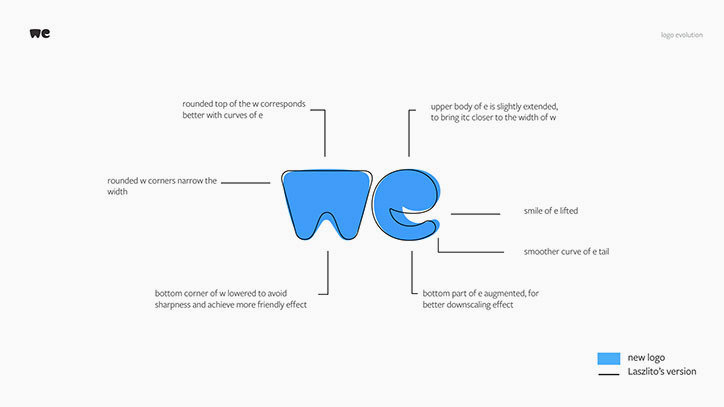
With the new site also comes a new logo and identity. The focus is moving away from transferring, and towards we. We’ve collaborated with Paul van der Laan from Bold Monday to help us sharpen our ideas on the logo. Next to the logo we’ve introduced a new color palette, updated typography and a visual language around particles.
5. Illustrations
When people interact with our service, they come across a few important moments. We’ve worked together with illustrators to mark these moments. Now when your transfer is done, you’ll get a thumbs up by a shark, or a cool pug smiling at you. We’ve added a level of emotion to our product by doing this. And it makes sense because working with the creative community is a big part of our DNA.
