Today CodePen just announced their latest redesign as it went public to all users. This would be CodePen’s first big overhaul since it launched online to compete with other web-based IDEs like jsFiddle.
You’ll note that while the design itself has been changed, CodePen’s entire experience has been improved. You can still search by tags but also by collections and recent posts.
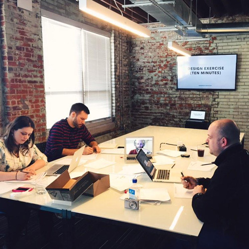
CodePen wrote their own blog post about the process and Sparkbox even setup a case study page detailing the CodePen redesign process.
One unique part of this redesign is that changes & bug reports are managed solely through GitHub. So anyone can submit a bug report and the developers will work on it according to the severity of those affected.
A gripe I had with the old design was how each preview loaded very slow. On a page with 8-10 different pens you’d sometimes have to wait 5+ seconds for everything to finish rendering. But now it seems like rendering is handled much quicker with no discernible lag time.
Granted this is only the first day of release so there are bound to be some issues. However current feedback is predominantly positive with props to both CodePen & Sparkbox.
There are so many new features to cover including templates, recent pens/posts, revamped profiles, and dynamic editor resizing(plus a lot more). To read about all the changes I urge you to visit CodePen’s official blog post which covers everything in detail.
Also you’re curious to learn more, the Sparkbox case study offers a behind-the-scenes look at the entire process.
