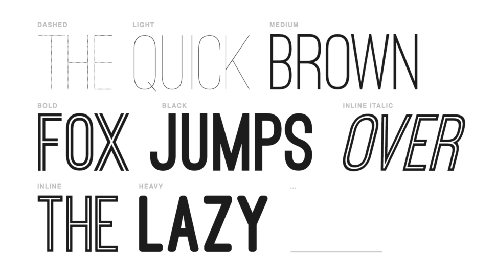
Today we are talking about the second font in our series of favorite
Fonts of the Week, the gorgeous Ostrich Sans.
Ok, so I’m sure that it’s very exciting to have your font on the (ex-)president’s Twitter feed, but this not the only reason we chose Ostrich Sans as the Font of the Week. Tyler Finck has a rich history in designing fonts and typefaces, of over 13 years. He has design over 15 fonts and countless typefaces. Ostrich Sans is one of his many fonts that would fit in any context.
The modern-looking font has a subtle minimalist touch that makes Ostrich Sans a suitable font for logo&branding, poster, invitations, business cards, etc. The font includes eight free styles: dashes, light, medium, bold, black, inline italic, inline, and heavy. The contrast given by the full letters and the race track lines described the Obama’s message of unity perfectly. Although the Unite States of America didn’t write history in 2014 during the World Cup Championship, the fact that Obama used Ostrich Sans was for sure a day to remember for its designer.
If you visit Tyler Finck’s blog, you will notice a feature that will probably save you from buying fonts that might not be suited for your project. The scale from the bottom of the page allows you to view any available fonts at different sizes.
The designer’s fonts have been used by many notorious companies such as Target, The Discovery Channel, TJ Maxx, NASA, UBC Universal, and many others.
Other fonts designed by Tyler are:
Do you have a favorite font or are you a font designer? If so, make sure you drop us an email at webdesignledger.blog@gmail.com for a chance to be featured in out Font of the Week Series. Until then, make sure you hit the subscribe button for daily posts about design.
