

Every designer should be familiar with the inner workings of a style guide. These guides are little print booklets or digital PDFs that contain information about a company’s brand, identity, color scheme, and other similar features.
The concept of a Style Tile advances this idea for use on the web. Style tiles include branding and colors, but focus more on design aesthetics for user interfaces.
Any large web project can be improved with an organized style tile. But how do you know where to start? In this post I’ll cover the basics of style tile design and how you can use tiles in your own work. Once you understand the purpose and structure of style tiles you’ll realize their place in the larger web design workflow.
The Style Tile: Overview & Usage
As Tuts+ author Chris Brown explains in his wonderful post, style tiles are alternatives to jumping right into a digital mockup.
Website layouts are mostly based around content. A style tile isn’t great for explaining how content fits together – but it’s perfect for explaining everything else. Colors, icons, typography, textures, page elements, you name it.
The purpose of a style tile is not to plan out the full mockup. It’s just a roadmap to help you reach the destination with less hassle. These tiles cannot replace wireframes or mockups. But they can be used for generating ideas and gluing the pieces together.


A good style tile behaves more like an extended UI kit. It may also be comparable to a moodboard with more pragmatism.
Ultimately style tiles are just a new way of generating ideas quickly. They can be sent to clients as “jumping off” points for a new project and they’re great for inspiration when it comes time to build the full website.
Flexibility for Mockups
By creating a style tile first you give yourself flexibility to change. It’s easier to make changes on a small UI kit rather than a full layout. These quick graphics and ideas give you points of reference for what the layout could become, without committing to the full layout.
Also keep in mind that most websites nowadays are fully responsive. It takes a lot of work to craft both full-width and responsive-width mockups. But style tiles don’t require such considerations because they focus on smaller pieces of the puzzle.

Flexibility reigns supreme in the field of digital design. Especially in the early stages of large projects you really need to be flexible with ideas. Once you’ve locked into an idea the rest of the process becomes much easier.

Clients also seem to respond positively to style tiles, assuming you explain what they are first. When clients expect a simple moodboard they’re more open to direct critique from an early-stage thought process.
Tile Design Tips & Trends
When it comes to actually designing a style tile you need to consider the overall composition along with the internal elements. Some tile designers like to create mini-headers with the website’s logo, color scheme, and tile version number.
The branding should be recognizable and explain that the document is only a style guide. The version number helps clients reference different versions based on what they like(ie. I like the button styles in v1 but the typography looks better in v2).
However the website’s branding should only take up a small portion of the design. Style tiles are meant to convey ideas about the interface. Naturally this would include headers, paragraphs, links, buttons, and icons. But also consider adding smaller elements like nav items and form fields.

If a site is more niche-specific then it helps to add more detail. For example, a tile for a social networking site may include elements of the user profile. What will the default avatar look like? How should a user’s timeline be designed?
Place greater focus on individual page items that offer a glimpse of your creative direction. From here it’s all about feedback and making necessary changes to prepare for the 1st mockup draft.
Gathering Client Feedback
Before sending out any tiles go over your work and reaffirm the direction. Try to complete 2 or 3 different versions and see which elements draw the most attention.
Clients know what they want when they see it but don’t always know how to say it in words. Offering too many choices will create choice paralysis. Instead opt for a lower number(2 is great) and gauge their reaction.

Try to encourage open-ended feedback instead of pushing a certain ideology. Ask your clients to share their opinions on specific items(ie. what are you thoughts on the direction of the button textures?).

You also want to gather as much “corrective” feedback as possible. This means the client should explain what they do/don’t like and why. Once you understand why they like something it’ll help you piece together other areas of the design.
Regarding the total number of elements to use in a tile, that really depends on the project. Some websites only need a small number of elements while other projects may require a full UI kit. At the very least include some basic branding, colors, typography, and vital elements for the webpage.
Style Tile Examples
The best way to learn is often by example. Since style tiles are relatively new, only a sparse number of designers have latched onto the idea regardless of its practicality.
Take a look over the following style tiles to get an idea of what they’re all about. You may shake your head in rejection or find yourself asking how you didn’t think of this before. The style tile is not great for every project or every designer. But it can save time during the early creative stages when the concept isn’t completely set in stone.
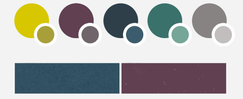
Tile for Colors

Tile for Icons
![]()
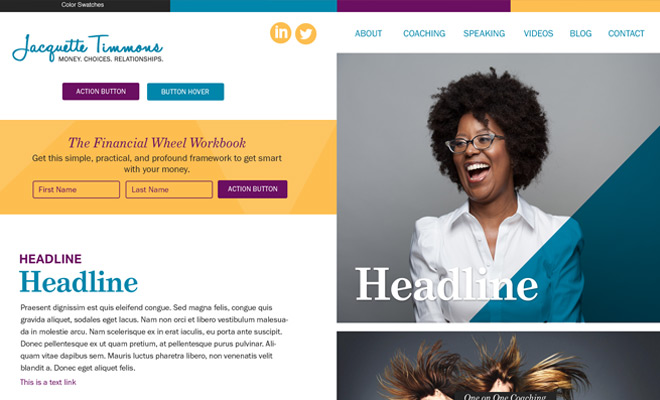
Terasu Style Tile

WAC Tile

iOS App Style

Tan Tile

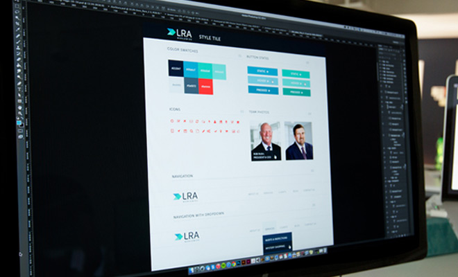
LRA Style Tile
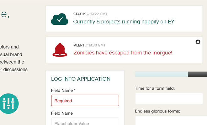
Project Lifecycle

Zoobit

Visit Denver

Textures & Colors

Fishery Website

LFC 360 Tile

Southside Farms

Depression Management App

ThinkGeek Style Tile

Teal Style Tile
School of Architecture

Divestment Tile

Bloomz Style Tile
