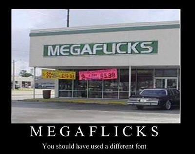
The logo is a representation of what a company stands for, it’s the backbone of the brand and it portrays its self as a global presence in the marketplace. A well-designed logo is a crucial part of any company’s marketing strategy and it needs to be done right. So I took the liberty of gathering a few examples of some poorly designed logos that should never have made the cut. Take some notes and tel!

I bring my kids here regularly, they have really good prices!

I heard Johnny’s got the best loafs in town!


This one is pretty self-explanatory…

What kind of work are we talking about here?

Not sure, if that’s what I would call winning…

It’s not the same if you don’t take it laying down…

Just keep walking and don’t make eye contact with anyone in the windows…

This one ruined it for everyone…

Is this some sort of clue as to where the food comes from?

Do you think they did it on purpose?

This has to be an online website where librarians get together…

I’d say this one is spot on…
Which one was your favorite and why? If you have any good ones I missed feel free to leave links/comments below so I can check them out! Thanks!


Haha seems some of them we’re done for 5 bucks. Megaflicks is the best lol.
I actually don’t mind the instagram redesign.