When visitors find your website online they are expecting a certain experience or depth of information. Landing pages are the single webpages that visitors are directed onto, either from search results or a link elsewhere online. Different pages will have different purposes in regards to drawing in users and feedback from the audience.
But generally speaking there are some common traits within all good landing pages. In this article I want to discuss just a few ideas on spicing up your pages to keep visitors interested. Also it is important to focus on the purpose of the page and getting users to convert doing whatever action you deem necessary.
Branding with Big Page Elements
You only have a split second to entice visitors into staying on your page and reading further. Branding is one solution where you can blend a logo, icon, or vector into the page above-the-fold. This way your visitors already catch an idea of the product and may decide for themselves if it looks interesting.
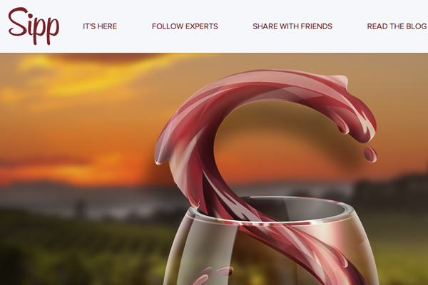
Sipp is an iPhone app for wine lovers with an exceptional homepage. There are lots of big screenshots and photo slideshows demonstrating why you might get this application. But notice right at the top you find a large fullscreen background element with some text. The wine is in the shape of an ‘S’ denoting the Sipp branding. It is truly a brilliant example of a landing page utilizing these big oversized features.
The page for Lifedots is similar but with a different purpose. There is no detailed information or external links to other profiles. The goal here is to get people interested in the idea of their product, so as to sign up for email notifications. One large preview screenshot along with a flat signup form brings minimalism to this oversized landing page.
Product Designs
Big or small you will want to display some products on the page itself. Unless you are still in early beta stages and do not have anything to show – but in this case at least put up some recognizable branding. Icons or vector characters will go a long way towards brand recognition.
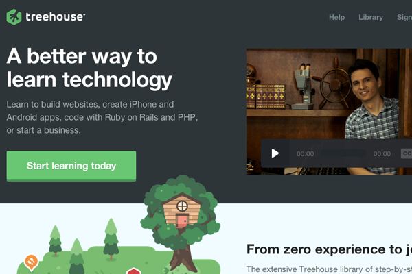
The website for Treehouse is fantastic because it displays many of the natural product features in an easy-to-understand design. There are screenshots and video players explaining what somebody could learn by studying at Treehouse. Also of the small icons littered throughout the page add to this natural earthy design. It draws you in right from the get-go.
Blog/Magazine Articles
Many Internet marketers do not even consider blog pages as single landing pages. But when going out to market your blog online it is common to share links which lead back directly to the blog article. People have certain expectations of blogs online and what type of content should be found in the post.
You can design blogs to look more like online magazines if you have enough content. This design strategy often keeps people hooked to the website for longer periods of time because it appears more professional. Also you can include widgets for related posts that readers may also click onto and read. When done properly, your blog articles may behave as landing pages which advertise your entire website full of related content.
Articles on The Verge provide an excellent demo of these traits. It is never a good idea to overwhelm your audience with too many distracting widgets. But similar content and related suggestions are often welcome as long as they don’t overlap within the article content itself.
Listing Dynamic Features
When looking back to individual product pages it is worth discussing features and how your visitors will see them. Small lists including icons or screenshots will help readers to digest your info quicker. You want visitors to keep moving throughout the page without getting lost. Kareer does a good job at using annotated captions which animate onto the page.
Granted you do not need anything fancy to grab attention. Not everybody will be interested in your product so it’s really about catering to the audience who would sign up and get on board. Living in the modern world of CSS3 and jQuery animation can be your friend. Don’t be afraid to push boundaries and try out new UI/UX techniques which other people aren’t trying yet.
Place yourself into the seat as a visitor and look at each page with a critical eye. Think about what kind of information you would want to know as a potential customer. Why should anyone want to pay or use your service? What specific value do you provide that other competitors may not provide(or not provide well)? Keep asking the right questions and you will eventually write a high-quality list of features that gets people digging deeper into your landing page.
Single-Page Layouts
Possibly one of the most common forms of landing page design focuses on a single page. Aside from blog posts you may want to push a single product or service to clients who would need this done. Single-page websites allow visitors to quickly consume what you are offering and decide for themselves if they could use the service.
For example Sendy has a great single-page design which is focused around e-mail newsletters. You immediately find a whole bunch of screenshots and stats explaining how they work and what you get for signing up. What I really like towards the bottom of the page is a small FAQ section for newcomers. This is a good way to introduce confused visitors to your product while explaining things in “normal” language.
Many other example websites in this article are built using single page layouts. Keep this in mind when developing a landing page for any product. You want to provide just enough information to get people hooked, but not so much as to drive them away in boredom or restlessness.
Closing
I hope these tips will prove useful to some designers getting started with Internet marketing. When you study the numbers it will become clear which pages are drawing the most attention for the longest time. Bounce rates and user exits are also statistics worth analyzing. Stay alert for newer landing page trends and keep practicing your own ideas. Eventually you will find the right solution and learn more about website UI design in the process.


Leave a Reply