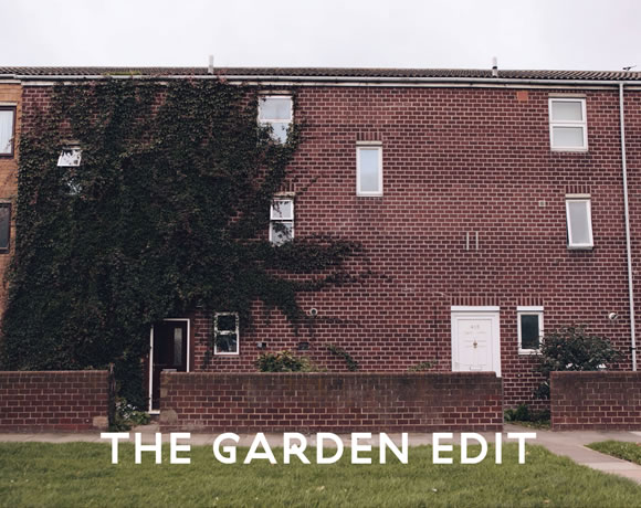
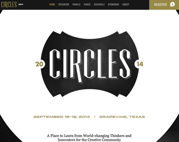
For our first inspirational list of 2014 we decided to gather examples of white type in web design. I’m always browsing css galleries and other sites to find nice things to show here, and I noticed that a lot of sites use the dark/colorful background white type combo. This is why I decided to dedicate a list to it.
Whether you are using a beautiful background image, a texture, or even a big video, overlaying white type can create a very dramatic effect. Check out the examples we have here and give white type a try in your next project.


Web design is becoming really beautiful these days thanks! 🙂
I just published my portfolio last week, using white type on banners:
https://rajtoral.com
Gisele these are even better than the last list you posted. Are they free? Where to download?
Even better than the last one you posted. Thanks Gisele!
Paper tiger looks really good!
Check out my blog as well, it uses white typography similar to this.
https://thejoltjoker.com
Very good examples for inspiration ;))
Looking very nice indeed 🙂
Amazing how the classic ideas never die. Great examples of effective white type. Thanks for sharing.
i love such great ideas for coming designs in 2014. thanks for your ideas
It’s very difficult to use white webfonts without a shadow or outline and make them look good. Those are some good examples, but they lack real impact imho. As I said: tough job online compared to print.
White type isn’t particularly hard to pull off. It’s been a staple of command line interfaces for decades. There are two notable exceptions or caveats. First, if the page is text-heavy, the white text on a dark background makes just about every other page with a white background seem blindingly bright. Second and alternatively, like the Big Bite Creative example, if the background isn’t dark enough, some of the text becomes washed out and difficult to read. Finding a balance between dark and light is what is often hard to accomplish.
mf
Wow! Awesome idea, we’re loving these at my work! Take a look at our website, our developers have done something similar (although new landing pages are coming out on the 25th!!) – Bill 🙂 Pickevent.com