
Infographics are a great way to get people to actually look at data. The use of visual design elements can simplify complex information and make it easier to digest. In this article, there are 13 infographics that present information and data that is useful to web workers. Whether you’re a web designer, developer, or blogger, you should find these infographics very interesting.
Click on the images for a larger version.
The Internet’s Undersea World

Search Benefits of the Blogosphere

The Life Cycle of a Blog Post

50 REPETITIVE & ANNOYING Website Intros Examined

Web Trends

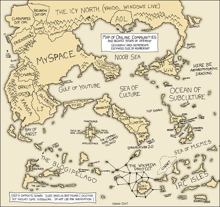
Map of Online Communities
What People are Doing Online

Global Traffic Map

Periodic Table of Typefaces

The Exploding Internet

The Web Life of an Article

Yahoo YDN Metro Map

World Map of Social Networks


This post definetly proves that with some imagination and creativity, a list of statistics can be transformed into some brilliant graphics. There are normally a few that stand out in the collection but all of these are brilliant. Alot more people would engage with stats and figures if they were shown like this!
Have you seen numberpicture.com? Its a site that visualizes data into static images – but the way it visualizes it (ie the shape and form of the charts can be created by users of the site) and then these can be used for free by others. It makes the data look so pretty I find! Pure awesomeness… It definitely makes the stats more engaging..
Wow, these are simply great. “Web Trends” is very cool and the “Map of Online Communities” is stunning. Is this hand drawn?
Great post, infographics rules!
Great infographics! Thanks for rounding them up!
Thanks for helping me out with my project – nice resource some of them I knew already some of them are completely new … .
Thanks ‘-)
Cool. Love the periodic table.
Nice list. I am a fan of information visualization.
Beautiful examples of information design – keep ’em coming.
stevieblackcreative
Very Cool! Great collection.
Nice list
Great examples of Infographic Maps. I’m currently working on a map as part of a design challenge hosted on my site. These will definitely come in handy for inspiration.
Thanks for the post!
Very interesting info-graphics, did you know ChartsBin.com. New site recently launched for statistics to charts/map.