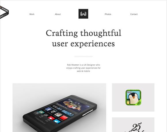
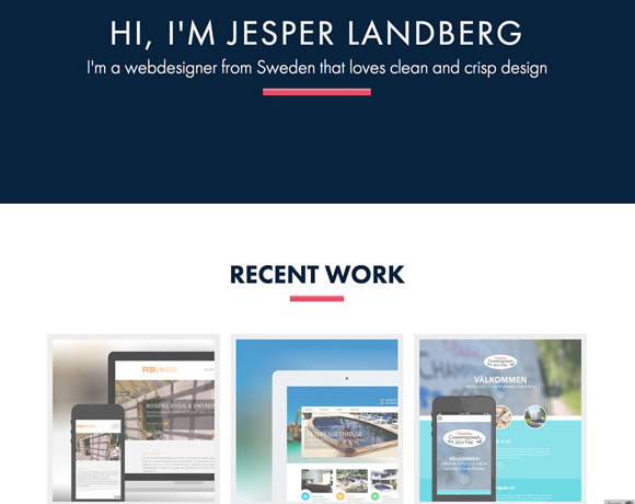
As a designer, it can be tempting to use a lot of unnecessary design elements or a complex color palette to make a website stand out. Doing this will often result in a web site that looks over designed and distracts from what’s most important: the content. Most of the time, you’ll discover that it’s much better to take a minimalistic approach. So for today, we gathered 15 Fresh Examples of Clean and Minimal Web Designs to inspire your for your next project.
Inspiration  Gisele MullerSeptember 9, 20139 Comments07.2k
15 Fresh Examples of Clean and Minimal Web Designs
Share
Gisele Muller
Gisele Muller loves communication, technology, web, design, movies, gastronomy and creativity. Web writer, portuguese/english translator and co founder of @refilmagem & @mentaway Twitter: @gismullr


Great examples! I adore minimalist design. I’ve also posted a similar article recently, just in case, you can find it here: https://superbwebsitebuilders.com/7-minimalist-web-designs-for-your-inspiration/
Awesome! Simple is always beautiful 🙂
Great to stimulate inspiration.
Is it possible to submit some pages to see them in next articles? 🙂
Amazing collection, beautiful and adorable specially myfelt….
Great collection, All of them are good especially myfelt….
I love that Barcelona design. The use of black and gray text really works. Top marks!
Great Collection!!!
I love all the collection. Especially Box Clever
These are all fresh and clean designs. I love all of them. Thank you for sharing.
Hi, although all sites look nice, almost all of them are portfolio sites. I would really like some nice examples of B2B minimalist websites, where a designer had to work for a customer but still was able to carry through with the minimalist design.. great post though!