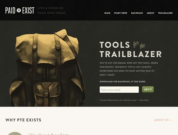
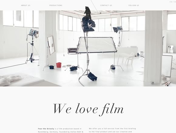
Minimalism is the art of exposing the essence of something, eliminating non essential forms, features and concepts. In web design, minimalism is really appreciated, especially when it comes to menus and navigation. It is always inspiring to see how some designers apply the well known “less is more” concept to websites menus, and this is what we will show here today, minimal navigation menus. Enjoy.
Inspiration  Gisele MullerAugust 13, 20129 Comments07.5k
20 Examples of Minimal Style Navigation Menus in Web Design
Share
Gisele Muller
Gisele Muller loves communication, technology, web, design, movies, gastronomy and creativity. Web writer, portuguese/english translator and co founder of @refilmagem & @mentaway Twitter: @gismullr


I got to say that I really like the south & eleven design the best. Something about it really sticks out. Granted, all 20 are excellent but the south & eleven design really stands out to me the most and has me thinking of some new design ideas based on it. Thanks for including these references.
Great post Giselle!!!
A simple or minimal navigation is almost the best way not to confuse the users.
Very inspirational navigation designs. Perfect for any new website project
Once again you’ve focused like a laser on something my site needs improvement on! Great samples, thanks.
We’ve been moving away from complicated dropdown menus for some time now, focusing on keeping the most important pages in the main navigation menu and putting less important pages in the footer navigation. Nice examples. I particularly liked the Envy Labs example.
Great post! Loving these minimal nav menu designs. I think they look and function better than overly complicated dropdown menus.
Interesting examples. But sometimes minimal navigation only means minimal content. If you don’t have a lot to say/show, it’s easy to do it in only a few pages (and this is the case of all the examples I checked). Do the same on a website with lots of resources and info and then I’ll be impressed.
Envy labs, looking good!