One way to easily define the tone and mood of a website is to use a big background image. However, when doing this, you need to consider that big images often have a lot going on, so it’s important to take a minmal approach with other aspects of the design. Not doing so could result in a website that is far too busy, cluttered, and difficult to navigate. So for your inspiration, here are 20 examples of how to effectively use big background images in web design.
Uber – Portfolio WordPress Theme
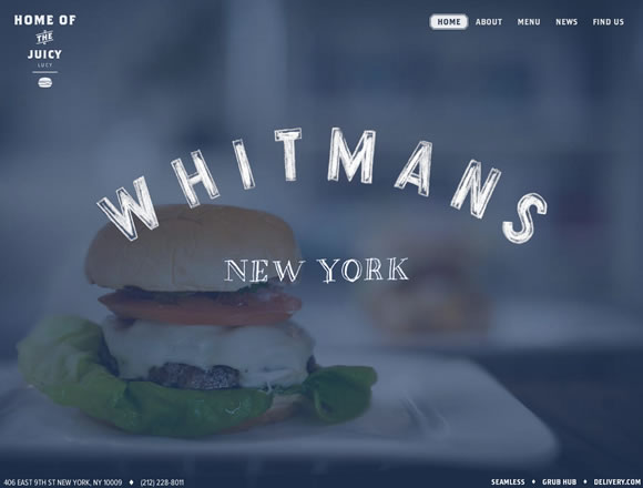
Whitmans New York
Studio Octopi
Von Dutch
Hiu Denim Co
Casey Britt
Range Rover Evoque


These are some great examples! Very inspiring to see what has been done with larger graphics. It’s so visually appealing.
Great selection of inspirations!
Thanks for sharing these. There are some great examples here of big bold backgrounds working well.
That’s a great point about being careful when choosing a photo and the design elements of the site. I’ve seen some sites that didn’t apply that rule and everything was far too cluttered.
What I love about these large photo background sites is that they have so much character. I bet it saves web designer’s a lot of time and effort as well…let the photo do the talking rather than having to invest loads of time creating visually interesting page layouts.
Always a solid list, thanks Gisele!
Great picks! I love big background designs, especially when they’re fullscreen, they take on completely different feel.
Wow,,great lists thanks!!
But be careful using large photo as background can be eat your user’s bandwidth 😀
In this age of ultra fast connections and downloads, why NOT use great large imagery? Nice samples.
I’m always hesitant to using big background images, but it’s probably time to get over that.
I personally believe one of the latest web design trend is usage of big background images. Designers nowadays often use photos to create something new in the website. The time has been changed for the betterment for sure.
It is always a tradeoff. If possible we try to use two images instead. One for each side and the content traditional in the middle. It gives almost the same feeling but speed is less affected.
Thought this was a great article and one that has some great sites in it for inspiration. There seems to be a trend with a lot of sites I see using big background images. I agree with you that you have to be careful when using an image of this size because it can make or break a site. There are some great examples and the site that stood out for me was the Amazing Spider-Man site. The use of large city scape image works really well and I love the interaction on the site from the dragging of the back ground and the roll over effects for key points of interest. Great article and I look forward to more like this from yourself.
We are thinking of applying a big background for our site and looking for references. Great collection!
Stupid questions, what’s the best resolution for these background images? Hit me up @96robots, I’d love to know what is industry standard.
I’ll have 2 of those burgers thanks. Cracking examples of full-page images, and I suppose those could be changed with responsive design depending on the device being used to view the site, so could work for small-screens too.