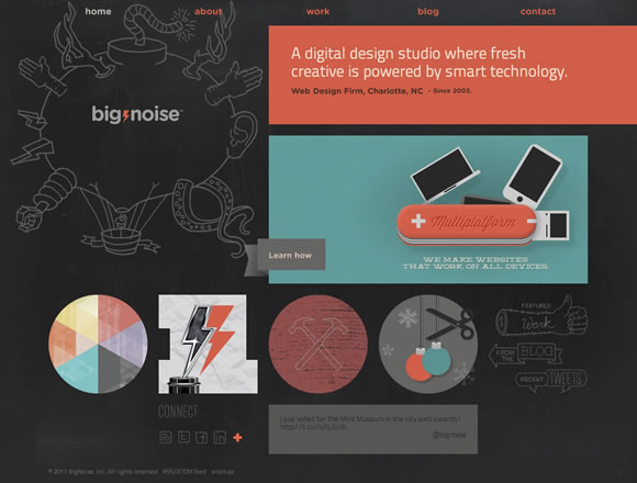
The use of textures in web design has been popular for a while, and it’s still going strong. It’s definitely an excellent way to add realism and depth to a design, but the key to successfully using textures is not to over do it. The last thing you want to do is add some busy texture as a background that distracts the user’s attention away from what’s important, which is the content. Take a look at these examples to get inspiration on the proper way to do textures in web design.
Inspiration  Gisele MullerJuly 17, 201217 Comments04.1k
21 Beautiful Examples of Subtle Textures in Web Design
Share
Gisele Muller
Gisele Muller loves communication, technology, web, design, movies, gastronomy and creativity. Web writer, portuguese/english translator and co founder of @refilmagem & @mentaway Twitter: @gismullr


Now is the time of simple background without anything.. The important is the content… but if we don’t have a good content? I think will be better have a good middle of between content and images, in those moment. Good examples..in any case. Thanks for sharing.
Nice websites, thanks. It’s amazing how many of these websites are for iPhone Apps.
Nice examples as always Gisele.
I really enjoy the soft retro colors of HDlive but that text header looks like HO live to me.
I also enjoy the fun and approachable layout of Explanimate.
amasign selection of design, thanks
It seems like textures are making a huge come back in web design in recent weeks. Thanks for sharing!
Great collection! Yardsale and ChatCheckIn are my top picks.
Love the clean and minimal styling of Maverick Digital and soft focus of Kerem.
Excellent collection.
Some great examples here – thanks. Particularly like the Yardsale example.
great collection
Amaizing selection of the websites! I’m checking the samples and they are all so different an cool!
Very helpful. Thanks for sharing! 🙂
I really do like Yardsale as well…
Love it! Thanks for the post!
Every design is very creative.These designs play important role in website look.
Great list.. Yardsale has very nice layout. Love the wood texture. I will add them up to my own collection.
Everyone, if you need more design inspiration of web design with texture, you can visit my collection here https://webdesigninspirationtoday.com/design/style/texture
Cheers 🙂
Oliver Lisher stands out from the rest i must say!