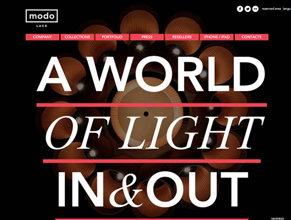
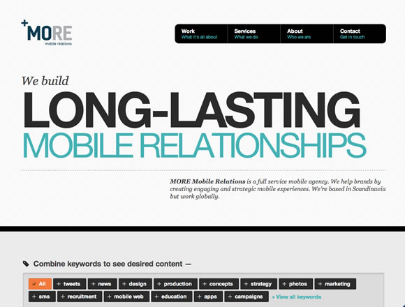
Here at WDL we love typography and we never get tired of gathering good typography inspiration for our readers. From free fonts to type usage in signs and typography videos, we like to give you as many resources as we can on everything surrounding type. Today we decided to gather some examples of beautiful typography usage in web design. We will show you examples here where typography is the main focus, and examples where typography complements the design. Check it out and let us know what do you think.
Inspiration  Gisele MullerApril 30, 201216 Comments06k
21 Beautiful Examples of Typography in Web Design
Share
Gisele Muller
Gisele Muller loves communication, technology, web, design, movies, gastronomy and creativity. Web writer, portuguese/english translator and co founder of @refilmagem & @mentaway Twitter: @gismullr


Colorful collection with great examples.
Nice collection, thank you for sharing it.
Great examples. Would also be nice to read where we can find all these nice fonts so we can actually use them in webdesign typography.
The value of a good well designed typographical site is often over looked – especially at the lower end of web design, where templates reign.
Some good examples here showing the way ahead.
Keep up the good work.
Excellent selection. Thanks for sharing..more ideas I see. Good choice of colours and design too. My preferite site are oliverrussell.com, and fiftythree.com.
These sites are too good. Lots of typographical variations and very inspiring.
Oooo, some very cool stuff. Quite envious!
For fun, read the Whiteboard.is copy – what is this mumbo-jumbo? Just write clearly about what you do, dammit. Are they trying to confuse future clients by making up nonsense?
“At Whiteboard, we aim to inspire color in the margins through action, story, conversation, and love. We are simple in our love, conflicted in our thoughts, and intentional in our actions.”
“Don’t stand or raise a fist in defiance, simply walk into your world and be yourself. Let the dreams within you flood the streets of our cities. There is no time, no moment—there is a here and now and that is all you need.”
This is a good collection of sites. Thank you for sharing.
Love the grand canyon typography. Great collection!
Excellent type treatments. Great photography (and great type) is the key to the simplicity of these site layouts. Sucks when a client won’t spring for decent photos – always makes our job a little tougher.
I like the collection!! Some really good designs there.
Thanks for sharing here. Very good collection! The beauty of typography goes beyond mere aesthetics; it facilitates the communication between you and your audience.
This is a great article and one that has some very interesting and inspiring example within it. I am always looking for inspiration when it comes to typography and how I can push the use of it within my designs. The site that stood out for me was Asics – Stop at Never site. I love the bold use of typography and I feel it gives the site a real balance. This coupled with the scrolling effect gives the site an impact and wow factor. Thought this was a great article and one that will be a great resource for me in the future.
Definitely a strong collection of beautiful websites. Thanks for sharing! However, in a few of the sites (e.g. Saucony and Asics) I found myself more impressed by the jquery parallax & scrolling effect than the Typography. But then again, quality Typography is supposed to complement and enhance the overall web experience vs stand out, in my opinion.
Great collection! Got to say I loved the simplicity of Lifetree Creative’s typography.