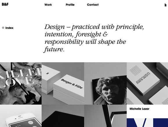
Choosing the proper colors for a website is certainly a very important step of the creative process. So deciding to go with hardly any color at all can be a bold move, but if done correctly, it can pay off. For this post we’ve collected 21 Breathtaking Examples of Minimal Color Usage in Web Design. In these examples, you’ll notice that very few colors are used throughout. It’s mainly shades of grays, and a few desaturated colors here and there. This gives the designs a sophisticated look and allows what’s most important (the content) to get the attention it needs.
Inspiration  Gisele MullerJune 11, 201216 Comments05.5k
21 Breathtaking Examples of Minimal Color Usage in Web Design
Share
Gisele Muller
Gisele Muller loves communication, technology, web, design, movies, gastronomy and creativity. Web writer, portuguese/english translator and co founder of @refilmagem & @mentaway Twitter: @gismullr


So difficult to strike a balance between “breathtaking minimal colour” and “boring grey”. Thanks for finding these.
Nice list 🙂
Some really clever uses of color. More people should incorporate more black and white into their designs!
Good list..Your proposals are better always ! Thanks for sharing! My preferite design is like “myownbike.de”
Wonderful list. I love all of them. Thanks for sharing 🙂
I totally agree, like the idea of a minimal color usage in web design, so it could give more emphasis on the content itself for a particular site, simple yet sophisticated. Wonderful list! Thanks for sharing such a useful post.
I really like those minimals sites … Less is the best.
Muito bacana!
Thats are wonderful samples of minimalism in Web Design!
“Theory” is quite nice!
Check this architecture related minimal site (with random color contrasts).
https://www.dimscale.com
Cheers
Amazing list of very inspiring websites.
Eephus League Magazine is just… whaow!!!
Thank you.
Thought this was a great article and with the collection one that will be very useful for me. What I like about this article was that it was about colour which is very important when designing and developing sites. I liked all the examples you have included but the one that stood out for me was the Eephus League Magazine. I love the use of colour in this site, how they have used the white space and then as you scroll down you get hit with areas of colour through the images which really make them stand out. I love everything about the site and through the design it really has that wow factor. This was a great collection and one that will be a constant resource for me for my future design and development projects.
Some good examples here. Book of Beards works particularly well.
Thanks for the great post! Minimal sites are great. They look super clean. I tried making my portfolio site (https://www.earlvarona.com) ‘minimal’ but I’m not sure if it’s ‘minimal’ enough. What do you guys think?
how cool is book of beards!
Hochburg’s very clean!!