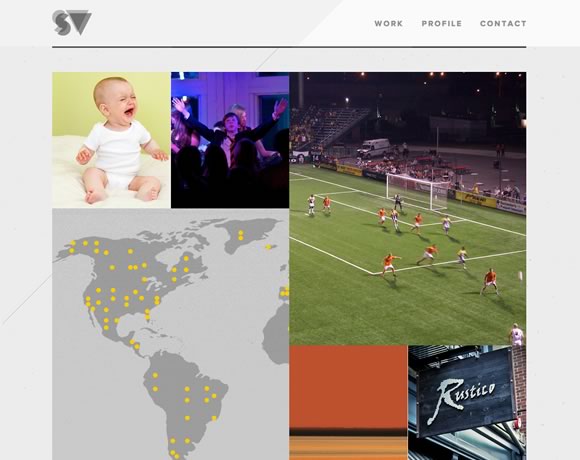
What makes a clean web design layout? What are the elements that tells us if a layout is clean or not? Probably each person has their own view on this subject, and today we gathered a few examples of web designs that we believe are clean. In our opinion clean doesn’t mean the absence of colors, images or animation (for instance). We believe that a clean layout is the one that has the right amount of elements to show its point without overloading the user with information. Clean is the layout where things are disposed in a way that makes everything clear and easy to browse. Today you will find here examples of websites that use color, image, typography, and much more while delivering a clean design. Check it out and let us know what do you think is the main element of a clean layout.
Share
Gisele Muller
Gisele Muller loves communication, technology, web, design, movies, gastronomy and creativity. Web writer, portuguese/english translator and co founder of @refilmagem & @mentaway Twitter: @gismullr


Nice post, I like more “UI Wireframe Sketches” when designers do work on paper and after created on computer.
Thank you for sharing these inspirational clean websites. I totally agree that a clean website uses just the necessary design elements to get its point across and naturally attracts the website visitors eye to the most important area(s) on screen. The examples you provide perfectly show that there’s more ways to achieve this.
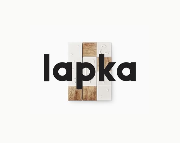
Lapka definitely has the edge in this list.
Minimalist at it’s best!
Lapka is the worst. It is nothing more than a splash screen, something had has been out of date for more than 10 years. It is just another click the end user has to do to get at any information.
Lapka is more about the designer saying “I am cool” than it is about good web design.
I agree, Ray.
If a site doesn’t let me know something about the content when I land there, I’m gone. Most of the others do this, or are enticing enough for me to want to investigate further.
Did you guys actually visit the site?
Its not a splash page. First it is intriguing, then a simple mouse movement will get you enough information to want to continue.
Field trip is definitely something different and grabs my eye.
I love Noble Design. Thats a really beautiful design. Mercer Tavern is also quite nice. Thanks for the post.
Like Linaka, I love so much the style bu Noble Design. Very nice! Good list…more inspirations really interesting..Thanks!
I like both Verdi and Mustasj – as they take ‘clean’ or minimal design to the next level by having the ability to express an idea through the visuals.
I think the most successful clean style designs not only show you only the necessary elements with proper spacing etc, but they also 1. lift the brand and 2. express an idea clearly. This is the type of stuff that separates typical clean wordpress themes from a clean website with great communication of ideas and brand.
John, well said. Your words are inspiring. Thank you.
Stunning! Thank you for all the great resources on this site. ♥ love it all!!!
Nice article with some great clean website designs.
Nice layouts Design. Thanks.
GRK Fresh Greek is making us feel hungry! Great collection, thanks.
Great list. But Ideaware is not really a clean one, IMO. I will add them some of them into WDIT collection,
https://webdesigninspirationtoday.com/design/style/clean
Wow… I have so much to learn. Thank you for this inspiring article with the beautiful examples of clean website design. I particularly like Caava Design. The cutout showing the background through it is inspired! Not to mention the other details like the moving arrows and graphics upon scrolling. Gisele, you obviously have a great eye for design.
I really love both Caava Design and Mustasj!
@gismullr – is Web Design Ledger doing another post for 2013 clean designs?