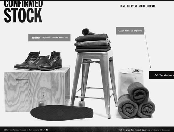
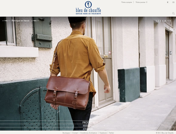
Using big photographs in a web design, either as the background or part of the content, is a great way to easily set the overall mood of a site. However, when doing this, you run the risk of creating a site that it visually too busy. That’s why most site’s that you see making use of big images have an overall minimal style when it comes to the other design elements. For today’s inspiration, we’ve gathered a collection of sites that are excellent examples of how to use big photography in a web design.
Inspiration  Gisele MullerMarch 12, 201215 Comments05.1k
21 Examples of Big Photography in Web Design
Share
Gisele Muller
Gisele Muller loves communication, technology, web, design, movies, gastronomy and creativity. Web writer, portuguese/english translator and co founder of @refilmagem & @mentaway Twitter: @gismullr


Great selection of designs here. My favourite is probably ‘Nemeth Interactive’ as I feel it’s use of a large photograph fits the website very well.
Woa! Pure class! Bomb Girls website is just technically incredible!
Agreed! definitely got me scratching my head!
wonderful collections..more inspirations..Thanks for sharing..
Gisele, thanks a lot for the next great collection! Your articles are always mentioned in our seasonal roundups of the best web design articles. This one is one more candidate for the collection of Spring 2012 🙂
You forgot my site! I have a pretty cool picture – of me haha…
Nice collection, I particularly liked blindbarber.com because of it’s a very original design.
Also liked the navigation in annasafroncik.it
I think I will try this approach for new clients. Now bursting with ideas!
Inze.It truly have a brilliant picture there, its so symmetrical and crisp. Fabulous.
I’m a fan of the heavy and visual image websites myself. They look professional, and its a brilliant way to brand yourself distinctively. LOVE all of these sites! And BEG bicycles with its vintage feel and stamp!
wow, can you please talk a little bit a bout the technology behind each one ??? I meant the language used and how did they implemented the website
Nice collection of pics… simply Awesome….
Big Type was always a huge inspiration for me as you can also see on my website. Thanks for the collection.
I like the big image designs, but some information on how to implement these designs without killing your web page’s download speed would be most helpful. With search engines placing so much emphasis on page speed, I am worried these designs might be detrimental to my rankings…that is, without some good instruction on the dos and don’ts.
Using huge backgrounds is one of the most actual web design trends of this year. I adore websites like these.
Great post, it’s nice to see the movement towards minimizing design and using the image as the design. Here are two more big photography designs from pro photogs. The images design the sites and it really draws your attention.
https://www.gallagherphoto.com/
https://www.vallely.ca/