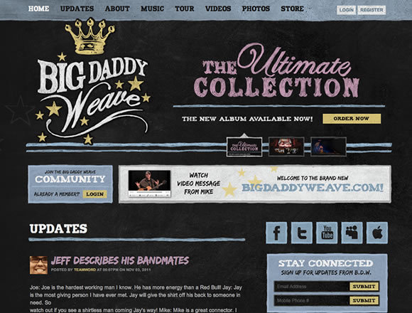
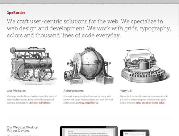
There are a lot of ways to give a website some personality, depth and style, and certainly illustration and hand drawn elements are a good example. From small background elements to complete illustrated websites, from illustrated icons to hand drawn typography, today we will show you some examples of websites using a different approach to spice up their layout. And if you consider that adding illustrated elements can make your page to messy, think twice and check some of the examples we have here. There are a lot of good ways to give your project a nice touch if you use the right amount of illustrative elements, so check out and enjoy.
Inspiration  Gisele MullerNovember 7, 201113 Comments04.6k
21 Examples of Illustration and Hand Drawn Elements in Web Design
Share
Gisele Muller
Gisele Muller loves communication, technology, web, design, movies, gastronomy and creativity. Web writer, portuguese/english translator and co founder of @refilmagem & @mentaway Twitter: @gismullr


Drawings like in the site by “Lounge” are my preferite. I hope in the future make a site with my hand drawings. This is a beautiful way make of art in the web. Thanks for sharing!
I love hand drawn art on websites as it gives a ‘unique’ ‘humain’ feel to them.
As much as I am a fan of all things shiney & new looking you can not deny that hand drawn elements on websites give them a look that no computer generated graphic ever will!!
Thanks for posting these inspiational examples.
Robbie
Sunday Best Designs just gave us an inspiration on how we can build a tailor made suit online store! Thanks!
Thanks for putting this list together for us. Using drawings in your web design is a great way to set your site apart from your competition. Great examples.
Tao Community site stands out for me, altough i am not so sure about useablility, I would do extensive A/B testing between more “main stream” design and this to see how well the visitors finds things…
Hand drawn designs create a different effect and it looks very impressive, Nice Examples of hand drawn designs I like it very much
Nice Collection!
I have also created a post on fresh and inspiring sites
https://www.alldesignstuffs.com/2011/inspirational-websites-set-3-containing-fresh-and-latest-sites/
I hope you like it!
some lovely sites featured.
Great collection !
me like.
me like a lot.
Great collection. GoLive site is superb
Great collection! Thanks.
Hey, my web designing cousin, santaclaradesign.com, just sent me this link. I designed the Big Daddy Weave CD package for Warner Bros. and they used all of my psd elements to make the site. I love it. I love what you web folks can do with our print stuff!
And in case you’re wondering, to get that chalkboard effect, I typeset the words in Photoshop, printed it out and literally traced the printout using tracing paper using a pencil – making sure not to make it too perfect. This gave it a hand drawn feeling and texture. I then scanned that in and made it a channel in photoshop and added color to each element. Make sense?