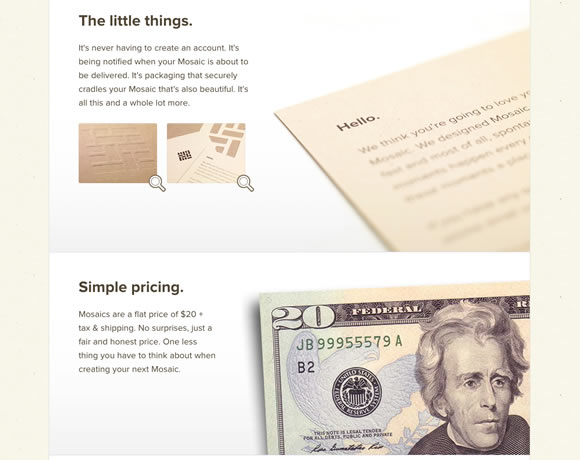
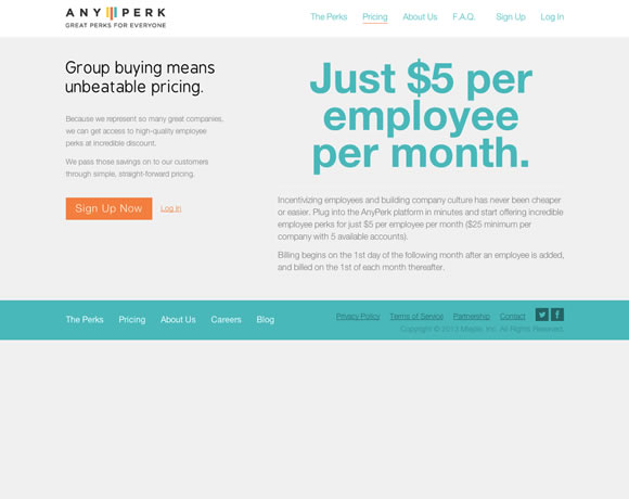
We are always talking about clean and minimal designs, designs that are simple and effective, and lately, we are also talking a lot about the new trendy flat designs. So why it is so difficult to find a “pricing page” that is well designed? If designers are taking websites to a next level where usability and beauty are combined to deliver awesomeness, why when you go from a homepage to a pricing page you feel like you are entering a totally different website? Designers should pay more attention to this specific page, specially if they want better conversion rates.
It doesn’t matter if you are developing a website for a restaurant, a service provider or something else that may require periodical payments, you need to put a lot thought into the pricing portion of the site. First of all, you want to show the pricing menu in a clear way so that users don’t need to search for it. Second, if the homepage looks amazing, do the same with the pricing page so it’s obvious to the user that you care about your product. Third, remember to be clear and provide the important information your users need to know. Avoid small letters and confusing data.
I have to admit it was hard to gather the examples we will show here. I had to go through a lot of websites to find nice enough designs to show you, so I hope you enjoy the selection and I hope you use these examples as inspiration for your next project. And if you have an example to share, please share in the comments.


Hi Gisele, I love some of these pricing pages. Clear to the point and very simple in design, I particularly like Treehouse, Spotify, Zendesk and Audible page designs the most. These pages also make for very good landing pages.
Often a websites homepage is used as the main landing page nothing wrong in that, but a well crafted landing page such as these can have much more impact. They probably reinforce their product/service and strengthen conversion.
Good stuff. You know, I’d actually like to see some examples of bad pricing pages too!
Really love the Spotify and Squarespace pages.
Hi Giselle. I’m a fan of minimalist design. Those always standout for me. In terms if pricing pages, I strongly feel that the message should be delivered above the fold without having to scroll down. This will give visitors a bird’s eyeview of your pricing without being overloaded with all the information. However, A clear link to a price breakdown/price comparison table where all the features are included must be clearly highlighted.
Some nice looking examles. However, its hardly that difficult to design a good looking pricing page for 2-4 different prices since you have all that lovely space to play around with and they all fit nicely on a single page.
What would be more intersting is to see examples of complex pages with a larger amount of prices. Examples that show ways to deal with larger amounts of data. Do you present all data in small type in order to fit it all and if so, is the content really readable? Maybe you’re making the data scrollable, either horizontal on vertical, or use another form of showing/hiding content such as accordians or sliders in order to make sure the text is actually large enough to read. In that case, how to make sure that it is still possible for the user to be able to get an overview and to compare prices?
As you can tell designing such pages is a much more complicated challange than simply present a couple of prices on a minimal page.
Hi,Gisele great work all of them designed brilliantly but squarespace and Geckoboard stands out for me.
Well Done!!!
Zendesk & Square Space are awesome! Great inspiration for something that comes up a lot in business website design.
Rdio simplicity is awesome … clean and clear … love it!
Thanks for the compilation!
Lots of effective ways to say this is the price, and a few erm… not so friendly ones.
though they all look good.
I really love ZenPayroll and Easel 😀
What’s the conversion like on the nicer designed pages?
Some really nice examples of clean and informative designs that make it easy for the viewer to get an idea on prices. Very inspiring. Thanks.
very helpful, we need it, thanks