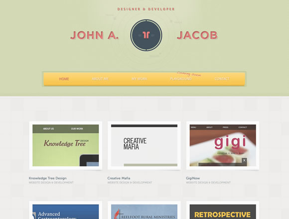
First of all, we would like to wish everyone a Happy New Year! To kick things off for 2012, we’ve gathered some amazing examples of subtle textures and patterns in web design. The web sites in this collection demonstrate that you don’t always have to over do it to make a big impression. Sometimes it’s better to use subtle design elements so that the focus is on the content. In many of these examples you’ll notice that the textures and patterns used are barely noticeable at first glance, but just enough to add an extra layer of interest and depth.
I know you’ll get plenty of inspiration from these web designs, and hopefully they’ll help you come up with new ways to use subtle textures and patterns in your own projects.
create
Percival
Cast Iron Design
Beckin
The Neighborhood Studio
STRBK
dwd co
St Kilda High Hopes
Freitag
decode
Tabspresso
radoor & co
workdiary.de
Berg Cloud


beautiful and useful for me as designer.
Very nice this post. So useful and I see more interesting Ideas. Thanks for sharing. subtle textures in the webdesign sometimes when you don’t have so much info or products are important!
Excellent post 🙂 great sites!
A subtle texture can be very useful in a design that might otherwise be a little too sparse.
Thanks for finding and sharing.
Excuse me I recommend massonn.com 😉 Thanks
When it comes to web designs, I think bringing uniqueness and attractiveness at the same time is really important and that is what each design posted above is all about. To create a catchy design uniqueness is the key.
thanks for the awesome collections!
These are some very inspiring designs and backgrounds. I always have to keep reminding myself to add a unique and attractive design to my client’s sites.
very nice design and very good collections…..Thanks for finding and sharing.
thanks for the nice collection!
Great inspiration source! Thanks for the Share!
Wow, I love the John A Jacob-website! Great inspiration source too!
nice collection!
thanks for sharing!
see again. great