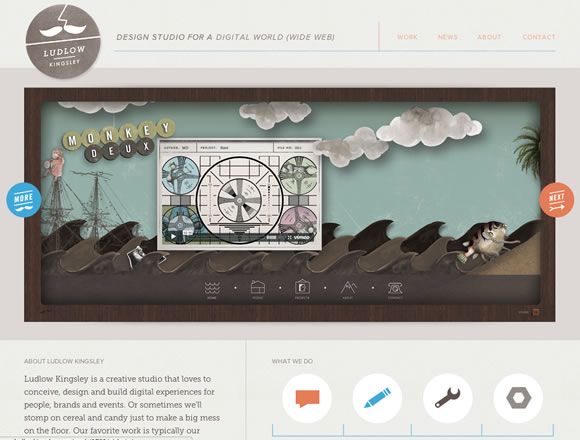
Sliders are an excellent way to organize and highlight important content on a site. They can also be used to display a good amount of content within a limited amount of screen real estate. The most popular way to add a slider or slideshow to a website is still jQuery, which seems to have a new plugin released every day. In order to give you some inspiration, we’ve gathered 21 very good examples of how sliders are being used today.
Inspiration  Gisele MullerMay 14, 201214 Comments06.5k
21 Fantastic Examples of Sliders in Web Design
Share
Gisele Muller
Gisele Muller loves communication, technology, web, design, movies, gastronomy and creativity. Web writer, portuguese/english translator and co founder of @refilmagem & @mentaway Twitter: @gismullr


Very nice examples…Good design..more inspirations…is a paradise this! Thanks for sharing
Thanks,,I like the examples that use slider for big images..
I still prefer a slider that I built over many of the ones displayed. I do like how these are incorporated into the page.
I built one that can be viewed here in use: https://creativewildcat.com/photography/ or on my homepage in another context.
It can be downloaded for free at https://modules.creativewildcat.com/sliders/multi-content/
I enjoy these types of articles that showcase great sites!
I like me some sliders. Good inspiration
There wasn’t anything really special about most of the sliders. I would agree that most of the pages are well designed websites, but for the most part the sliders are fairly normal.
I love the rdio example! I’ve been going back to their site over the past few weeks just for inspiration. Love the ‘Doberman’ one too, except I find the arrow placement in the top right corner is counter-intuitive.
Great post!
Thought this was a interesting article with some great examples of slideshows. If done right a slideshow can really give a site that wow factor and make it stand out form the rest. From the collection the site that stood out for me was x-doria. I love how the slideshow stretches across the whole page and has a really smooth transition adding extra graphics. There are some great examples here and this article will be great inspiration for me when I am working on future projects
A couple of these are really nice.
Check out the slider I build for a client:
https://www.novo-int.com
I have got to admit that slider is pretty cool.
However there is an issue in Internet Explorer. I wouldn’t anything less from IE though.
@Aftab Ahmad, that is a really cool slider. You’ve taken a great, frequently used feature and added a unique twist to it! Nice work, and thanks for sharing.
Thanks for this post!
There’s some very nice things here.
Atelier is so complex with form from everywhere.
So Creativ.
🙂
Nice sites – and I am a fan of sliders – they enable you to present multiple points of information in limited screen space.
As long as the on-screen movement enhances the site, and doesn’t detract from the goals of that site, then I say use ’em.
I like Golla – but I needed to click on the arrows to make it move…maybe it should be scrolling on auto.
Many Thanks,
Darren.
Thanks for some of the inspirational design ideas as I am looking to create some new WordPress sliders as have been stuck coming up with ideas.