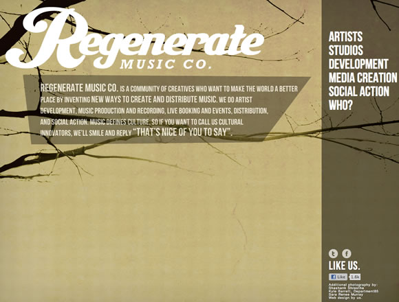
Here at WDL, we really like minimalism and we believe that the “less is more” principal can result in amazing websites. Minimalism, explained as the essence of something, is when we reduce something to its necessary elements. What is the right amount of elements to compose a minimal design is a polemic subject, but we can all agree that having few elements make a layout elegant, easy to understand/use and pleasant to see. Today we gathered a few examples of minimalistic designs to inspire you, check it out.
Share
Gisele Muller
Gisele Muller loves communication, technology, web, design, movies, gastronomy and creativity. Web writer, portuguese/english translator and co founder of @refilmagem & @mentaway Twitter: @gismullr


Congratulations for this list… site like “www.fruute.com” are my favorite.. These are design where the are important content and graphics properties bring out the contents. Thanks for sharing..
Thanks for the lists.. I like wearefo.com and andychak.com
Thanks for the list they are all great websites. I love the Oliver Spencer one that is my favourite
Nice set of inspiration Gisele! Keep it coming!
Great list! some of them are inspiring
Cool! Less is more.
These are really inspiring. I like to work with minimalism. But never feel confident but now I like to start my project. Thanks for inspiring. Keep sharing.
Thanks for this wonderful list. I will inspire me on my next design. Thanks
Thought this was a great article and a very inspiring collection of sites. I see a lot of articles like this and I have to say that this is one of the best I have come across for a while. I think you have put together a great variety of sites and they all have elements that I love. The site that stood out for me was the b14 site. I thought the look and feel of the site through the design and layout was amazing. I loved the balance that had been created and the fact that even though there is some large images and content, you still get that minimalist feel. Great article and I look forward to more articles like this from yourself.
I have alway tried to create minimalist sites with as much white space as possible. Somtimes I just get a little to carried away with the information.
Thanks for your article.
Excellent list, Gisele! Big list of web design galleries. Thanks for sharing. Website Design, as this is known, has grown enormously in the last decade, making life more convenient for consumers.
You should also check the designs on http://www.webstarttoday.com.
Hi!
b14’s very minimalist, and the full white backround give us feel purity.
Good job.
Very nice! My favorites: b14, Visual Supply Co., and fruute. Thanks for sharing.
Some of these look really neat and professional thanks! The academy one looks very individual and modern 🙂
Cool list and some of the ideas are inspiring. But, really…the minimalistic approach to web design lacks some of the marketing elements that give your website “oomph”. Ultimately, great design by itself doesn’t sell…great design with appropriate marketing elements turns your clicks into calls and customers.
Definitely some interesting designs of the bunch, but it’s important to remember that a great design doesn’t mean everything.
When viewing some of the sites above, I had no idea what they wanted me to do nor where a particular call to action as.