
Contact forms or contact pages – depending on how you choose to make it available – are an important part of a website. The contact section is actually the part where you allow your users/clients to get in touch with you, to reach you and to hire you. For this article, we gathered some examples of how websites are showcasing their contact section. From colorful letters forms to clean and simple contact information, you will see several inspiring examples of how to display your contact information.
Reverend Danger


Tim Biskup


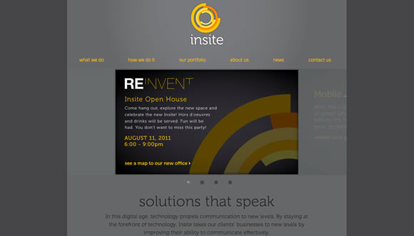
Insite

Kettle


Cory Etzkorn


GiftRocket


Cabedge

Studio Chirpy


murray & murray


Loysel’s Toy


headlamp


Growcase


Christia Wwoo


Paperlux


Whitespace


Select Properties


Shaw & Shaw Photography


Forefathers


IQ Creative Intelligence


Syropia


Fakta


Dolce Caffé Font


The Reverend Danger website is very inspiring.
Nice example! thanks.
I haven’t really been wow’ed by any of these. There are some really lovely contact forms but nothing unusual or eye catching. I like the maps which are being shown, they are all very creative. Including the old style map on Loysels Toy. I loved the Shaw and Shaw site, not particularly for the contact form but the style and design. It’s really interesting.
this examples really know how to put the fun on the contact pages, one of the toughest pages in web design!
I found some of these to be very interesting as I always love to see what other web architects are doing. Its always good for inspiration and pushing the creative limits.
All very pretty and creative, yes. But of the six that caught my eye sufficiently to follow the links, four were inaccessible to me and the other two were difficult to use because of very basic and easily fixed oversights. Usability being sacrificed at the altar of design again. I thought, or hoped, that designers had by now realised that these two aims are not mutually exclusive and that they just present another challenge for their skills.
Contact page of “loyselstoy.com” make me crazy.
A lot of beautiful examples in this article. Thanks.
Goes to show again; less is more. Good examples!
This one looks great too:
https://www.beatsfactory.com/radio/#bfcontact
Keep on writing!
very nice examples.
These are some awesome contact forms! I’m going to try and use these ideas on my sites :)) thanks for posting!
This is fantastic, great ideas!
Thanks for publishing the site! (Growcase)
Appreciate it.
Also, cool topic idea for a round-up 🙂
I’d also suggest checking out grooveshark’s signup experience, its amazing.
A good tool for enhancing your contact page is a button that send your details to your visitors phone, instantly via SMS called Sendola. well worth checking out.
https://www.sendola.com/